Appearance
Image split with overlay
This guide describes setting up an Image split with overlay section.
Use the section to display two images, overlaid with text, on a store page.
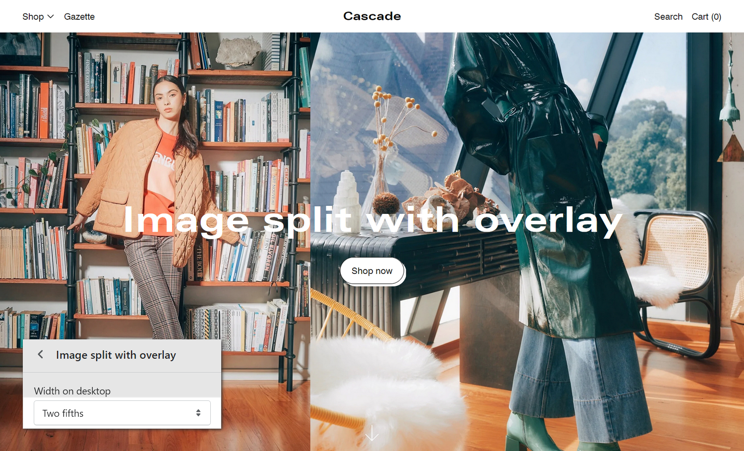
The previous image shows an Image split with overlay section on a store's home page. In the lower left, the section settings' Width on desktop dropdown is set at Two fifths. This setting specifies the width of the first image, inside the section, on desktop display devices.
For general guidance with modifying sections, refer to Sections overview and Shopify help: Sections and blocks.
Set up an image split with overlay section
To set up an Image split with overlay section:
Go to Customize theme.
In Theme editor, at the top of the page, use the dropdown to select a page that contains an Image split with overlay section. For example, select the Home page.
Note
The section can be added into any page, except Checkout and Giftcard pages. To add the section into the current page, select Add section > Image split with overlay. Refer to Shopify help: Add a section.
From the side menu, select Image split with overlay.
Select a setting described in the following table.
| Setting name | Description |
|---|---|
| First image > Image | Use the (first) Image selector options to setup an image to display inside the section. Refer to Edit an image inside a section or block. |
| First image > Image > Connect dynamic source | To display an image from a dynamic source, if available, select the Connect dynamic source icon beside the (first) Image selector, and then choose a metafield to add. Refer to Shopify help: Metafields. |
| First image > Width on desktop | Select the dropdown Width on desktop to set a width for the section's (first) image. The options are One half, Two fifths, One half, Three fifths, and Two thirds. This setting applies to desktop display devices. |
| First image > Indent image | Select the Indent image checkbox to add/remove the spacing that's displayed around the (first) image. |
| First image > Indent background color | Use the dropdown Indent background color to set a background color for the spacing that's displayed around the (first) image. To use this setting, set the First image > Indent image option to on. Set the background color to Follow section color scheme. Alternatively, set the color to the (section) color scheme's Primary, Secondary, or Tertiary background color. |
| Second image > Image | Use the (second) Image selector options to setup an image to display inside the section. Refer to Edit an image inside a section or block. |
| Second image > Image > Connect dynamic source | To display an image from a dynamic source, if available, select the Connect dynamic source icon beside the (second) Image selector, and then choose a metafield to add. Refer to Shopify help: Metafields. |
| Second image > Indent image | Select the Indent image checkbox to add/remove the spacing that's displayed around the (second) image. |
| Second image > Indent background color | Use the dropdown Indent background color to set a background color for the spacing that's displayed around the (second) image. To use this setting, set the Second image > Indent image option to on. Set the background color to Follow section color scheme. Alternatively, set the color to the (section) color scheme's Primary, Secondary, or Tertiary background color. |
| Content > Heading | In the Heading box, enter text to display as a heading (title) inside the section. |
| Content > Text size | Select the Text size radio buttons to set a size for text inside the section. Set the section's text to use the same size as Feature heading or Standard heading text. |
| Content > Text | In the Text box, enter (body) text to display inside the section's text area. Format the text and add links by using the Text editor pane. |
| Content > Text > Insert dynamic source | To display (body) text from a dynamic source, if available, select the icon Insert dynamic source beside the Text box, and then choose a metafield to add. Refer to Shopify help: Metafields. |
| Content > Show scroll down arrow | Select the checkbox Show scroll down arrow to show/hide an arrow (down) icon inside the section. |
| Layout > Aspect ratio – mobile | Use the Image aspect ratio - mobile options to set the width-to-height ratio for images inside the section to Natural or Full screen. This setting applies to mobile display devices. |
| Layout > Aspect ratio – desktop | Use the dropdown Image aspect ratio – desktop to set the width-to-height ratio for images inside the section. The options are Classic (4:3), Widescreen (16:9), Cinematic (2.35:1), and Full screen. This setting applies to desktop display devices. |
| Layout > Content position | Use the Content position dropdown to set a position for the section's content area. The options are Middle left, Middle center, Middle right, Bottom left, Bottom center, and Bottom right. |
| Layout > Text alignment | Use the Text alignment options to align text inside the section to the Left, Center, or Right. |
| Layout > Display content below image on mobile | Select the checkbox Display content below image on mobile turn on/off displaying the section's content area below the image. The setting applies to mobile display devices. With this setting off, the content area overlays the image. |
| Color > Color scheme | Use the Color scheme options to select a color scheme for the section. Refer to Colors. |
| Color > Disable transition | Select the checkbox Disable transition to turn on/off overriding the color transitions set in the section's theme settings. Setup defaults for this setting in Theme Settings > Colors > Transitions. |
| Color > Text color | Use the Text color options to select a color for text inside the section. The options are: Follow color scheme, White, and Black. |
| Custom CSS | Select Custom CSS. In the box, enter custom CSS styles to apply only to the current section. Refer to Shopify help: Add custom CSS. To apply custom styles to your entire online store, refer to Theme settings > Custom CSS. |
| Remove section | Select Remove section to delete the section from the current page. |
Configure a block within an image split with overlay section
A default Image split with overlay section contains no blocks. To configure a block inside the section:
Go to Customize theme.
In Theme editor, at the top of the page, use the dropdown to select a page that contains an Image split with overlay section.
From the side menu, expand the Image split with overlay section menu.
To configure an existing block, select the block from the side menu.
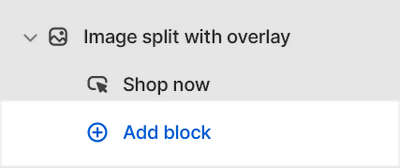
To add a new block, select Add block, choose a block to add, and then select the block you added.
Note
Inside the section, you can add, remove, show, hide, or move blocks. Refer to Configure blocks inside a section, and Shopify help: Sections and blocks.
Apply a block setting described in the Table: Image split with overlay blocks.
Table: Image split with overlay blocks
The following table describes the blocks inside the Image split with overlay section, and their corresponding settings.
To configure a block, refer to Configure a block within an image split with overlay section.
| Block name | Block description | Block setting(s) |
|---|---|---|
| Button | Displays a button inside the section. |
|
| Color | Adds an overlay, with a specified color, to the section. |
|
| CSS background | Adds an overlay, with a specified (CSS) color gradient, to the section. |
|