Appearance
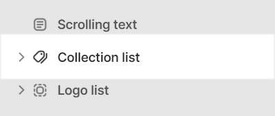
Collection list
This guide describes setting up the Collection list section.
Use the section to display a selection of collections on a store page.
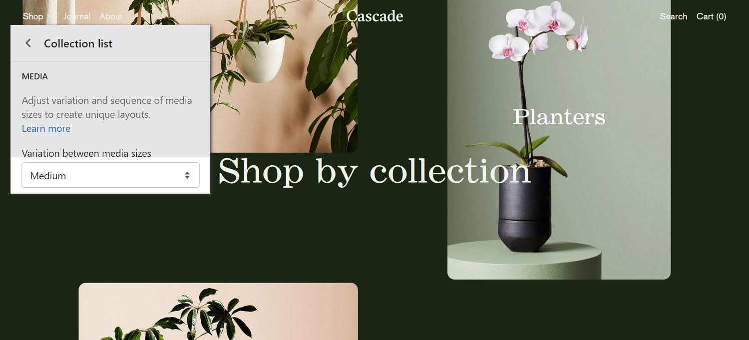
The previous image shows a Collection list section on a store's home page. In the upper right, part of Theme editor's section menu is displayed. The menu's Level of media size variation slider is set at 2. This setting applies a medium amount of variation to the sizes of the collection tiles (images), inside the section.
For general guidance with modifying sections, refer to Sections overview and Shopify help: Sections and blocks.
Set up a collection list section
To set up a Collection list section:
Go to Customize theme.
In Theme editor, at the top of the page, use the dropdown to select a page that contains a Collection list section. For example, select the Home page.
Note
The section can be added into any page, except Checkout and Giftcard pages. To add the section into the current page, select Add section > Collection list. Refer to Shopify help: Add a section.
From the side menu, select Collection list.
Select a setting described in the following table.
| Setting name | Description |
|---|---|
| Heading | In the Heading box, enter text to display as a heading (title) inside the section. |
| Heading > Insert dynamic source | To display (heading) text from a dynamic source, if available, select the icon Insert dynamic source beside the Heading box, and then choose a metafield to add. Refer to Shopify help: Metafields. |
| Layout > Feature full width collections | Select the checkbox Feature full width collections to turn on/off displaying collection tiles at full width inside the section. With this setting off, a mix of half width and full width tiles are displayed. |
| Layout > Text display | Use the Text display options to specify a display mode for the section's text. To overlay content with text, select Overlay. To display text below content, select Under image. |
| Layout > Overlay text size | Use the Overlay text size options to specify a size for overlay text inside the section. Set overlay text to use the same size as Standard or Feature text. To use this option, set the Text display option to Overlay. |
| Layout > Enable cascade layout on mobile | Select the checkbox Enable cascade layout on mobile to show/hide the section's cascading content area on mobile displays. |
| Layout > Desktop layout | Select the Desktop layout options to set a layout style for the section's cascading content area. The options are One column or Two columns. This setting applies to desktop display devices. |
| Cascade effect > Level of media size variation | Adjust the Level of media size variation slider to apply more or less varied sizes to the media items displayed inside a cascading section. The slider ranges from 0 to 4. Select 0 for no size variation, to display all media at the same size. Select 4 to maximize the size variation. |
| Cascade effect > Sequence | Adjust the Sequence slider to set how media items (tiles) are resized inside a cascading section. Inside a cascading section, tiles are resized according to a pattern or "sequence". Adjust the slider between 1 and 5 to specify a sequence. |
| Cascade effect > Alignment variation | Adjust the Alignment variation slider to use more or less varied alignments to display media items inside a cascading section. The slider ranges from 1 to 7. Select 1 for minimally varied alignments. Select 4 for maximum alignment variation. |
| Cascade effect > Vertical space between items | Adjust the Vertical space between items slider to set the amount of vertical space displayed between items inside a cascading section. The slider ranges from 0.5 to 2. |
| Cascade effect > Start position | Use the Start position options to specify a starting position for displaying the first item in a cascade layout. The options are Top left and Top right. |
| Cascade effect > Use global settings | Select the Use global settings checkbox to turn on/off "global settings" mode. Enabling this option overrides all cascade effect settings you specified inside the section, and applies the "global" cascade effect settings you specified in Theme settings > Cascading content. |
| Heading overlay > Overlay heading | Select the Overlay heading checkbox to turn on/off overlaying the section's content with the section's heading text. The overlay remains in the section ("sticky") as the cascading content scrolls. |
| Heading overlay > Heading mobile font size scale | Use the Heading mobile font size scale slider to specify a size for overlaid heading text inside the section. This setting applies to mobile display devices. The slider ranges from -2 to 4. To use this setting, enable the section's Overlay heading option. |
| Heading overlay > Heading desktop font size scale | Use the Heading desktop font size scale slider to specify a size for overlaid heading text inside the section. This setting applies to desktop display devices. The slider ranges from -2 to 10. To use this setting, enable the section's Overlay heading option. |
| Heading overlay > Call to action link | In the Call to action link box, enter a URL for the section's button to use or select a link to a store page. The button is displayed beside overlaid heading text inside the section. To use this setting, enable the section's Overlay heading option. |
| Heading overlay > Call to action link > Connect dynamic source | To display a link from a dynamic source, if available, select the Connect dynamic source icon beside the Call to action link box, and then choose a metafield to add. Refer to Shopify help: Metafields. |
| Heading overlay > Call to action label | In the Call to action label box, enter text to display as label text for the section's "Call to action" button. To use this setting, enable the section's Overlay heading option, and add a link to the section's Call to action link box. |
| Heading overlay > Call to action label > Connect dynamic source | To display Call to action label text from a dynamic source, if available, select the Connect dynamic source icon beside the Call to action label box, and then choose a metafield to add. Refer to Shopify help: Metafields. |
| Heading overlay > Call to action style | Use the Call to action style options to apply a Solid or Border button style to the section's Call to action button. To use this setting, enable the section's Overlay heading option, and add a link to the section's Call to action link box. This setting defaults to Solid, if the section's Blend mode option is not set to Normal. |
| Heading overlay > Blend mode | Use the Blend mode options to specify how the section's overlay heading text blends with the colors beneath it. Refer to Mozilla developer documentation: Mix blend mode examples. The options are Normal, Difference, Exclusion, Overlay, Soft light. Some blend modes work better when the text color is dark, others when it is light. |
| Heading overlay > Blend mode color scheme | Use the Blend mode color scheme options to select a color scheme for the section's Blend mode effect. Refer to Colors. This setting applies only when the section's Blend mode option is not set to Normal. |
| Color > Color scheme | Use the Color scheme options to select a color scheme for the section. Refer to Colors. |
| Color > Disable transition | Select the checkbox Disable transition to turn on/off overriding the color transitions set in the section's theme settings. Setup defaults for this setting in Theme Settings > Colors > Transitions. |
| Spacing > Remove top padding | Select the checkbox Remove top padding to add/remove the spacing (padding) that's displayed above the section. Refer to W3 Schools: CSS Padding. |
| Spacing > Remove bottom padding | Select the checkbox Remove bottom padding to add/remove the spacing (padding) that's displayed below the section. Refer to W3 Schools: CSS Padding. |
| Theme settings | If available, select Theme settings to access additional settings for the section. Refer to Section theme settings menu. |
| Custom CSS | Select Custom CSS. In the box, enter custom CSS styles to apply only to the current section. Refer to Shopify help: Add custom CSS. To apply custom styles to your entire online store, refer to Theme settings > Custom CSS. |
| Remove section | Select Remove section to delete the section from the current page. |
Configure a block within a collection list section
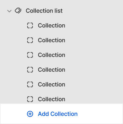
A default Collection list section contains 3 collection blocks. To configure a block inside the section:
Go to Customize theme.
In Theme editor, at the top of the page, use the dropdown to select a page that contains a Collection list section.
From the side menu, expand the Collection list section menu.
To configure an existing block, select the block from the side menu.
To add a new block, select Add collection, and then select the block you added.
Note
Inside the section, you can add, remove, show, hide, or move blocks. Refer to Configure blocks inside a section, and Shopify help: Sections and blocks.
Apply a block setting described in the following table.
| Setting name | Description |
|---|---|
| Choose collection | Use the following Choose collection selector options to set up a collection inside the section.
|
| Choose collection > Connect dynamic source | To display a collection from a dynamic source, if available, select the Connect dynamic source icon beside the Choose collection selector, and then choose a metafield to add. Refer to Shopify help: Metafields. |
| Overlay text color > Override section color scheme | Use the Override section color scheme to turn on/off "Override section color scheme" mode for the block's text color. With this setting enabled, the block ignores the section's color scheme. Instead, the Text color override selector specifies a color scheme to apply to the block's text. |
| Overlay text color > Text color override | Use the Text color override options to select a color scheme for the block's text. Refer to Colors. |
| Remove block | Select Remove block to delete the block from the current section. |