Appearance
Collection
This guide describes setting up the Collection section.
Use the section to customize how products are displayed on (default) Collection pages, by modifying the layout or adding features like product filtering and sorting.
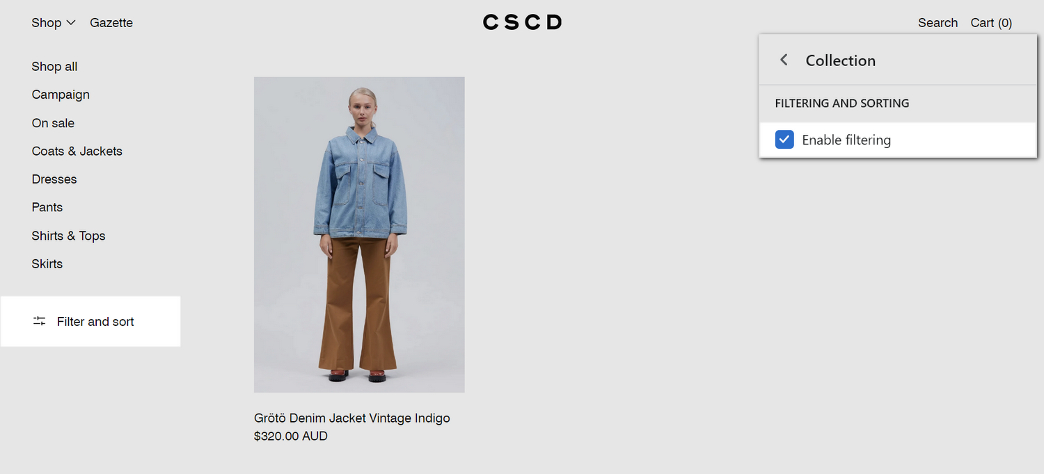
The previous image shows a Collection section on a store's (default) Collection page. In the upper right, part of Theme editor's section menu is displayed. The menu's Enable filtering checkbox is set to on. This setting displays the product filtering options, inside the section's Filter and sort area, in the lower right.
For general guidance with modifying sections, refer to Sections overview, and Shopify help: Sections and blocks.
Set up a collection section
To set up a collection section:
Go to Customize theme.
In Theme editor, at the top of the page, use the dropdown to select Collections > Default collection.
Note
The section is available only on Collections > Default collection pages.
From the side menu, select Collection.
Select a setting described in the following table.
| Setting name | Description |
|---|---|
| Maximum number of products per page | Adjust the Maximum number of products per page slider to set the maximum number of products to display inside the section. The slider ranges from 2 to 24. |
| Filtering and sorting > Enable filtering | Select the Enable filtering checkbox to show/hide the product filtering options inside the section. If enabled, visitors can select a range of products within a collection by using filtering criteria like availability and price. Refer to Shopify help: Searching for products and filtering your product list and Shopify help: Add storefront filtering. |
| Filtering and sorting > Enable filtering > Customize filters | Follow the Customize filters link to open the Navigation > Collection and search filters page in your store's Shopify admin. Use the page to set up custom filters and navigation menus for your store's collections. Refer to Shopify help: Custom filters. |
| Filtering and sorting > Desktop filter layout | Use the Desktop filter layout options to display the section's product filtering and sorting options inside a Sidebar or Drawer panel. Drawer is the default layout for mobile devices. |
| Filtering and sorting > Expand filters by default | Select the Expand filters by default checkbox to show/hide the product filtering options, by default, inside the section. With this option set to off, to access the product filtering options, visitors must select the Filter button inside the section. |
| Filtering and sorting > Show filter counts | Select the Show filter counts checkbox to show/hide a count of the number of products in each filter category, inside the section. A count is displayed beside the name of each filter. For example, for a collection containing two products that are in stock, In stock (2) is displayed in the Availability filter area. |
| Filtering and sorting > Enable color swatch filters | For products in a collection that use color swatches, select the Enable color swatch filters checkbox to show/hide the option to filter products by color swatch, inside the section. Refer to Shopify help: Variants and Shopify help: Searching for products and filtering your product list. |
| Filtering and sorting > Enable sorting | Select the Enable sorting checkbox to show/hide the product sorting options inside the section. If enabled, visitors can arrange the products in a collection by using sorting criteria like price and popularity. Refer to Shopify help: Collection layout and appearance. |
| Collection menu > Menu | Use the following Menu selector options to set up a menu to display inside the section.
|
| Collection menu > Desktop menu layout | Use the Desktop menu layout options to set how menu items in the section's navigation menu are displayed on desktop devices. Select Sidebar to display menu items vertically (one above the other). Select Horizontal to display menu items side-by-side. Horizontal is the default layout for mobile devices. |
| Layout > Feature full width products | Select the Feature full width products checkbox to turn on/off displaying product tiles at full width inside the section. With this setting off, a mix of half width and full width product tiles are displayed. |
| Layout > Enable cascade layout on mobile | Select the Enable cascade layout on mobile checkbox to show/hide the section's cascading content area on mobile displays. |
| Layout > Desktop layout | Use the Desktop layout options to set a layout style for the section's cascading content area. The options are One column or Two columns. This setting applies to desktop display devices. |
| Cascade effect > Level of media size variation | Adjust the Level of media size variation slider to apply more or less varied sizes to the media items displayed inside a cascading section. The slider ranges from 0 to 4. Select 0 for no size variation, to display all media at the same size. Select 4 to maximize the size variation. |
| Cascade effect > Sequence | Adjust the Sequence slider to set how media items (tiles) are resized inside a cascading section. Inside a cascading section, tiles are resized according to a pattern or "sequence". Adjust the slider between 1 and 5 to specify a sequence. |
| Cascade effect > Alignment variation | Adjust the Alignment variation slider to use more or less varied alignments to display media items inside a cascading section. The slider ranges from 1 to 7. Select 1 for minimally varied alignments. Select 4 for maximum alignment variation. |
| Cascade effect > Vertical space between items | Adjust the Vertical space between items slider to set the amount of vertical space displayed between items inside a cascading section. The slider ranges from 0.5 to 2. |
| Cascade effect > Start position | Use the Start position options to specify a starting position for displaying the first item in a cascade layout. The options are Top left and Top right. |
| Cascade effect > Use global settings | Select the Use global settings checkbox to turn on/off "global settings" mode. Enabling this option overrides all cascade effect settings you specified inside the section, and applies the "global" cascade effect settings you specified in Theme settings > Cascading content. |
| Color > Color scheme | Use the Color scheme options to select a color scheme for the section. Refer to Colors. |
| Theme settings | If available, select Theme settings to access additional settings for the section. Refer to Section theme settings menu. |
| Custom CSS | Select Custom CSS. In the box, enter custom CSS styles to apply only to the current section. Refer to Shopify help: Add custom CSS. To apply custom styles to your entire online store, refer to Theme settings > Custom CSS. |