Appearance
Centered layout for pages
Note
This is an advanced customization guide that requires editing theme code. These actions are not supported by Switch Themes or Shopify. We recommend hiring an expert if you're not comfortable editing Liquid, HTML, CSS, and Javascript.
Before you customize a theme, make a backup. Refer to Shopify help: Duplicating themes.

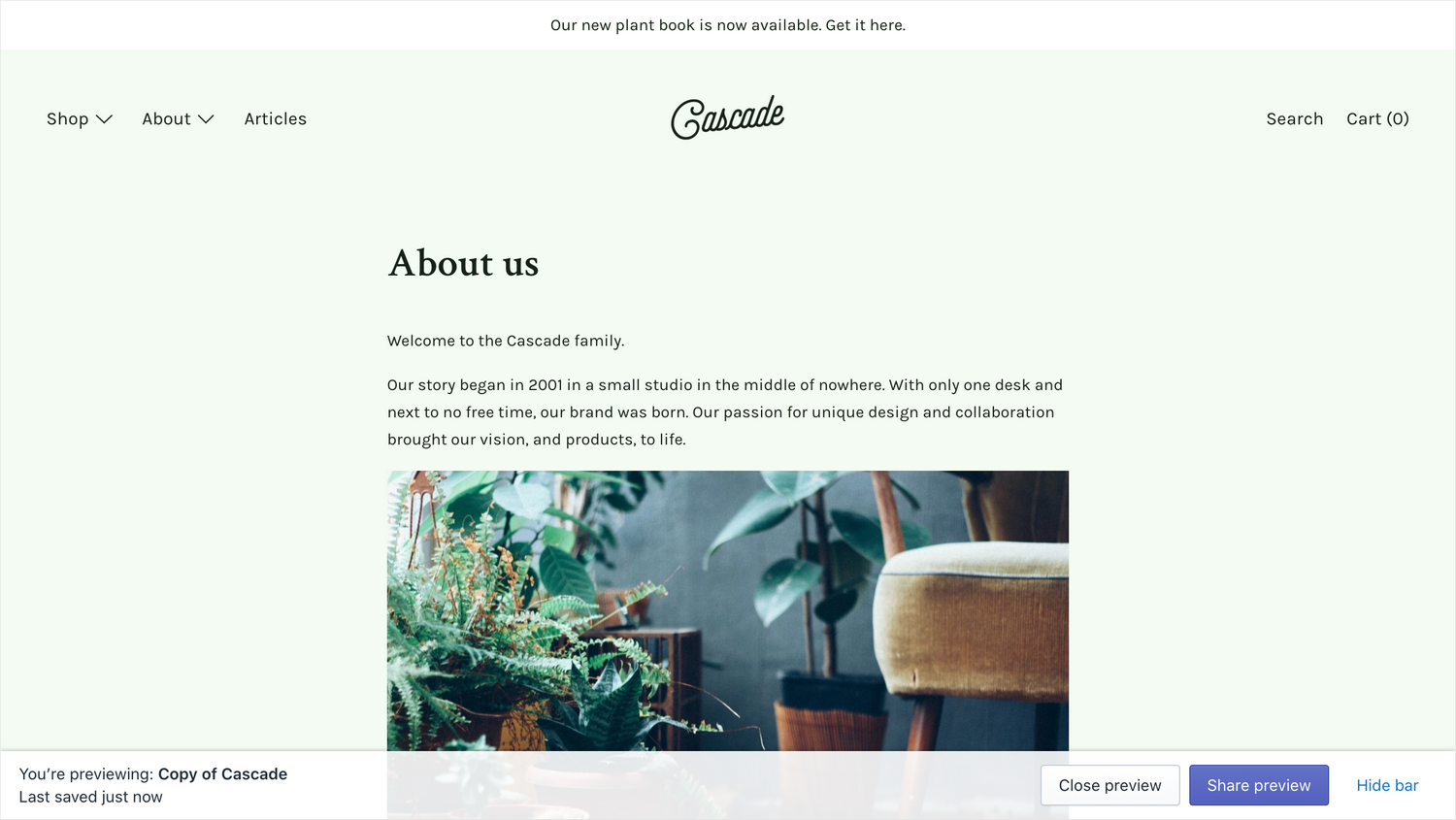
Follow these steps to modify the Cascade page template, to display content in a single column in the center of the page. Make sure to work in a duplicate of the theme so you can easily undo your changes if something goes wrong.
You can make these changes to the main page template or, to create an alternate page with this layout, refer to Shopify partners blog: How to Use Alternate Templates in Shopify Theme Development.
In the file Snippets / page__template.liquid, find the two
.grid__itemelements and remove the classes.lg--up--two-fifthsand.lg--up--three-fifths, respectively.Remove the
.lg-up--mt0class on the second.grid__item.Change the
.lg--up--seven-eighthsclass on the top-mostdivelement to.lg--up--one-half. This prevents the content from becoming too wide.If you prefer a wider column here, we recommend increasing the font size by referring to Adjust font sizes. This prevents the lines of text from being too long to read comfortably.
Verify that your template's final code is similar to our page.liquid file on GitHub.