Appearance
Header

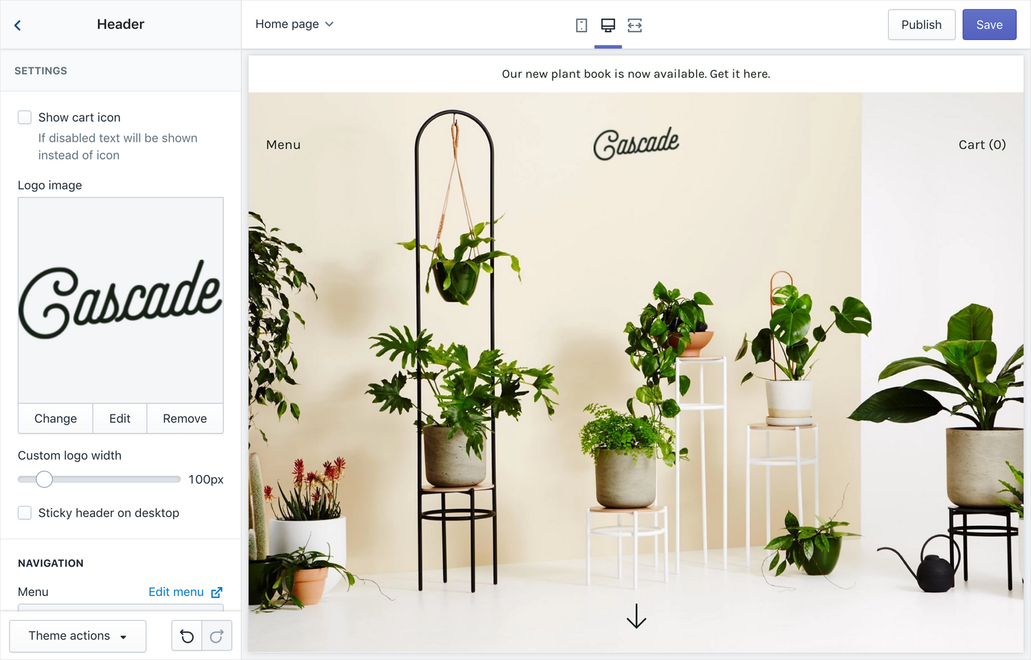
The header is a static section – which means it is displayed on every page of your shop.
Settings
- Show cart icon – enable this to show a cart icon instead of just the text "Cart"
- Logo – Upload a logo to use instead of your Shop's title
- Custom logo width – the width of the logo in pixels it will be displayed in the header
- Sticky header on desktop – make the header stick to the top of the screen when you scroll
Navigation
- Menu – select the main navigation for the header
- Enable links to drop-down link headings – If using a mega menu, enable this setting to enable links to all headings of your mega menu.
- Show search – show a link to the search bar next to the cart in the header. Clicking on search will open the search bar in the modal.
Mobile menu
The mobile menu is the panel that slides out when the menu button is clicked on mobile devices.
- Show menu icon – show a menu icon instead of the text "Menu"
- Secondary menu – select a secondary menu that will be displayed underneath the main menu
- Show search – show a search bar
Announcement bar
You can show an announcement bar which is displayed at the top of the header.
- Show announcement- check this to enable the announcement bar
- Home page only – check this if you only want the announcement bar to display on the home page
- Text – the message you want displayed to customers
- Announcement color combination – select one of your color schemes to use for the announcement bar
- Link – make the announcement bar a clickable link
Banner Image block
To show a banner image on the home page of your site, add a Banner image block here. A banner is an image displayed at the top of your site with an arrow to drive customers to the first section.
The Classic preset showcases a banner. For a demo, refer to Demo: Cascade theme classic
- Image – upload an image to use for the banner
- Image – mobile (optional) – upload an image to use for the banner on mobile-sized devices
- Image style – choose between "fit content" and "full screen". With full screen, some cropping may occur. If using "fit content" – a ratio of at least 5:4 is recommended to best work on mobile + desktop.
- Text color – override the header's text color when banner image is present
- Logo image – override the logo shown over the banner
Content
Add a heading and/or a button over the banner image.
- Heading (optional) – add a heading to show over the banner image
- Button text (optional) – override the logo shown over the banner
- Content position – choose how to align the content
- Text alignment– set the alignment of the content text