Appearance
Theme settings

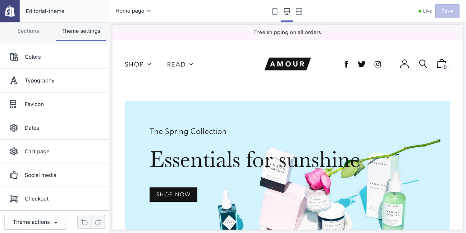
Theme settings contains settings that affect the theme as a whole. You can customize colors and fonts, configure social media accounts and adjust other settings, like the format of dates.
Colors
Editorial provides a color palette that lets you configure four accent colors and two background colors. You can then assign these colors to various components on your store. This gives your store a cohesive and refined look.
General colors
- Primary – the main content color, used for text and buttons
- Main Accent – used for content, blogs and articles
- Secondary Accent – used for the notice bar, newsletter and footer
- Shop Accent – used for collections and products
- Borders – used for borders
Backgrounds
- Background – used for the background of all site pages
- Section background – used for section backgrounds
Buttons
- Color – choose between "Primary" and "Accent" colors for the buttons
Secondary text
- Color – choose between "Primary" and "Accent" colors for secondary text; secondary text is prices, dates, and pagination text.
Footer
- Background – choose a color for the footer's background; all colors from the General colors section are available, plus black and white
- Accent – choose a color for the footer's foreground (text, links and social media icons); all colors from the General colors section are available, plus black and white
Typography
Use the Shopify font picker to choose three font families:
- Main – the base font family
- Header – the font family for titles, names and section headings
- Body – the font family used for longform text like product descriptions and blog post or page content
When choosing a family, you also choose a default weight. Weight is the thickness of the strokes; "Bold" is a weight, so is "Light".
Headings
- Text transform – capitalize the headings or make them all uppercase, or, leave them as they are
Section titles
- Typeface – choose whether to use the Main font or the Header font; the specific font families are defined above
- Modify font weight – use the font as is, or use a lighter or darker weight (will only apply if weight is available)
- Text transform – capitalize the section titles or make them all uppercase, or, leave them as they are
- Letterspacing – increase letterspacing; letterspacing, or tracking, is the amount of horizontal white space between each letter
Navigation, buttons, meta
These three elements' settings have the same controls:
- Text transform – choose between capitalizing, making upercase or doing nothing
- Letterspacing – increase letterspacing
Borders and horizontal rules
- Height – adjust the thickness of borders and horizontal rules, in pixels
Products
- Show vendor – show the product's vendor in collections, on the homepage, in related products, and in search results.
- Show second image on hover – if a second product image is available, it will be shown when the mouse pointer hovers over the product's image on collection pages
Favicon
The favicon is a small icon that represents your site. It often appears to the left of the site's title in the browser's tab.
- Image – choose an image to use as a favicon; make sure the image looks good at a very small size like 16 by 16 pixels
Dates
Adjust the display settings of dates across the site.
- Date format – choose between "Time Ago" (e.g., 6 days ago) or "Standard" (e.g., 18th December 2018)
Cart page
- Enable cart notes – let your visitors add special instructions to their order
- Show product vendor – show each product's vendor in the cart
- Cart type – choose between "Drawer," which appears as an overlay on the current page, or "Page," which always takes the visitor to a dedicated cart page
Social media
Social sharing options
Choose which sharing options to enable wherever "Share links" are enabled. Enabling sharing links is done on the individual page's template.
- Share on Facebook
- Tweet on Twitter
- Pin on Pinterest
Social accounts
Provide full URLs to your social accounts.
Checkout
Customize your Shop's checkout settings. This one is not a theme setting, ror further help, refer to Shopify help: Customizing the style of your checkout.
Change theme style
Apply one of the theme's styles (previously called "Presets") – Agency, Amour, or Adventure. Theme styles are snapshots of pre-configured theme settings that add up to a distinctive look. You can use these as a starting point for customizing your store.
Warning
When you apply a new style, you will lose changes to theme settings. However, none of your store data (products, pages, blog posts, etc.) will be lost.