Appearance
Image sections
Show images in galleries, single photos with text or slideshows on your homepage.
Gallery
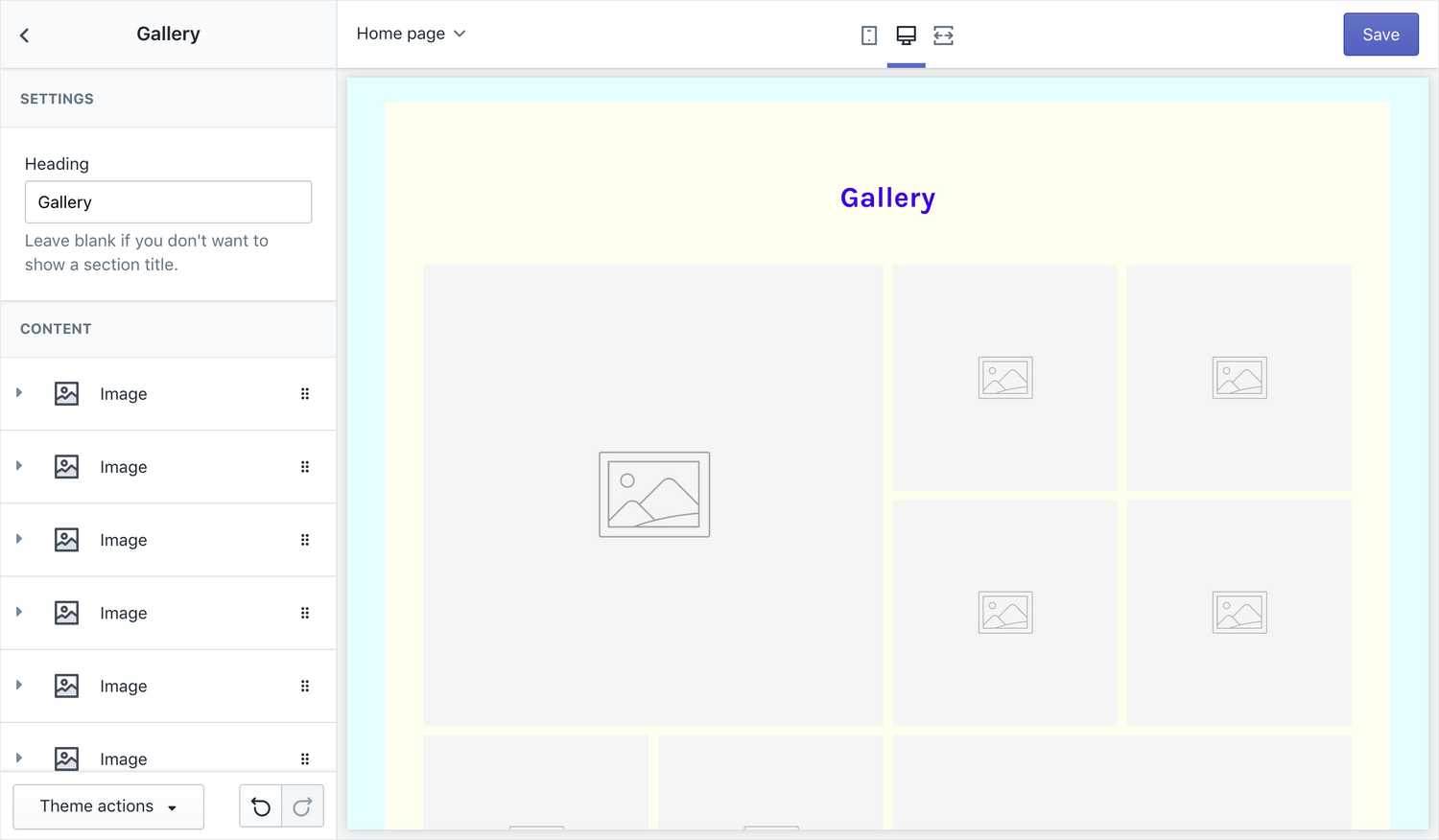
Show a gallery of images on your homepage.
Settings
- Heading (optional) – choose a heading for the section; leave empty to hide
Images
Add up to 10 images. The layout will adjust automatically based on the number of images in the section.
Settings
- Image – choose an image to display
- Link (optional) – turn the image into a link
- Caption (optional) – add a caption; the caption will be revealed on hover
Image with text
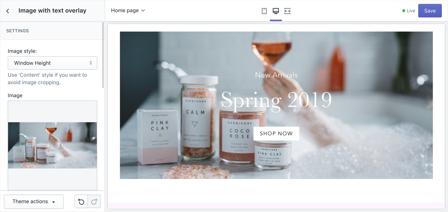
Shown an image overlaid with text, with an optional call to action button.
Settings
- Image style – choose between "Window height" (based on the device) or "Content" to avoid cropping
- Image – choose the image to use
- Heading – (optional) set the heading
- Text – (optional) edit the text in a rich text editor
- Call to action URL– the URL of the call to action button; leaving this blank will remove the button
- Call to action button text – edit the text of the Call to action button; can be left blank but that would be pointless, wouldn't it
- Text and button color – set a color for the text and the Call to action button; colors available are store colors from Theme Settings as well as black and white
- Content position – choose a position for the text and Call to action button; nine locations are available, along the top, middle, and bottom, and left, centre and right (think 3 × 3 grid)
Slideshow
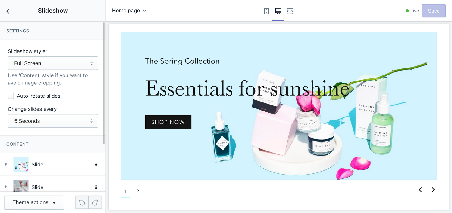
Add a slideshow to your homepage.
Settings
- Slideshow style – choose the appearance of your slideshow – "Full Screen" makes the images expand to the full height of the view, "Content" makes the image keep their original proportions, avoiding cropping
- Auto-rotate slides – choose whether you want the slides to change on their own, without user interaction
- Change slides every __ seconds – determines how often the slides change when Auto-rotate slides is enabled
Slides
Add slides to the slideshow.
Settings
- Image – choose an image
- Heading – (optional) set a heading for the text overlay
- Text – (optional) edit the main text of the text overlay
- Optional: Call to action URL – the URL of the call to action button; leaving this blank will remove the button
- Call to action button text – edit the text of the Call to action button
- Text and button color– set a color for the text and the Call to action button; colors available are store colors from Theme Settings as well as black and white
- Content position – choose a position for the text and Call to action button; nine locations are available, along the top, middle, and bottom, and left, centre and right (think 3 × 3 grid)