Appearance
Create layouts with cascading content
This guide describes how to use Cascade's "cascading" layout features.
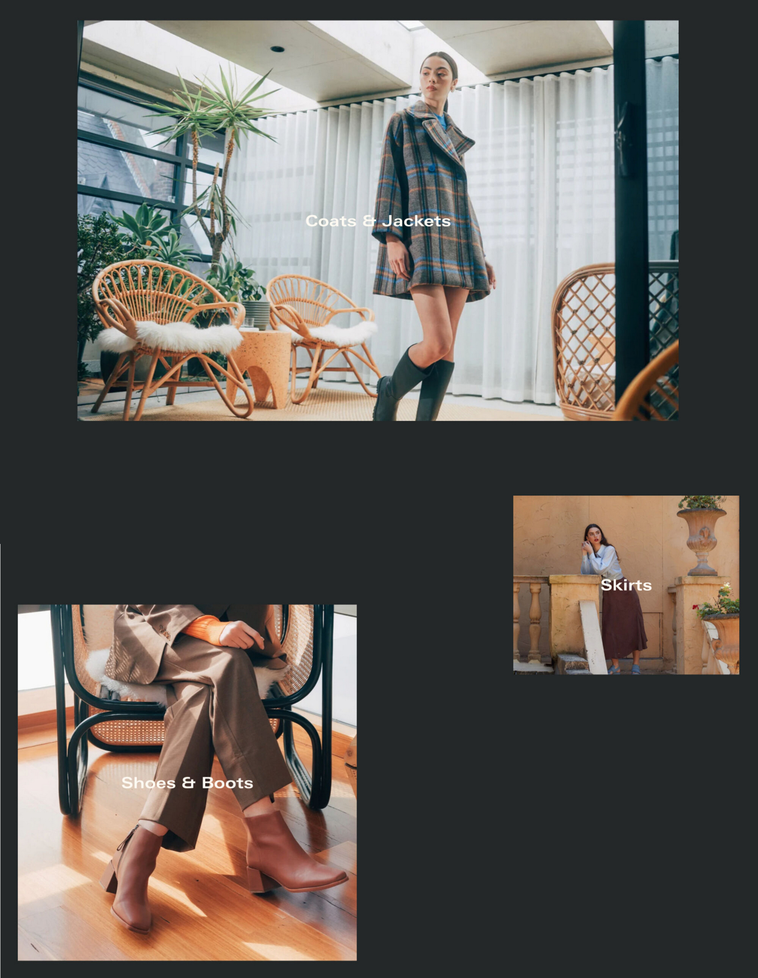
Cascade theme features a "cascade" design layout. A cascade layout arranges items to follow one after another on a store page. Use the layout to create a succession of items on a page with a mix of different content, like images, videos, and text.
The previous image shows examples of a Cascading content section, displayed on different store pages. The section provides a cascade layout to create a succession of product tiles, with images, arranged in columns. Each product tile links to a corresponding product page.
By providing cascading layouts in a number of theme sections, Cascade theme gives you the flexibility to create unique layouts for your store's pages.
Sections that provide a cascade layout
The following table describes the sections that provide a cascade layout.
| Section name | Description |
|---|---|
| Cascading collection | Displays product tiles from a selected collection using a cascade layout. |
| Cascading content | The main cascading content section uses a cascade layout to display (mixed) blocks of content. Use the section to combine different content types on a page, like images, text, and video, arranged in a cascade layout. |
| Cascading gallery | The Cascading gallery section is the same as the Cascading content section, but it's pre-configured with image blocks for creating a gallery of images - arranged in a cascade layout. |
| Cascading product list | Displays product images for a selection of products, arranged in a cascade layout. |
| Collection list | Adds collection blocks, arranged in a cascade layout, to display a list of collections on a page. |
| Image with cascading content | Displays an image beside (mixed) blocks of content arranged in a cascade layout. |
| Video with cascading content | Displays a video beside (mixed) blocks of content arranged in a cascade layout. |
| Blog | The main Blog template uses a cascade layout to display blog post articles. |
| Cascading product media | Displays product images, arranged in a cascade layout, on a Product page. |
| Collections list | Uses a cascade layout to display collections on the Collections list page. |
| Collection | In the main Collection template, a cascade layout is used to display product tiles. |
| List with product tiles | Displays product tiles on the Collections list page, arranged in a cascade layout. |
| Product - cascade | To display product media and content, the Product - cascade template uses a cascade layout. |
Common cascade layout settings
Most sections that use a cascade layout include the settings described in the following table.
| Setting name | Description |
|---|---|
| Enable cascade layout on mobile | Show/hide the section's cascading content area on mobile display devices. This setting is enabled by default. |
| Desktop layout | For desktop displays, select between a two column or one column cascade layout. |
| Hide left and right margin | Show/hide the spacing that's displayed on the left and right sides of the section. With this setting enabled, images inside the section are displayed "flush" against the edge of the page. This option is available only in the Cascading content sections. |
| Level of media size variation | Adjust the Level of media size variation slider to apply more or less varied sizes to the media items displayed inside a cascading section. The slider ranges from 0 to 4. Select 0 for no size variation, to display all media at the same size. Select 4 to maximize the size variation. |
| Sequence | Adjust the Sequence slider to set how media items (tiles) are resized inside a cascading section. Inside a cascading section, tiles are resized according to a pattern or "sequence". Adjust the slider between 1 and 5 to specify a sequence. |
| Alignment variation | Adjust the Alignment variation slider to use more or less varied alignments to display media items inside a cascading section. The slider ranges from 1 to 7. Select 1 for minimally varied alignments. Select 4 for maximum alignment variation. |
| Vertical space between items | Adjust the Vertical space between items slider to set the amount of vertical space displayed between items inside a cascading section. The slider ranges from 0.5 to 2. |
| Start position | Use the Start position options to specify a starting position for displaying the first item in a cascade layout. The options are Top left and Top right. |
| Use global settings | Select the Use global settings checkbox to turn on/off "global settings" mode. Enabling this option overrides all cascade effect settings you specified inside the section, and applies the "global" cascade effect settings you specified in Theme settings > Cascading content. |
Mobile cascade layout
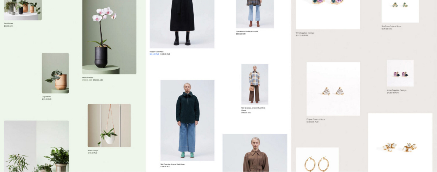
On mobile displays, items in a cascade layout are arranged in one column. From top to bottom, the alignment of the items alternates from left to right.
For example, in the following image, a cascade layout is used to display product tiles, with images, on a store page. For mobile displays, the images are arranged in one column. The first image is aligned to the left, and the second image is aligned to the right. This alternating left/ right alignment sequence is repeated, and applied to all images inside the layout.
Desktop cascade layout
By default, on desktop displays, the items inside a cascade layout are arranged in two columns. From top to bottom, the items' positions alternate between the left and right columns.
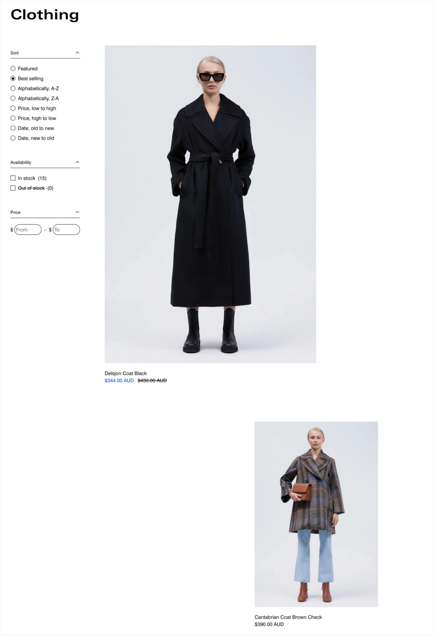
For example, in the following image, a cascade layout is used to display product tiles, with images, on a store page. For desktop displays, the images are arranged in two columns. The first image is aligned to the left column, and the second image is aligned to the right column. This alternating left/ right sequence is repeated, and applied to all images inside the layout.
Full width items on desktop
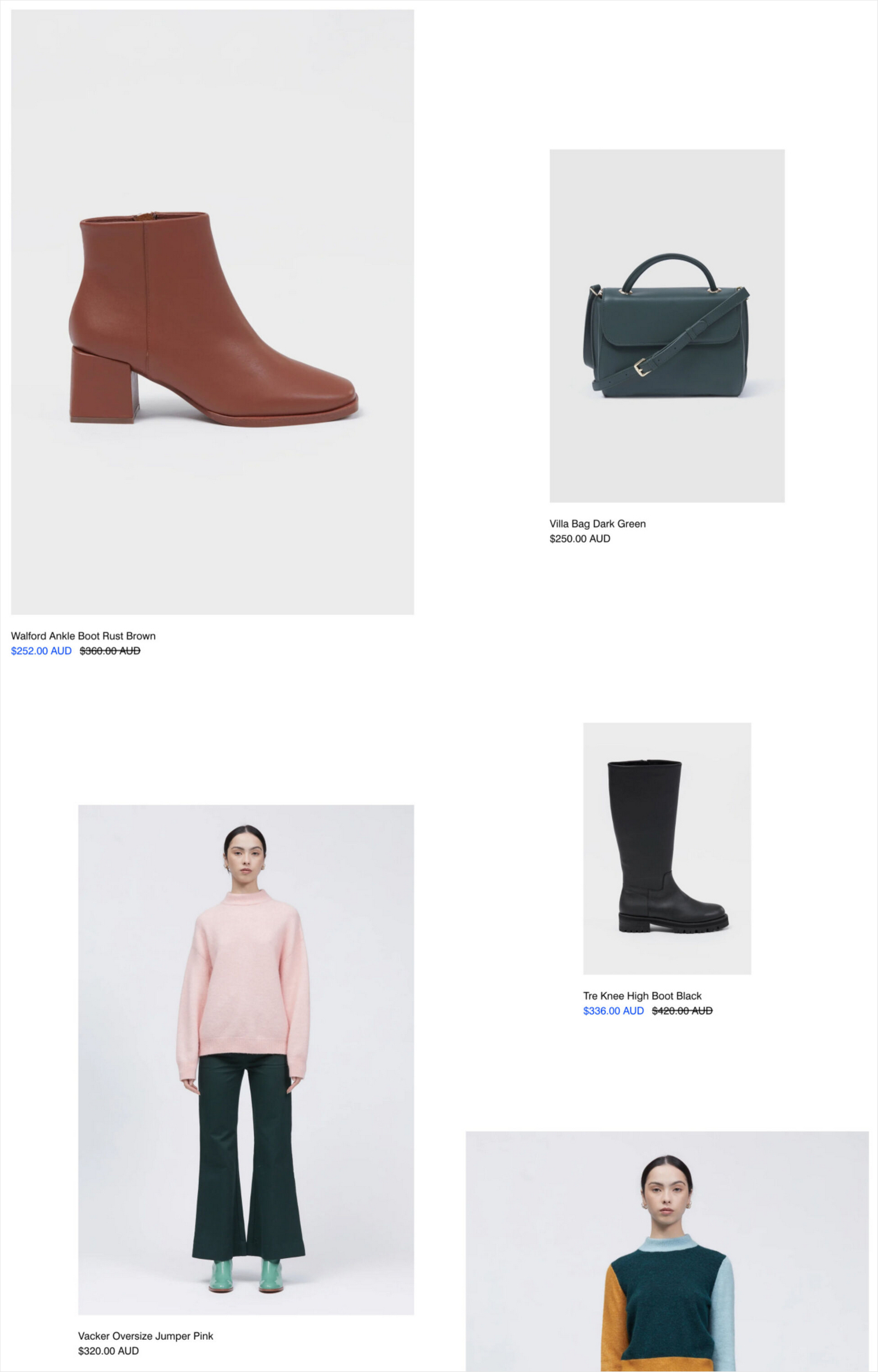
For desktop devices, you can set items to display at full width inside a cascade layout. Items set at full width are displayed across two columns (in a default cascade layout). Full width items are centered and displayed in the middle of the layout.
For example, in the following image, a cascade layout is used to display collection tiles, with images, on a store page. For desktop devices, the images are arranged in two columns. The first image is set to display at full width, across both columns, in the middle of the layout. The second image is aligned to the right column, and the third image is aligned to the left column. The alternating right/ left alignment sequence is repeated, and applied to all subsequent images inside the layout.
One column layout on desktop
For desktop devices, instead of using the default two column Desktop cascade layout, you can set a cascade layout to display items in one column, similar to a Mobile cascade layout.
For example, in the following image, a cascade layout is used to display product images on a store page. For desktop devices, instead of using the default two column cascade layout, the images are displayed in one column.