Appearance
Inset image with overlay
This guide describes setting up an Inset image with overlay section.
Use the section to display an image on a page, at offset position, overlaid with text.
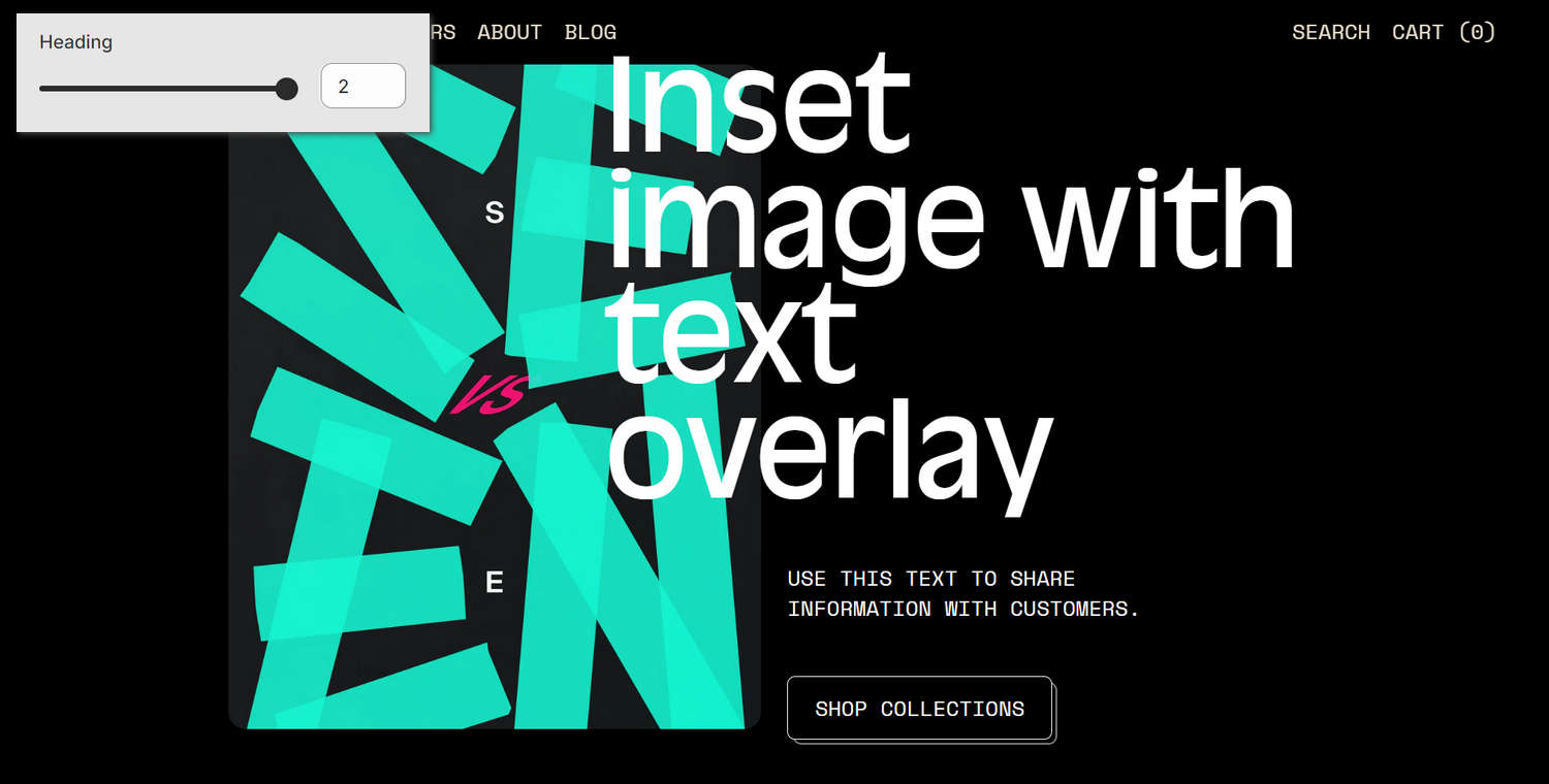
The previous image shows an Inset image with overlay section on a store's home page. In the upper left, part of Theme editor's section menu is displayed. The menu's Heading (offset) slider is set at 2. To maximize the section's overlay text effect, this setting moves the (overlaid) heading text closer to the image.
For general guidance with modifying sections, refer to Sections overview and Shopify help: Sections and blocks.
Set up an inset image with overlay section
To set up an Inset image with overlay section:
Go to Customize theme.
In Theme editor, at the top of the page, use the dropdown to select a page that contains an Inset image with overlay section.
Note
The section can be added into any page, except Checkout and Giftcard pages. To add the section into the current page, select Add section > Inset image with overlay. Refer to Shopify help: Add a section.
From the side menu, select Inset image with overlay.
Select a setting described in the following table.
| Setting name | Description |
|---|---|
| Image | Use the Image selector options to set up an image inside the section. Refer to Edit an image inside a section or block. |
| Image > Connect dynamic source | To display an image from a dynamic source, if available, select the Connect dynamic source icon beside the Image selector, and then choose a metafield to add. Refer to Shopify help: Metafields. |
| Image position on desktop | Select the radio buttons Image position on desktop to position the section's image to the Right or Left. This setting applies to desktop display devices. |
| Crop image | Use the Crop image dropdown to set a (cropping) shape for images inside the section. The dropdown options are No crop, Landscape, Square, and Portrait. |
| Image width on mobile | Use the Image width on mobile options to set a width for the section's image on mobile display devices. The options are Full (width) and Contained. |
| Image max width on desktop | Adjust the Image max width on desktop slider to specify a maximum width for the section's image on desktop display devices. The slider ranges from 0 % to 100 % or percent. |
| Offsets > Image | Adjust the Image (offset) slider to make the section's image more or less "offset". The slider ranges from 0 to 2. Adjust the image and heading offset options to create an overlay effect on desktop display devices. |
| Offsets > Heading | Adjust the Heading (offset) slider to make the section's heading more or less "offset". The slider ranges from 0 to 2. Adjust the image and heading offset options to create an overlay effect on desktop display devices. |
| Align text and button to heading offset | Select the checkbox Align text and button to heading offset to turn on/off "Align mode" for the section's text and button. Enable this setting to align the section's text and button to match the section's heading offset. |
| Content > Heading | In the Heading box, enter text to display as a heading (title) inside the section. |
| Content > Heading > Connect dynamic source | To display heading text from a dynamic source, if available, select the Connect dynamic source icon beside the Heading box, and then choose a metafield to add. Refer to Shopify help: Metafields. |
| Content > Text | In the Text box, enter (body) text to display inside the section's text area. Format the text and add links by using the Text editor pane. |
| Content > Text > Insert dynamic source | To display (body) text from a dynamic source, if available, select the icon Insert dynamic source beside the Text box, and then choose a metafield to add. Refer to Shopify help: Metafields. |
| Content > Overlay text alignment | Use the Overlay text alignment options to align overlay text inside the section to the Left, Center, or Right. |
| Content > Mobile font size scale | Use the Mobile font size scale slider to specify a size for text inside the section. This setting applies to mobile display devices. The slider ranges from -2 to 7. |
| Content > Desktop font size scale | Use the Desktop font size scale slider to specify a size for text inside the section. This setting applies to desktop display devices. The slider ranges from -2 to 10. |
| Call to action > Link | In the Link box, enter a URL or select a link to a store page. The link is displayed as a button inside the section. |
| Call to action > Link > Connect dynamic source | To display a link from a dynamic source, if available, select the Connect dynamic source icon beside the Link box, and then choose a metafield to add. Refer to Shopify help: Metafields. |
| Call to action > Label | In the Label box, enter text to display as label text for the section's "Call to action" link. |
| Call to action > Label > Connect dynamic source | To display (link) label text from a dynamic source, if available, select the Connect dynamic source icon beside the Label box, and then choose a metafield to add. Refer to Shopify help: Metafields. |
| Heading blend mode > Blend mode | Use the Blend mode options to specify how the section's overlay heading text blends with the colors beneath it. Refer to Mozilla developer documentation: Mix blend mode examples. The options are Normal, Difference, Exclusion, Overlay, Soft light. Some blend modes work better when the text color is dark, others when it is light. |
| Heading blend mode > Overlay color scheme | Use the Overlay color scheme options to select a color scheme for the section's overlay area. Refer to Colors. This setting applies only when the section's Blend mode option is not set to Normal. |
| Parallax > Enable parallax | Select the Enable parallax checkbox to turn on/off parallax effects for the section's content. With this setting on, an animation effect moves the section's text at a different speed than the section's image - when a store visitor scrolls through the store page. |
| Parallax > Parallax speed | Adjust the Parallax speed slider to make the section's parallax animation effect move faster or slower. The slider ranges from -6 to 5. |
| Color > Color scheme | Use the Color scheme options to select a color scheme for the section. Refer to Colors. |
| Color > Disable transition | Select the checkbox Disable transition to turn on/off overriding the color transitions set in the section's theme settings. Setup defaults for this setting in Theme Settings > Colors. |
| Spacing > Remove top padding | Select the checkbox Remove top padding to add/remove the spacing (padding) that's displayed above the section. Refer to W3 Schools: CSS Padding. |
| Spacing > Remove bottom padding | Select the checkbox Remove bottom padding to add/remove the spacing (padding) that's displayed below the section. Refer to W3 Schools: CSS Padding. |
| Theme settings | If available, select Theme settings to access additional settings for the section. Refer to Section theme settings menu. |
| Custom CSS | Select Custom CSS. In the box, enter custom CSS styles to apply only to the current section. Refer to Shopify help: Add custom CSS. To apply custom styles to your entire online store, refer to Theme settings > Custom CSS. |
| Remove section | Select Remove section to delete the section from the current page. |