Skip to content

Product - cascade

This guide describes setting up the Product - cascade section.

Use the section to set what's displayed on a (cascade) Product page, when a visitor selects a product from a page assigned to the Products > Cascade template. Refer to Shopify help: Apply a new template to a product.

An example Product - cascade section on a store's product page.

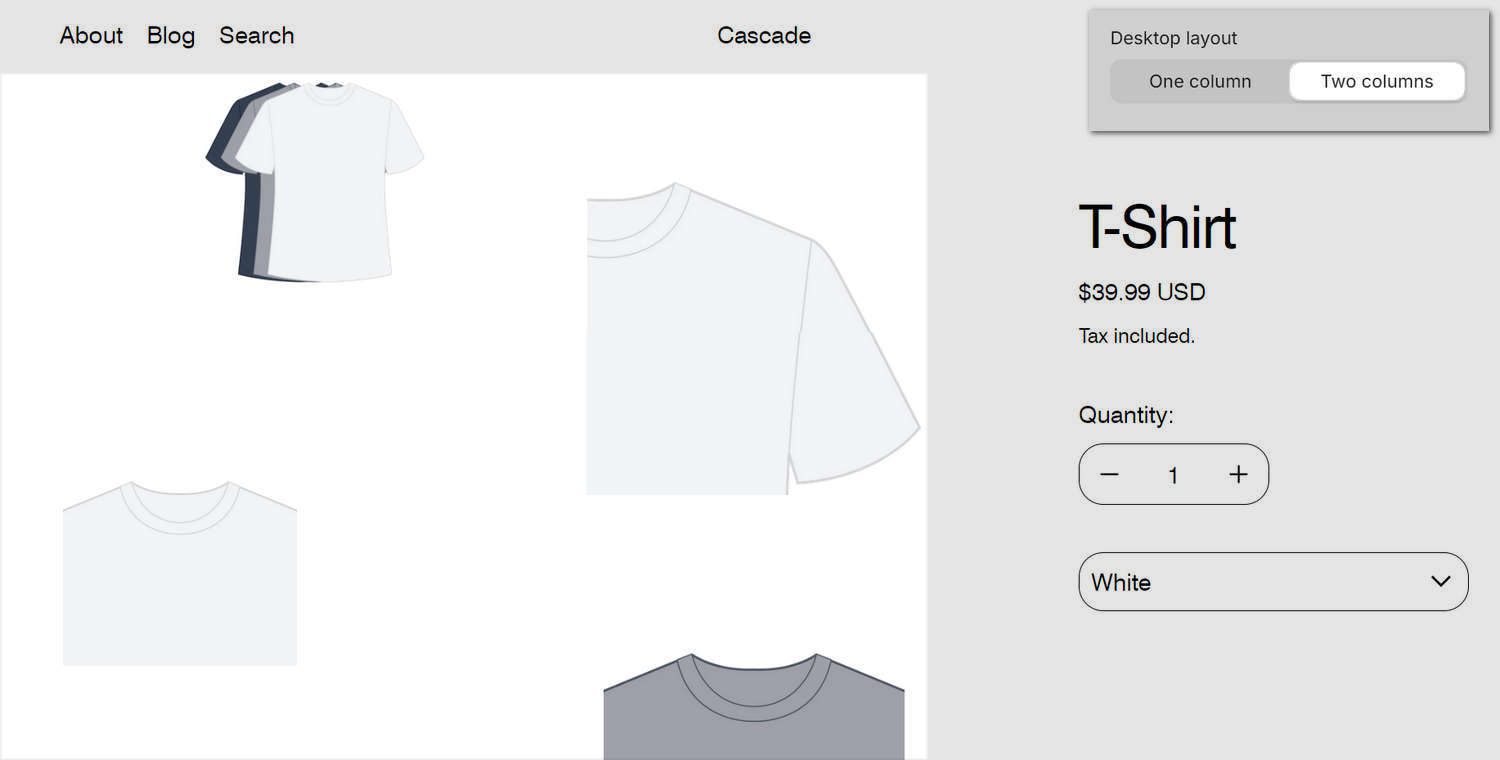
The previous image shows a Product - cascade section on a store's (cascade) Product page. In the upper right, part of Theme editor's section menu is displayed. The menu's Desktop layout option is set to Two columns. The setting specifies a layout style for the section's cascading content area on desktop display devices. The two column layout is applied to the product images inside the section.

Note

The section uses a cascade layout to display product media items on a (cascade) Product page. A cascade layout arranges the items in columns. Inside a column, the items follow one after another to create a succession of items on a store page.

For general guidance with modifying sections, refer to Sections overview, and Shopify help: Sections and blocks.

Set up a product - cascade section

To set up a Product - cascade section:

  1. Go to Customize theme.

    In Theme editor, at the top of the page, use the dropdown to select Products > Cascade.

    Note

    The section is available only on the Products > Cascade product page.

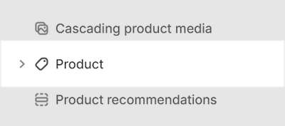
  2. From the side menu, select Product (cascade).

    The Product - cascade section selected in Theme editor.

  3. Select a setting described in the following table.

Setting nameDescription
Layout > Media position on desktopUse the Media position on desktop options to position the section's media area on the Left or Right side of the section. This setting applies to desktop display devices.
Layout > Media width on desktopUse the Media width on desktop options to specify a width for the section's media area. The options are: 1/2 (one half), 3/5 (three fifths), 2/3 (two thirds), and 3/4 (three quarters). This setting applies to desktop display devices.
Product content > Width on desktopUse the Width on desktop options to specify a width for the section's "product content" area that contains the section's Product blocks. The options are Full width and Narrow. This setting applies to desktop display devices.
Product content > Alignment on desktopUse the Alignment on desktop options to align the content inside the section's product content to the Left, Center, or Right. This setting applies to desktop display devices. To use this setting, set the Width on desktop option to Narrow.
Featured media > Width on desktopUse the Width on desktop options to specify a width for the section's featured media area. The options are Half width and Full width. This setting applies to desktop display devices.
Featured media > Enable slideshowFor products with multiple images/videos, select the Enable slideshow checkbox to show/hide a slideshow in the section's featured media area. The slideshow is created from items in the product's media gallery, with arrow icons that move to the next/previous slide. This setting applies to desktop display devices.
Featured media > Skip featured media in cascading contentSelect the Skip featured media in cascading content checkbox to show/hide featured media in the section's cascading content area.
Cascading content > Enable cascade layout on mobileSelect the Enable cascade layout on mobile checkbox to show/hide the section's cascading content area on mobile displays.
Cascading content > Desktop layoutUse the Desktop layout options to set a layout style for the section's cascading content area. The options are One column or Two columns. This setting applies to desktop display devices.
Cascade effect > Level of media size variationAdjust the Level of media size variation slider to apply more or less varied sizes to the media items displayed inside a cascading section. The slider ranges from 0 to 4. Select 0 for no size variation, to display all media at the same size. Select 4 to maximize the size variation.
Cascade effect > SequenceAdjust the Sequence slider to set how media items (tiles) are resized inside a cascading section. Inside a cascading section, tiles are resized according to a pattern or "sequence". Adjust the slider between 1 and 5 to specify a sequence.
Cascade effect > Alignment variationAdjust the Alignment variation slider to use more or less varied alignments to display media items inside a cascading section. The slider ranges from 1 to 7. Select 1 for minimally varied alignments. Select 4 for maximum alignment variation.
Cascade effect > Vertical space between itemsAdjust the Vertical space between items slider to set the amount of vertical space displayed between items inside a cascading section. The slider ranges from 0.5 to 2.
Cascade effect > Start positionUse the Start position options to specify a starting position for displaying the first item in a cascade layout. The options are Top left and Top right.
Cascade effect > Use global settingsSelect the Use global settings checkbox to turn on/off "global settings" mode. Enabling this option overrides all cascade effect settings you specified inside the section, and applies the "global" cascade effect settings you specified in Theme settings > Cascading content.
Heading overlay > Overlay headingSelect the Overlay heading checkbox to turn on/off overlaying the section's content with the section's heading text. The overlay remains in the section ("sticky") as the cascading content scrolls.
Media > Enable image zoomSelect the Enable image zoom checkbox to show/hide a panel that contains product images. The panel opens when a store visitor selects a product image inside the section. The panel provides a zoom in/out feature for images.
Media > Enable video loopingSelect the Enable video looping checkbox to turn on/off continuous replay for videos inside the section. If this setting is set to off, the video plays once. To use this setting, upload video media to the Products area of your Shopify admin. Refer to Shopify help: Product media.
Media > Autoplay videos on desktopSelect the Autoplay videos on desktop checkbox to turn on/off playing videos automatically, inside the section. This setting applies to desktop displays.
Color > Color schemeUse the Color scheme options to select a color scheme for the section. Refer to Colors.
Theme settingsIf available, select Theme settings to access additional settings for the section. Refer to Section theme settings menu.
Custom CSSSelect Custom CSS. In the box, enter custom CSS styles to apply only to the current section. Refer to Shopify help: Add custom CSS. To apply custom styles to your entire online store, refer to Theme settings > Custom CSS.

Configure a block within a product - cascade section

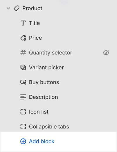
A default Product - cascade section contains 8 product blocks. To configure a block inside the section:

  1. Go to Customize theme.

    In Theme editor, at the top of the page, use the dropdown to select Products > Cascade.

  2. From the side menu, expand the Product (cascade) section menu.

  3. To configure an existing block, select the block from the side menu.

    To add a new block, select Add block, choose a block to add, and then select the block you added.

    The Product section's Add block menu in Theme editor.

    Note

    Inside the section, you can add, remove, show, hide, or move blocks. Refer to Configure blocks inside a section, and Shopify help: Sections and blocks.

  4. Apply a block setting described in the Table: Product - cascade blocks.

Table: Product - cascade blocks

The following table describes the blocks inside the Product section, and their corresponding settings.

The blocks indicated with an asterisk * are contained in a default Product section. To configure a block, refer to Configure a block within a product - cascade section.

Block nameBlock descriptionBlock setting(s)
Title *Displays a product's title inside the section.
  • Select the Text size radio buttons to set a style for title text inside the block. The options are Standard or Feature.

  • Select Remove block to delete the block from the current section.
Price *Displays a product's price inside the section.There are no customizable settings available for this block.
Quantity selector *Displays a quantity selector, inside the section, for choosing the number of products to purchase.
  • Select the Hide label checkbox to show/hide the "Quantity" label prefix inside the block.

  • Select Remove block to delete the block from the current section.
Variant picker *Displays a variant picker for choosing variations of a product, inside the section.
  • Use the Options style options to set a style for the variant picker. The options are Drop down, Button, Text with underline, and Radio.

  • Select the checkbox Hide option labels to show/hide the name of the currently selected product variant inside the block.

  • Select Remove block to delete the block from the current section.
Buy buttons *Displays the Add to cart and Buy it now buttons inside the section.
  • Select the checkbox Show dynamic checkout button to show/hide a button with the customer's preferred payment method, beside the Add to cart button, inside the block. Refer to Shopify help: Dynamic checkout buttons.

  • Select the checkbox Show pickup availability to show/hide indicators, inside the block, for products that can be collected from designated customer "pick up" locations. Refer to Shopify help: Show pickup availability to your customers.

  • Select the checkbox Show recipient information form for gift card products to show/hide a Gift card recipient information form inside the block. With this setting enabled, when a customer purchases a gift card product from your store, they use the form to provide details about the gift card's recipient - like the recipient's name and email address. Refer to Shopify help: Adding or updating gift card products.

  • Select Remove block to delete the block from the current section.
Description *Displays a text area to contain additional product information, inside the section.
  • Select the Truncate description checkbox to show/hide a Read more button, inside the block. Selecting the button opens an expanded text area that contains additional product information. Enable this setting for products with variant images and longer descriptions. To use this setting, set collapsible tabs to off.

  • Select Remove block to delete the block from the current section.
Icon list *Displays a list of items with icons, inside the section, arranged in a horizontal row.
  • In the Heading box, enter text to display as the block's title text.

  • To display (heading) text from a dynamic source, if available, select the Insert dynamic source icon, beside the Heading box, and then choose a metafield to add. Refer to Shopify help: Metafields.

  • Select the Text color radio buttons to set text inside the block to use the color scheme's Text or Secondary color.

  • For items 1 to 5, use the Item # > Text box to enter text to display beside the (list) item, inside the block.

  • For items 1 to 5, to display (list) text from a dynamic source, if available, select the Insert dynamic source icon, beside the Item # > Text box, and then choose a metafield to add. Refer to Shopify help: Metafields.

  • For items 1 to 5, select the dropdown Item # > Icon to choose a graphical icon to display beside the (list) item's text, inside the block. There are more than 50 icons, including: Box, Check mark, Map pin, Price tag, and Star, as well as icons related to food and health. For no icon, select None (default).

  • Select Remove block to delete the block from the current section.
Collapsible tabs *Displays a text area with expandable tabs, to contain additional product information, inside the section.
  • Select the Show border above and below tabs checkbox to show/hide a line (border) above and below each tab item inside the block.

  • For Tab 2 to 5 items, select the Enable checkbox to show/hide the item inside the block.

  • For Tab 1 to 5 items, in the Heading box, enter text to display as the block's title text.

  • For Tab 1 to 5 items, to display (heading) text from a dynamic source, if available, select the Insert dynamic source icon, beside the tab item's Heading box, and then choose a metafield to add. Refer to Shopify help: Metafields.

  • For Tab 1 to 5 items, in the Tab content box, enter text to display inside the block. Format the text and add links using the text editor pane.

  • For Tab 1 to 5 items, to display (tab) content from a dynamic source, if available, select the Insert dynamic source icon, beside the tab item's Tab content box, and then choose a metafield to add. Refer to Shopify help: Metafields.

  • For Tab 1 to 5 items, use the selector Tab content from page > Select page to add content from another store page into the block.

  • For Tab 1 to 5 items, to display (tab) content from a dynamic (page) source, select the Connect dynamic source icon, beside the tab item's Tab content from page selector, and then choose a dynamic source to add. You must define sources of dynamic content. Refer to Shopify help: Metafields.

  • For Tab 1 to 5 items, select the Icon dropdown to choose a graphical icon to display beside the block's title text. There are more than 50 icons, including: Box, Check mark, Map pin, Price tag, and Star, as well as icons related to food and health. For no icon, select None (default).

  • Select Remove block to delete the block from the current section.
Complementary productsWhen a customer selects a product from your store, related products are displayed inside the section. To setup complementary products, install the Shopify search & discovery app, and refer to Shopify developer help: Product recommendations.
  • In the Heading text box, enter text to display as title text inside the block.

  • To display heading text from a dynamic source, if available, select the Connect dynamic source icon, beside the Heading box, and then choose a dynamic source to add. Refer to Shopify help: Metafields.

  • Use the Heading size dropdown to set a size for heading text inside the block. Set the block's heading text to use the same size as Standard heading or Secondary heading text.

  • Adjust the slider Maximum products to show to set the total number of products to display inside the block. The minimum number is 1, and the maximum is 10.

  • Select Remove block to delete the block from the section.
Star ratingDisplays customer submitted product ratings, represented as star icons, inside the section.
  • Select the Star color radio buttons to apply the color scheme's Text or Accent color to the star (rating) icons inside the block.

  • Select Remove block to delete the block from the current section.
TextDisplays a text area to contain additional product information, inside the section.
  • In the Text box, enter text to display inside the block.

  • To display text from a dynamic source, if available, select the Insert dynamic source icon, beside the Text box, and then choose a metafield to add. Refer to Shopify help: Metafields.

  • Select the Icon dropdown to choose a graphical icon to display beside the text, inside the block. There are more than 50 icons, including: Box, Check mark, Map pin, Price tag, and Star, as well as icons related to food and health. For no icon, select None (default).

  • Select Remove block to delete the block from the current section.
Rich textDisplays an area with formatted text and links inside the section.
  • In the Rich text box, enter text to display inside the block. Format the text or add a link using the Text editor pane.

  • To display text from a dynamic source, like product Title or Vendor, select the Insert dynamic source icon, beside the Rich text box, and then choose a metafield to add. Refer to Shopify help: Metafields.

  • Select Remove block to delete the block from the current section.
Supporting linksDisplays a menu of links inside the section. This block supports a single menu level.
  • Use the following Supporting links menu selector options to set up a menu with links inside the block. This block supports a single menu level.
    • To add a menu, choose Select menu, enter the name of a menu into the Search box or select a menu from the list. Then, choose Select.
    • To create a new menu, choose Select menu > Create menu to open the Add menu page in Shopify admin. Select the new menu, and then choose Select. Refer to Shopify help: Add, remove, or edit menu items in your online store.
    • To replace a menu, choose Change > Change menu, and then select or create a menu.
    • To remove a menu, select Change > Remove menu.

  • Select Remove block to delete the block from the current section.
Pop-upDisplays a pop-up overlay to contain additional product information, inside the section.
  • In the Link label box, enter text for the link to use inside the block. When the link is selected, a pop-up overlay is displayed.

  • To display link label text from a dynamic source, if available, select the Insert dynamic source icon, beside the Link label box, and then choose a metafield to add. Refer to Shopify help: Metafields.

  • Use the following Page selector options to add content from another store page into the block.
    • To add a page, choose Select page, enter the name of a page into the Search box or select a page from the list. Then, choose Select.
    • To create a new page, choose Select page > Create page to open the Add page page in Shopify admin. Select the new page, and then choose Select. Refer to Shopify help: Pages.
    • To replace a page, choose Change > Change page, and then select or create a page.
    • To remove a page, select Change > Remove page.
  • To display content from a dynamic source, if available, select the Connect dynamic source icon, beside the Page selector, and then choose a dynamic source to add. You must define sources of dynamic content. Contact form fields cannot be displayed in the pop up. Refer to Shopify help: Metafields.

  • Select the Icon dropdown to choose a graphical icon to display beside the text, inside the block. There are more than 50 icons, including: Box, Check mark, Map pin, Price tag, and Star, as well as icons related to food and health. For no icon, select None (default).

  • Select Remove block to delete the block from the current section.
LiquidDisplays advanced customizations from Liquid code, like app snippets, inside the section.
  • In the Liquid box, enter Liquid template language code for the block to use.

  • Select the checkbox Suppress default block spacing to turn on/off the default spacing between blocks. Refer to Layout.

  • Select Remove block to delete the block from the current section.
TabsDisplays a row of body text below a selectable heading inside the section.
  • Use the Heading font options to set the block's heading text to use the same font as Heading or Body text.

  • For items 2 and 3, select the Item # > Enable checkbox to show/hide the item inside the block.

  • For items 1 to 3, in the Item # > Heading box, enter text to display as the tab item's title.

  • For items 1 to 3, to display (heading) text from a dynamic source, if available, select the Insert dynamic source icon, beside the Item # > Heading box, and then choose a metafield to add. Refer to Shopify help: Metafields.

  • For items 1 to 3, in the Item # > Tab content box, enter text to display as the tab item's body text inside the block. Format the text and add links using the text editor pane.

  • For items 1 to 3, to display (tab) content text from a dynamic source, if available, select the Insert dynamic source icon, beside the Item # > Tab content box, and then choose a metafield to add. Refer to Shopify help: Metafields.

  • For items 1 to 3, use the Item # > Tab content from page > Select page selector to choose another store page as a source for the tab item's content displayed inside the block.

  • For items 1 to 3, to display (tab) content from a dynamic (page) source, select the Connect dynamic source icon, beside the Item # > Tab content from page selector, and then choose a dynamic source to add. You must define sources of dynamic content. Refer to Shopify help: Metafields.

  • Select Remove block to delete the block from the current section.
InformationDisplays rows of heading text with corresponding rows of body text, arranged in a table layout, inside the section.
  • Use the Headings > Text color options to apply the color scheme's Secondary or Text color to heading text inside the block.

  • Use the Headings > Position options to position heading text to the Left of, or Above, body text inside the block.

  • For row items 1 to 5, in the Row # > Heading box, enter text to display as the item's title.

  • For row items 1 to 5, to display (heading) text from a dynamic source, if available, select the Insert dynamic source icon, beside the Row # > Heading box, and then choose a metafield to add. Refer to Shopify help: Metafields.

  • For row items 1 to 5, in the Row # > Content box, enter text to display as the item's body text inside the block. Format the text and add links using the text editor pane.

  • For row items 1 to 5, to display (row) content text from a dynamic source, if available, select the Insert dynamic source icon, beside the Row # > Content box, and then choose a metafield to add. Refer to Shopify help: Metafields.

  • Select Remove block to delete the block from the current section.
Horizontal ruleDisplays a horizontal line inside the section.
  • There are no customizable settings available for this block.

  • Select Remove block to delete the block from the current section.
ShareDisplays an area, inside the section, with buttons for sharing links to your store's products via social media. Refer to Social media.
  • There are no customizable settings available for this block.

  • Select Remove block to delete the block from the current section.