Appearance
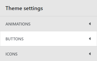
Buttons
This guide describes the Theme settings > Buttons menu options.
Use the menu options to set how buttons are displayed throughout your store. Refer to Shopify help: Buttons
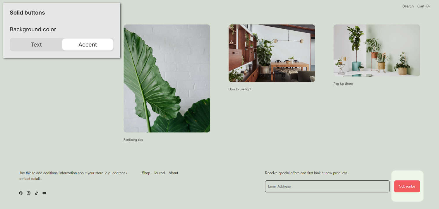
The previous image shows a store's home page in Theme editor. In the upper left, the Theme settings > Buttons > Background color option is set to Accent. These options set the background color for solid (primary) buttons to the color scheme's Text or Accent color. In the lower right, the color scheme's red Accent color is applied to the Subscribe button on the store's home page.
For general guidance with adjusting a theme setting, refer to Settings overview and Shopify help: Theme settings.
Configure buttons
To set how buttons are displayed on your store's pages:
Go to Theme settings > Buttons.
Select a setting described in the following table.
| Setting name | Description |
|---|---|
| Border radius | Use the Border radius options to set the (roundness) shape for button borders to None (off), Small, Medium, Large or Full. |
| Button style | Use the Button style options to set the style for buttons to Default, 3D style 1 or 3D style 2. |
| Solid buttons > Background color | Use the Background color options to set the background color for solid (primary) buttons to the color scheme's Text or Accent color. |
| Call to action > Call to action style | Use the Call to action style options set each "call to action" (linked button) to display as a Button or Link. |