Appearance
Customize color schemes
This guide describes how to use Cascade's Color schemes feature.
With Cascade, you can create 3 different sets of colors called color schemes. Refer to Shopify help: Color schemes.
Color schemes provide a quick and easy way to use colors consistently across your store. Instead of colorizing store elements individually, whenever you apply colors to blocks, sections and pages, simply reuse the colors from your color schemes.
The following table describes Cascade's color schemes.
| Color scheme name | Description |
|---|---|
| Primary | This is your store's default color scheme. |
| Secondary | A second color scheme option for your store. |
| Tertiary | An optional third color scheme for your store. |
Setup a color scheme
To setup a color for a color scheme, complete the following steps.
In Theme editor's Theme settings page, select Colors to expand the color settings menu.
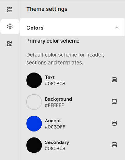
In the Colors menu, locate the color scheme you want to customize.
Select one of the following color scheme elements to colorize.
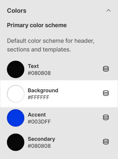
Element name Description Text Set the default color for primary text. Background Choose a color for your store's background. Accent Select a color for accented text, like hover over text and hyperlinks. Secondary Set a color for secondary text, like social media share links on product pages. For example, in the following image, the Primary color scheme > Background element is selected.
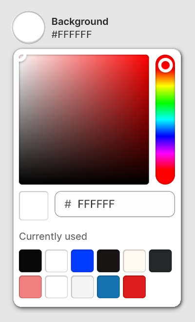
Use one of the following methods to set a color for the color scheme element.
- Choose a color with the Color picker.
- Enter a hexadecimal or hex color value. Refer to Colors HEX.
- Select a Currently used color.
- Choose the Connect dynamic source icon.
Example: Colorize an element by using a color from a dynamic source
To colorize an element by using a color from a dynamic source, if available, select the Connect dynamic source icon, beside the element selector, and then choose a dynamic source to add. You must define sources of dynamic content. Refer to Shopify help: Metafields.
For example, to set the Primary color scheme's Text element to use the Primary contrasting color metafield:
Define the metafield Primary contrasting color as a source of dynamic content. Refer to Shopify help: Metafields.
In Theme settings > Colors > Primary color scheme, select the Connect dynamic source icon, beside the Text element selector.
From the Branding menu, select Primary contrasting color.
Select Save, after you’ve adjusted a color setting, to avoid losing unsaved changes.

Apply a color scheme to a store section
To apply a color scheme to a section of your store, complete the following steps.
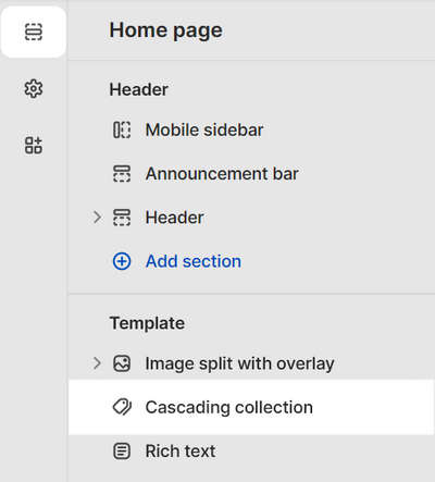
In Theme editor, use the side menu to select a store section to colorize.
For example, in the following image, the store section Home page > Cascading collection is selected.
In the expanded menu, locate the Color menu.
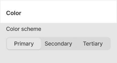
In the Color menu, use the Color scheme options to select a color scheme.
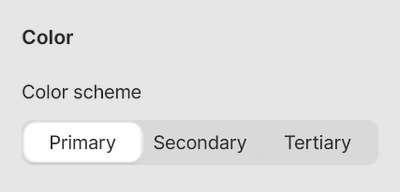
For example, in the following image, the Color scheme option is set to the Primary color scheme.
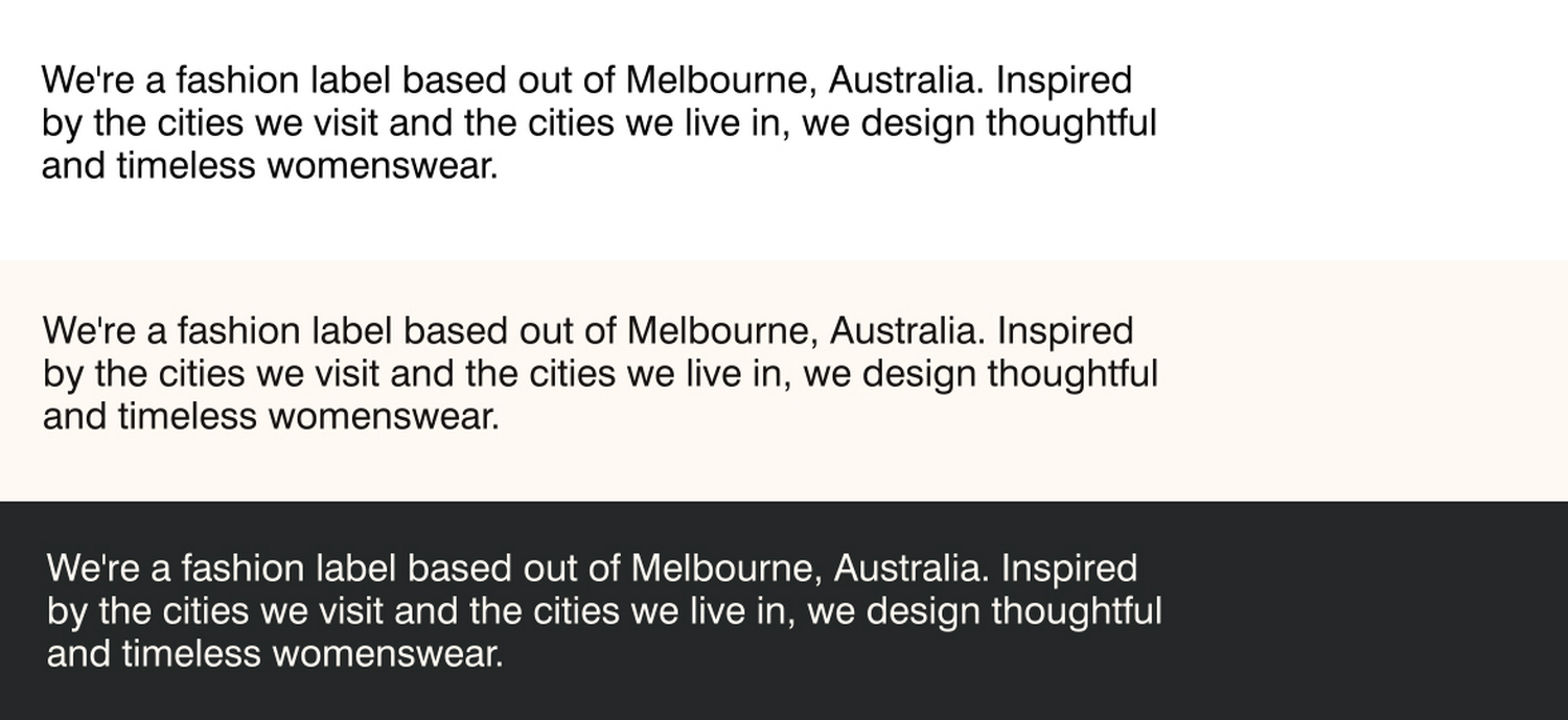
Example: A store section with different color schemes
In the following image, 3 different color schemes are applied to a Rich text section on a store page.
