Appearance
Cascading content
This guide describes setting up the Cascading content section.
Use the section to display items (blocks of content), arranged in a cascade layout. A cascade layout arranges items in columns. Inside a column, the items follow one after another to create a succession of items on a store page.

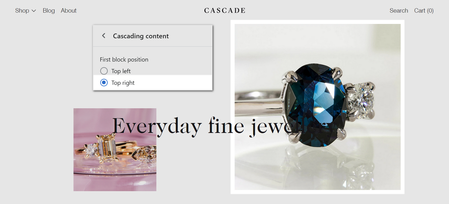
The previous image shows a Cascading content section on a store's home page. In the center left, part of Theme editor's section menu is displayed. The menu's First block position radio buttons are set to Top right. This setting displays the first product image tile (block) in the top right position, inside the section.
In a Cascading content section, each block of content can contain an image, text, a video, product, collection, or blog post, etc. Create unique store pages by mixing the types of content you add into the blocks.
For general guidance with modifying sections, refer to Sections overview and Shopify help: Sections and blocks.
Set up a cascading content section
To set up a Cascading content section:
Go to Customize theme.
In Theme editor, at the top of the page, use the dropdown to select a page that contains a Cascading content section.
Note
The section can be added into any page, except Checkout and Giftcard pages. To add the section into the current page, select Add section > Cascading content. Refer to Shopify help: Add a section.
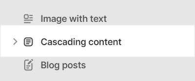
From the side menu, select Cascading content.

Select a setting described in the following table.
| Setting name | Description |
|---|---|
| Heading | In the Heading box, enter text to display as a heading (title) inside the section. |
| Heading > Insert dynamic source | If available, to display (heading) text from a dynamic source, if available, select the icon Insert dynamic source beside the Heading box, and then choose a metafield to add. Refer to Shopify help: Metafields. |
| Overlay heading | Select the Overlay heading checkbox to turn on/off overlaying the section's content with the section's heading text. The overlay remains in the section ("sticky") as the cascading content scrolls. |
| Desktop layout | Select the Desktop layout radio buttons to set a layout style for the section's cascading content area. The options are Single column or Two columns. This setting applies to desktop display devices. |
| First block position | Select the First block position radio buttons to specify a starting position for (content block) tiles inside the section's cascading content area. The options are: (first block in the) Top left or Top right. |
| Enable cascade layout on mobile | Select the checkbox Enable cascade layout on mobile to show/hide the section's cascading content area on mobile displays. |
| Hide left and right margin | Select the checkbox Hide left and right margin to show/hide spacing that's displayed on the left and right sides of the section. Refer to W3 Schools: CSS Margins. |
| Vertical space between items | Select the dropdown Vertical space between items to set a size for the vertical space between (content block) tiles in the section's cascading content area. The options are: Same as theme settings, Small, Medium, and Large. Setup defaults for this setting in Theme Settings > Cascading content. |
| Media > Variation between media sizes | Select the dropdown Variation between media sizes to make the sizes of (content block) tiles more or less varied, inside the section's cascading content area. The options are: Same as theme settings, None, Low, Medium, and High (amount of variation). If set to None, all tiles are displayed at the same size. Setup defaults for this setting in Theme Settings > Cascading content. |
| Media > Sequence | Adjust the Sequence slider to set how (content block) tiles are resized, inside the section's cascading content area. In the section's cascading content area, tiles are resized according to a sequence. Adjust the slider between 1 and 5 to change the sequence. |
| Color > Color scheme | Use the Color scheme options to select a color scheme for the section. Refer to Colors. |
| Color > Disable transition | Select the checkbox Disable transition to turn on/off overriding the color transitions set in the section's theme settings. Setup defaults for this setting in Theme Settings > Colors > Transitions. |
| Spacing > Remove top padding | Select the checkbox Remove top padding to add/remove the spacing (padding) that's displayed above the section. Refer to W3 Schools: CSS Padding. |
| Spacing > Remove bottom padding | Select the checkbox Remove bottom padding to add/remove the spacing (padding) that's displayed below the section. Refer to W3 Schools: CSS Padding. |
| Theme settings | If available, select Theme settings to access additional settings for the section. Refer to Section theme settings menu. |
| Custom CSS | Select Custom CSS. In the box, enter custom CSS styles to apply only to the current section. Refer to Shopify help: Add custom CSS. To apply custom styles to your entire online store, refer to Theme settings > Custom CSS. |
| Remove section | Select Remove section to delete the section from the current page. |
Configure a block within a cascading content section
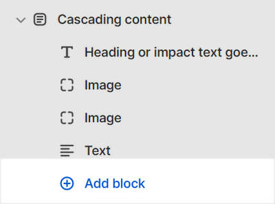
A default Cascading content section contains 4 blocks. To configure a block inside the section:
Go to Customize theme.
In Theme editor, at the top of the page, use the dropdown to select a page that contains a Cascading content section.
From the side menu, expand the Cascading content section menu.
To configure an existing block, select the block from the side menu.
To add a new block, select Add block, choose a block to add, and then select the block you added.

Note
Inside the section, you can add, remove, show, hide, or move blocks. Refer to Configure blocks inside a section, and Shopify help: Sections and blocks.
Apply a block setting described in the Table: Cascading content blocks.
Table: Cascading content blocks
The following table describes the blocks inside the Cascading content section, and their corresponding settings.
The blocks indicated with an asterisk * are contained in a default section. To configure a block, refer to Configure a block within a cascading content section.
| Block name | Block description | Block setting(s) |
|---|---|---|
Image* | Displays an image inside the section. |
|
| Image with text overlay | Displays an image, overlaid with formatted text, inside the section. |
|
| Video | Displays a video from a URL inside the section. |
|
| Product | Displays a product inside the section. |
|
| Collection | Displays a collection inside the section. |
|
| Blog post | Displays a blog post (article) inside the section. |
|
Heading* | Displays heading (or impact) text inside the section. |
|
| Heading with text | Displays (heading or impact) text, with formatted text, inside the section. |
|
Text* | Displays formatted text inside the section |
|
| Testimonial | Displays an image with a comment from a customer, client, or staff member inside the section. |
|
| Custom HTML | Renders custom HTML inside the section |
|