Appearance
Mobile sidebar
This guide describes setting up the Mobile sidebar section.
Use the section to provide visitors using mobile display devices with a side menu for navigating your store's pages.

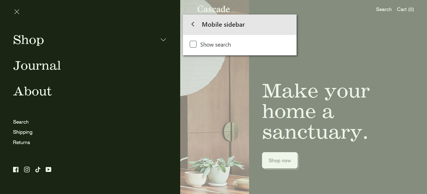
The previous image shows a Mobile sidebar section on a store's home page. In the upper center, the section's Show search checkbox option is set to off. On the left, this setting is applied to hide the search feature inside the section.
For general guidance with modifying sections, refer to Sections overview, and Shopify help: Sections and blocks.
Set up the mobile sidebar section
To set up your store's mobile sidebar section:
Go to Customize theme.
In Theme editor, at the top of the page, use the dropdown to select the Home page.
Note
The section is accessible from all pages, excluding the Checkout, Password, and Gift card pages.
From the side menu, select Mobile sidebar.

Select a section setting described in the following table.
| Section setting name | Description |
|---|---|
| Main menu | Set up a (main) menu to display inside the section. Refer to Set a mobile sidebar menu. |
| Auto-expand first menu item | Select the checkbox Auto-expand first menu item to show/hide second level links for the first menu item when the sidebar loads. |
| Showcase second-level links | Use the Showcase second level links options to show/hide second level links inside the section. This setting also applies a Grid or Scroll style to second level links. With this setting enabled, the section displays second level links to products or collections. The section showcases products or collections if they don't have child links. |
| Collection image crop | Use the dropdown Collection image crop to set an image cropping style for collection images inside the section. The options are: No crop, Portrait, Square, and Landscape. To use this feature, set the Showcase second-level links option to Grid or Scroll |
| Secondary menu | Set up a (secondary) menu to display inside the section. Refer to Set a mobile sidebar menu. |
| Show search | Select the Show search checkbox to show/hide the search feature inside the section. |
| Show social media icons | Select the checkbox Show social media icons to show/hide icons that link to your store's social media, inside the block. Refer to Social media. |
| Theme settings | If available, select Theme settings to access additional settings for the section. Refer to Section theme settings menu. |
| Custom CSS | Select Custom CSS. In the box, enter custom CSS styles to apply only to the current section. Refer to Shopify help: Add custom CSS. To apply custom styles to your entire online store, refer to Theme settings > Custom CSS. |
Set a mobile sidebar menu
To select a menu to display inside the mobile sidebar section, apply the following settings in Mobile sidebar > Main menu or Secondary menu.
If the section has no menu, to select a menu, choose Select menu. Enter the name of a menu into the Search box, or pick a menu from the list, and then choose Select.
To edit the current menu, select the menu link. The link opens the Navigation menu editor in Shopify admin. Use the editor to modify the menu. Refer to Shopify help: Add, remove, or edit menu items in your online store.
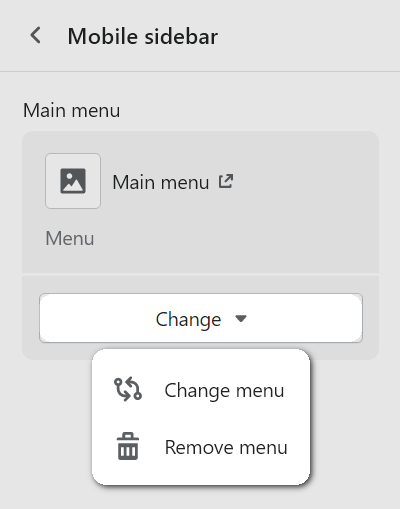
To create a new menu, select Change > Change menu, and then follow the Create menu link. The link opens the Navigation > Add menu page in Shopify admin. Use the menu editor to create a new menu, and then the select the new menu. Refer to Shopify help: Add, remove, or edit menu items in your online store.

To replace the current menu, select Change > Change menu. Enter the name of the replacement menu into the Search box, or pick a replacement menu from the list, and then choose Select.
To delete the current menu, select Change > Remove menu.