Appearance
Header
This guide describes setting up the Header section.
Use the section to provide visitors with a menu for navigating the pages in your store. The Header section is typically displayed across the top of your store's pages.
The previous video shows a Header section on a store's home page. The section uses the following settings in Theme editor:
- A custom logo image is uploaded.
- To display the logo on the left side of the section, the Desktop layout option is set to Logo left with search bar.
- The Show social icons checkbox option is set to
on, to display social media icons in the header. - The Show collection image checkbox option is enabled. With this setting enabled, the expanded Books navigation menu displays collection images, and provides second level links to individual collection pages inside the menu. Refer to Shopify help: Menus and links.
For general guidance with modifying sections, refer to Sections overview.
Set up the Header section
To set up your store's Header section:
Go to Customize theme.
In Theme editor, at the top of the page, use the dropdown to select the Home page.
Note
The section is accessible from all pages, excluding the Checkout, Password, and Gift card pages.
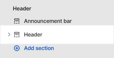
From the side menu, select Header.
Select a section setting described in the following table.
| Setting name | Description |
|---|---|
| Logo > Custom logo | Use the Custom logo selector options to set up an image to use as a logo inside the section. The recommended image dimensions are 800 x 300 pixels, in .jpg format. Refer to Add, replace or remove an image or video inside a section or block. |
| Logo > Custom logo Connect dynamic source | To display a logo image from a dynamic source, select the Connect dynamic source icon beside the Custom logo selector, and then choose a metafield to add. Refer to Shopify help: Metafields. |
| Logo > Custom logo width | Adjust the slider Custom logo width to set a size for the logo image inside the section between 20 and 800 pixels or px. If an image block is active, this setting won't apply to the home page. |
| Menu > Main menu | Select a menu to display inside the section. Refer to Set up a Header menu. |
| Menu > Enable links to drop-down link headings | Select the checkbox Enable links to drop-down link headings to turn links on/off for dropdown headings inside the section. |
| Menu > Feature second level links | Select the checkbox Feature second level links to show/hide second level links inside the section. With this setting enabled, the section displays second level links to products or collections. Note this setting also rearranges the order of products and collections inside the section. |
| Menu > Show collection images | Select the checkbox Show collection images to show/hide collection images inside the section. A collection image is associated with a collection, each product within a collection can have individual product images. Refer to Shopify help: Collection layout and appearance. |
| Menu > Collection image crop | Use the dropdown Collection image crop to set the shape of collection images inside the section. The options are: No crop, Portrait, Square, Landscape, Super wide, and Letterbox. If enabled, this setting applies to collection images above third level links, and to feature collection links. |
| Layout > Desktop layout | For desktop devices, use the Desktop layout dropdown to select a position for the logo and menu items inside the section. The options are
|
| Layout > Show border | Select the Show border checkbox to show/hide a horizontal line below the section. The border is not displayed if the first section is set to full width. |
| Layout > Show search icon | Select the Show search checkbox to show/hide the search icon inside the section. This setting is ignored if a search bar is present. |
| Layout > Show social icons | Select the checkbox Show social icons to show/hide links to your store's social media, inside the section. Refer to Social media. |
| Layout > Sticky header | Select the Sticky header checkbox to turn on/off keeping the header at the top of the page. |
| Overlay settings > Overlay header over home page | Select the checkbox Overlay header over home page to turn on/off positioning the header over the home page, as an overlay. |
| Overlay settings > Overlay text color | Use the Overlay text color dropdown to set a color for text when the header overlays the home page. Set the text color to use the section's color scheme color for Primary, Secondary or Tertiary text. Alternatively, set the text color to White or Black. Refer to Colors. |
| Overlay settings > Overlay logo image | Use the Overlay logo image selector options to set up an image to use as a logo, inside the section, when the header overlays the home page. Refer to Add, replace or remove an image or video inside a section or block. |
| Overlay settings > Overlay logo image > Connect dynamic source | To display an overlay logo image from a dynamic source, select the Connect dynamic source icon beside the Overlay logo image selector, and then choose a metafield to add. Refer to Shopify help: Metafields. |
| Overlay settings > Overlay gradient color | Use the Overlay gradient color options to set a color for the overlay gradient inside the section. The options are Black or White. |
| Overlay settings > Overlay gradient opacity | Select the Overlay gradient opacity slider to adjust the visibility of the overlay gradient, by setting an opacity value between 0% and 100%. |
| Theme settings | If available, select Theme settings to access additional settings for the section. Refer to Section theme settings menu. |
| Custom CSS | Select Custom CSS. In the box, enter custom CSS styles to apply only to the current section. Refer to Shopify help: Add custom CSS. To apply custom styles to your entire online store, refer to Theme settings > Custom CSS. |
Configure an image or video block in the Header section
A default Header section contains no blocks. To configure an image or video block inside the Header section:
Go to Customize theme.
In Theme editor, at the top of the page, use the dropdown to select the Home page.
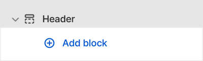
From the side menu, expand the Header section menu.
To configure an existing block, select the block from the side menu.
To add a new block, select Add block, choose Image or Video, and then select the block you added.
Note
Inside the Header section, you can add, remove, or show, hide a block. Refer to Configure blocks inside a section, and Shopify help: Sections and blocks.
Apply a block setting described in the following table.
| Block name | Block description | Block setting(s) |
|---|---|---|
| Image | Display an image inside the section. |
|
| Video | Display a video inside the section. |
|
Set up a Header menu
To select a menu to display inside the Header section, apply the following settings in Header > Menu.
If the section has no menu, to select a menu, choose Select menu. Enter the name of a menu into the Search box, or pick a menu from the list, and then choose Select.
To edit the current menu, select the Menu link. The link opens the Navigation menu editor in Shopify admin. Use the editor to modify the menu. Refer to Shopify help: Add, remove, or edit menu items in your online store.
To create a new menu, select Change > Change menu, and then follow the Create menu link. The link opens the Navigation > Add menu page in Shopify admin. Use the menu editor to create a new menu, and then the select the new menu. Refer to Shopify help: Add, remove, or edit menu items in your online store.
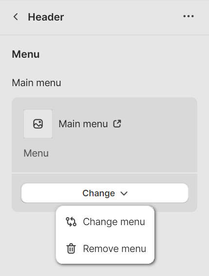
To replace the current menu, select Change > Change menu. Enter the name of the replacement menu into the Search box, or pick a replacement menu from the list, and then choose Select.
To delete the current menu, select Change > Remove menu.
Note
Note that this Header menu is only displayed on desktop devices. To change navigation for the mobile/drawer menu, refer to Sidebar menu.