Appearance
Products
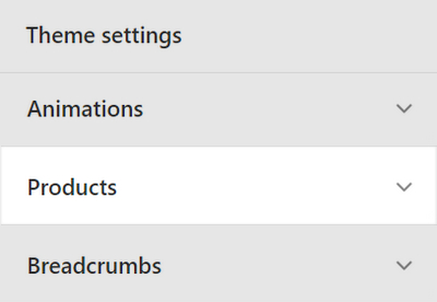
This guide describes the Theme settings > Products menu options.
Use the menu options to set how products are displayed throughout your store.
In the previous video, a recommended products section is displayed on a store's product page. To display a second product image when the cursor is placed over a product tile, in Theme settings > Products, the Hover action dropdown is changed from None to Show second image.
For general guidance with adjusting a theme setting, refer to Settings overview and Shopify help: Theme settings.
Configure products
To configure products:
Go to Theme settings > Products.
Select a setting described in the following table.
| Setting name | Description |
|---|---|
| Split title with hyphen (-) character | Select the checkbox Split title with hyphen (-) character to show/hide a hyphen - character inside the title text for product tiles. |
| Product grid tiles > Hover action | Use the dropdown Hover action to specify a behavior. The behavior applies when a cursor is placed over a product grid tile. The options are None, Show second image, and Show image gallery. |
| Product grid tiles > Show first product video on hover | Select the checkbox Show first product video on hover to show/ hide the first product video when a cursor is placed over the product's grid tile. |
| Product grid tiles > Show audio preview | Select the checkbox Show audio preview to show/ hide audio previews on product pages. Refer to Add audio previews. |
| Product grid tiles > Grid image size | Use the dropdown Grid image size to set a size for product images inside the product grid. The options are Natural, Square (1:1), Landscape (4:3), and Portrait (2:3). |
| Product grid tiles > Star ratings | Use the dropdown Star ratings to set the type of ratings to display inside the product grid. The options are Theme or Shopify product reviews. Refer to Product reviews. |
| Product grid tiles > Star ratings color | Use the Star ratings color options to set a color for the star (rating) icons inside the product grid to Text color or Accent color. Refer to Product reviews and Colors. |
| Product grid tiles > Show vendor | Select the Show vendor checkbox to show/hide the name of a product's vendor inside product tiles. |
| Additional metafield > Metafield key | In the Metafield key box, enter the name of a metafield key with the namespace label_theme. You can reuse the metafield on your store's pages. Refer to Shopify help: Metafields. |
| Additional metafield > Show on collection grid | Select the checkbox Show on collection grid to show/ hide metafields in the collection grid. Refer to Shopify help: Metafields and Collection grid. |
| Additional metafield > Show on product page | Select the checkbox Show on product page to to show/ hide metafields on product pages. Refer to Shopify help: Metafields and Product pages. |
| Color swatches > Enable color swatches on product pages | Select the checkbox Enable color swatches on product pages to show/ hide color swatches on product pages. Refer to Baseline: Color swatches guide. |
| Color swatches > Enable color swatches on collection pages | Select the checkbox Enable color swatches on collection pages to show/ hide color swatches on collection pages. Refer to Baseline: Color swatches guide. |