Appearance
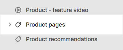
Product pages
This guide describes setting up the Product pages section.
Use the section to set what's displayed on a Product page, after a visitor selects a product from your store.
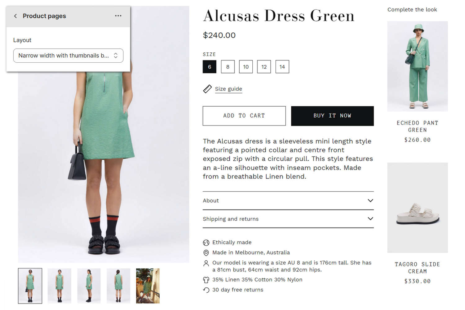
In the previous image, a Product pages section is displayed on a store's Product page. In the upper left, part of Theme editor's section menu is displayed. In the menu, the Layout option is set to Narrow width with thumbnails bottom. The setting positions the product thumbnail images at the botom of the section, and applies a narrow width to the section's (main) product image.
For general guidance with modifying sections, refer to Sections overview.
Set up a Product pages section
To set up a Product pages section:
Go to Customize theme.
In Theme editor, at the top of the page, use the dropdown to select a page that contains a Product pages section. For example, select the Products > Default product page.
Note
The Product pages section is available only on Default product, Book, Fashion, Music, and Preorder product pages.
From the side menu, select Product pages.
Select a setting described in the following table.
| Setting name | Description |
|---|---|
| Layout | For products with multiple images, use the Layout setting to specify a position for product thumbnail images inside the section. The options are Full width with thumbnails bottom, Full width with thumbnails left, and Narrow width with thumbnails bottom. |
| Horizontal thumbnail layout | For products with horizontal thumbnail images, use the Horizontal thumbnail layout setting to specify a size for thumbnail images inside the section. The options are Fixed size (uniform size) or Fit to image (thumbnails are sized based on the image's size). |
| Show thumbnails on mobile | Select the checkbox Show thumbnails on mobile to show/hide thumbnail images inside the section on mobile displays. |
| Mobile image layout | Use the Mobile image layout setting to specify a width for images inside the section on mobile displays. The options are Content width (displays a border around images) and Full width (no border around images). |
| Media > Media types (link) | Follow the Media types link to open the webpage Shopify help: Product media. |
| Media > Hide first video | If your store uses a Product - feature video section, for products that have video media, the first product video is displayed automatically. Select the Hide first video checkbox to show/hide the first product video inside the section. Refer to Shopify help: Product media. |
| Media > Enable image zoom | Select the checkbox Enable image zoom to show/hide a panel that contains product images, inside the section. The panel opens when a product's image is selected inside the section. The panel provides zoom in/out for images, arrow icons for navigating between images, and an X icon to close the panel. |
| Media > Enable video looping | Select the checkbox Enable video looping to turn on/off continuous replay for videos inside the section. If this setting is set to off, videos play once. Refer to Shopify help: Product media. |
| Media > Autoplay videos on desktop | Select the checkbox Autoplay videos on desktop to turn on/off playing videos automatically, inside the section. This setting applies to desktop displays. |
| Theme settings | If available, select Theme settings to access additional settings for the section. Refer to Section theme settings menu. |
| Custom CSS | Select Custom CSS. In the box, enter custom CSS styles to apply only to the current section. Refer to Shopify help: Add custom CSS. To apply custom styles to your entire online store, refer to Theme settings > Custom CSS. |
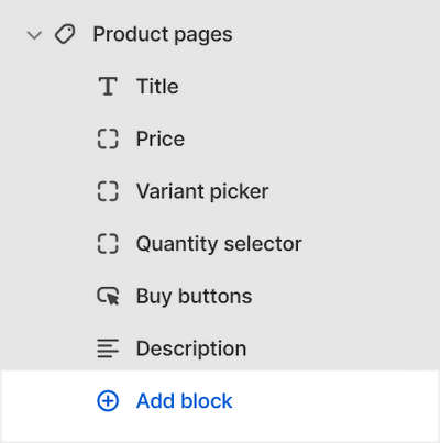
Configure a block within a Product pages section
A default Product pages section contains six product blocks. To configure a block inside the section:
Go to Customize theme.
In Theme editor, at the top of the page, use the dropdown to select a page that contains a Product pages section. For example, select the Products > Default product page.
From the side menu, expand the Product pages section menu.
To configure an existing block, select the block from the side menu.
To add a new block, select Add block, choose a block to add, and then select the block you added.
Note
Inside the section, you can add, remove, show/hide, or move blocks. Refer to Configure blocks inside a section, or Shopify help: Sections and blocks.
Apply the corresponding block settings described in the Table: Product pages blocks.
Table: Product pages blocks
The following table describes the blocks inside the Product pages section, and their corresponding settings.
Some blocks have No customizable settings available. The blocks indicated with an asterisk * are contained in a default Product pages section. To configure a block, refer to Configure a block within a Product pages section. To remove a block, select the block you require, and then choose Remove block.
| Block name | Block description | Block setting(s) |
|---|---|---|
Title * | Displays a product's title inside the section. | No customizable settings available. |
Price * | Displays a product's price inside the section. | No customizable settings available. |
Variant picker * | Displays a variant picker for choosing variations of a product, inside the section. |
|
Quantity selector * | Displays a quantity selector, inside the section, for choosing the number of products to purchase. | No customizable settings available. |
Buy buttons * | Displays the Add to cart and Buy it now buttons inside the section. |
|
Description * | Displays a text area to contain additional product information, inside the section. |
|
Complementary products * | When a customer selects a product from your store, the block displays related products inside the section. To setup complementary products, install the Shopify search & discovery app, and refer to Shopify developer help: Product recommendations. |
|
| Vendor | Displays the name of a product's vendor inside the section. | No customizable settings available. |
| Share buttons | Displays an area, inside the section, with buttons for sharing links to your store's products via social media. Refer to Social media. | No customizable settings available. |
| Text | Displays a text area to contain additional product information, inside the section. |
|
| Rich text | Displays a formatted text area to contain additional product information, inside the section. |
|
| Audio player | Displays an audio player inside the section for playing the audio tracks and tracklists associated with a product. |
|
| Audio player - tracklist | Displays a (playable) list of audio tracks associated with a product, inside the section. |
|
| Ordered list | Displays a numbered/ordered list of items inside the section |
|
| Collapsible tab | Displays a text area with expandable tabs, to contain additional product information, inside the section. |
|
| Icon list | Displays a list of items with icons, inside the section. |
|
| Pop-up | Displays a pop-up overlay to contain additional product information, inside the section. |
|
| Location inventory status | Displays the quantity of a product that's available in each inventory location, inside the section. |
|
| Specification list | Displays a "glossary of terms" style list inside the section. |
|
| Quote | Displays a text area inside the section to contain a comment/ quote about a product from a customer, client or staff member. |
|
| Inventory status | Displays a text indicator of a product's availability, inside the section. |
|
| Buy it with | Displays recommendations for products related to the current product, inside the section. |
|
| HTML | Displays custom HTML inside the section. | In the HTML box, enter custom HTML to display inside the block. |
| Star rating | Displays customer submitted product ratings represented as star icons inside the section. |
|