Appearance
Typography
This guide describes the Theme settings > Typography menu options.
Use the menu options to set how text is displayed throughout your store. Refer to Shopify help: Typography.
In the previous video, a blog posts section is displayed on a store's home page. To increase the size of the text, in Theme settings > Typography, the Base font size slider value is changed from 14px to 16px (pixels).
For general guidance with adjusting a theme setting, refer to Settings overview and Shopify help: Theme settings.
Configure typography
To set how text is displayed throughout your store:
Go to Theme settings > Typography.
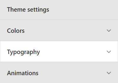
Select a typography setting described in the following table.
| Setting name | Description |
|---|---|
| Base font size | Adjust the Base font size slider to set a size for the base font in pixels or px. The minimum size is 13 px, and the maximum is 22 px. All text throughout your store is scaled relative to the base font size. |
| Line height | Adjust the Line height slider to set the spacing between lines of text (line height) for the base font. The minimum height is 1 and the maximum is 2. |
| Fonts > Headings | Use the Headings font picker to select a font for heading text. Refer to Set up fonts. |
| Fonts > Body | Use the Body font picker to select a font for body text. Refer to Set up fonts. |
| Fonts > Secondary | Use the Secondary font picker to select a font for secondary text. Refer to Set up fonts. Secondary text is used for links and buttons. |
| Headings > Capitalize | Use the Capitalize checkbox to turn on/off uppercase for headings. |
| Headings > Center page titles | Use the Center page titles checkbox to turn on/off center aligning page title text. |
| Headings > Letterspacing | Use the Letterspacing slider to set the spacing between headings and lines of body text. The minimum slider value is 0 and the maximum is 5. |
| Headings > Template heading size | Use the Template heading size options to set the heading text size to Small, Medium, Large, or Extra Large. This setting applies to product, article, and page templates. |
| Text overlay > Letterspacing | Adjust the Letterspacing slider to set the spacing between overlaid headings and lines of overlaid body text. The minimum slider value is 0 and the maximum is 5. |
| Text overlay > Text overlay heading size | Use the Text overlay heading size options to set the text overlay heading size to Medium, Large or Extra Large. |
| Product grid > Font | Select the Font options to set text inside the product grid to use the same font as Secondary or Body text. |
| Product grid > Align | Select the Align options to align the text inside the product grid to the Left or Center. |
| Product grid > Font weight | Select the Font weight options to set a weight for text inside the product grid (if available). The options are: -200, -100, Default, +100 and +200. |
| Section headings > Font size | Use the Font size options to set the section header font size to Small, Medium, Large or Extra Large. |
| Section headings > Center section headings | Use the checkbox Center section headings to turn on/off center aligning section title (heading) text. |
| Secondary > Capitalize | Use the Capitalize checkbox to turn on/off uppercase for secondary headings. |
| Secondary > Letterspacing | Use the Letterspacing slider to set the spacing between secondary headings and lines of body text. The minimum slider value is 0 and the maximum is 5. |
| Secondary > Show arrows on buttons | Use the Show arrows on buttons checkbox to turn on/off displaying arrow icons inside buttons. |
| Secondary > Button baseline adjustment | Use the Button baseline adjustment slider to set a position for button label text, inside buttons. The minimum slider value is -200 and the maximum is 200. |
| Rich text editor > Font size | Select the Font size options to set the rich text editor's font size to Small, Medium or Large. |
| Border > Width | Select the Width options to set the border width to 0, 1 or 2 px (pixels). |
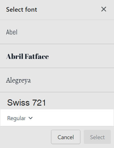
Set up fonts
To choose a font and font style for heading (title), body, and secondary text:
Go to Theme settings > Typography > Fonts.
Locate the type of text you want set up: Headings, Body or Secondary text.
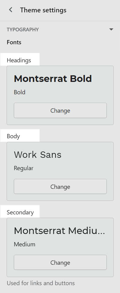
Select Change.
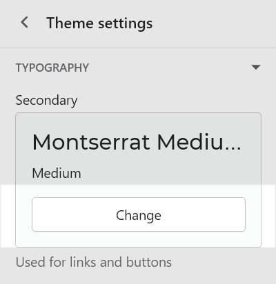
For example, in the following image, Change is selected for Secondary text.
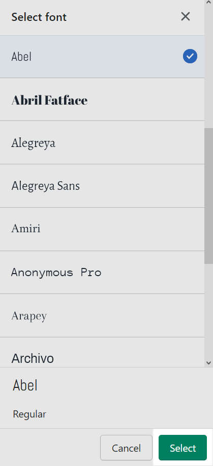
In the Search box, enter the name of a font.
Alternatively, use the font pick to select a font from the following font sets.
System fonts. A set of default system fonts. System fonts load quickly and their appearance might change according to the visitor's device type and web browser.
Other fonts. Fonts from Shopify's library that are not part of the default system font set.
Load more. Select Load more to access more fonts in each font set.
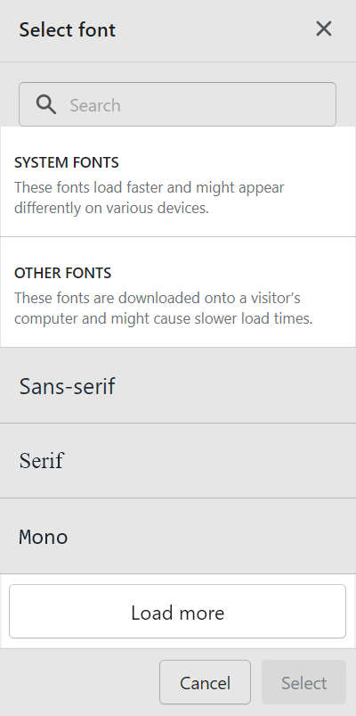
Inside the font picker area, use the dropdown to select a font style (if available).
Font styles include: Thin, Thin Italic, Extra Light, Extra Light Italic, Light, Light Italic, Regular, Italic, Medium, Medium Italic, Semi Bold, Semi Bold Italic, Bold, Bold Italic, Extra Bold, Extra Bold Italic, Black and Black Italic.
Choose Select.
At the top of the page, select Save.