Appearance
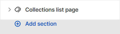
Collections list page
This guide describes setting up the Collections list page section.
Use the section to display your store's collections on the Collection list page.
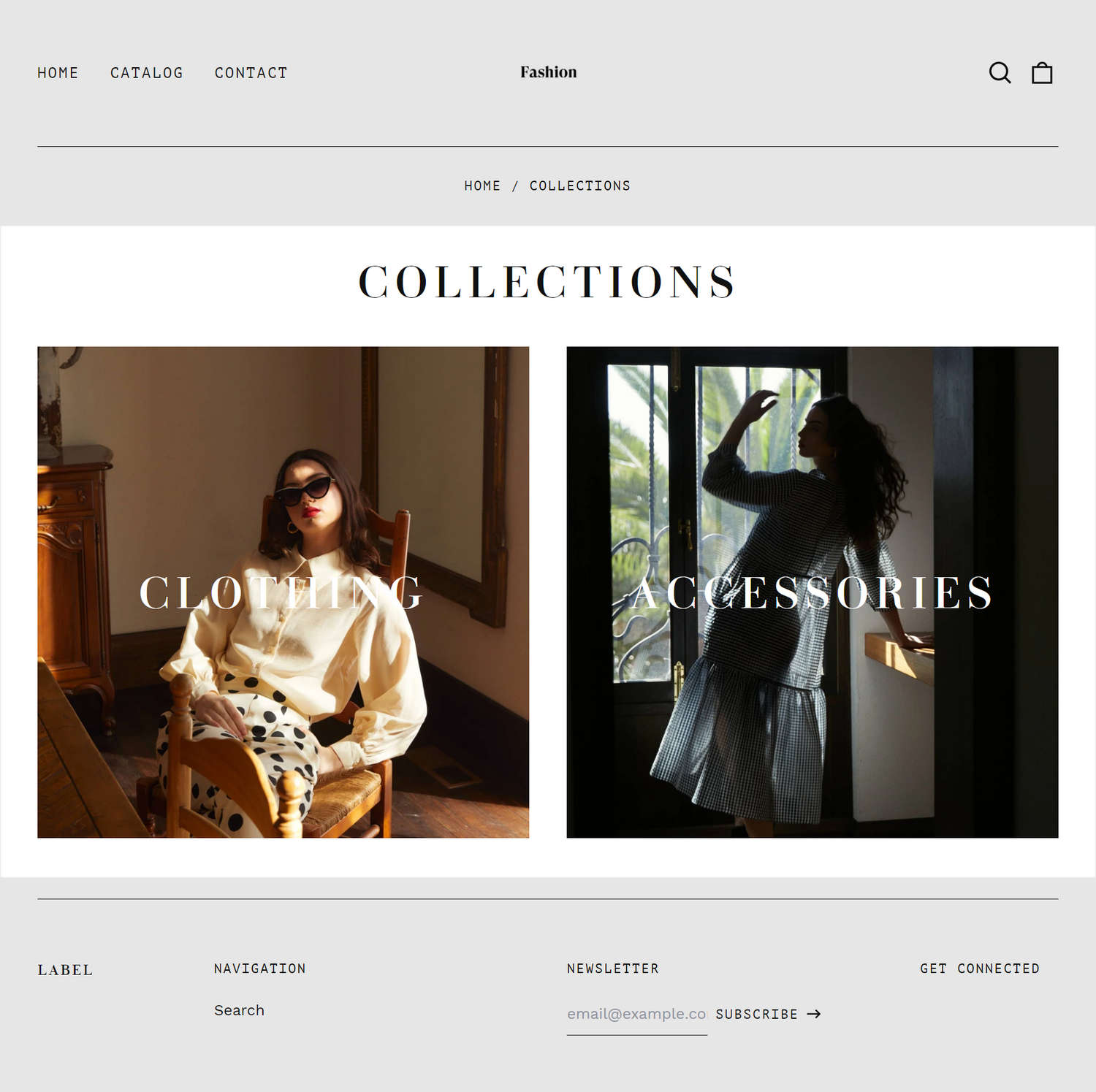
The previous image shows a Collections list page section on a store's Collection list page. The section contains two Collection blocks. Each block specifies a particular collection to display.
For general guidance with modifying sections, refer to Sections overview.
Set up a Collections list page section
To set up a Collections list page section:
Go to Customize theme.
In Theme editor, at the top of the page, use the dropdown to select Collection list.
Note
The section is available only on Collection list pages.
From the side menu, select Collections list page.
A default Collections list page section lists all of your store's collections. To specify the particular collections to display, refer to Configure a collection inside a Collections list page section.
Select a section setting described in the following table.
| Setting name | Description |
|---|---|
| Show heading | Select the Show heading checkbox to show/hide collection titles inside the section. |
| Collections per row on desktop | Use the Collections per row on desktop options to set the number of collections to display in each row, inside the section. The options are 2, 3 or 4. This setting applies to desktop display devices. |
| Crop images | Use the Crop image dropdown to set the shape for images inside the section. The options are No crop, Landscape, Square, and Portrait. |
| Full width | Select the Full width checkbox to turn on/off using the full width of the collection image area, inside the section. |
| Text size | Use the Text size options to set the size for text inside the section to Medium or Large. Refer to Typography. |
| Text color | Use the Text color options to specify a color for text inside the section. Set the text color to use the section's color scheme color for Primary, Secondary or Tertiary text. Alternatively, set the text color to White or Black. Refer to Colors. |
| Theme settings | If available, select Theme settings to access additional settings for the section. Refer to Section theme settings menu. |
| Custom CSS | Select Custom CSS. In the box, enter custom CSS styles to apply only to the current section. Refer to Shopify help: Add custom CSS. To apply custom styles to your entire online store, refer to Theme settings > Custom CSS. |
Configure a collection inside a Collections list page section
A default Collections list page section displays all of your store's collections. Alternatively, you can specify the collections to display inside the section by configuring Collection blocks.
To configure a block inside a Collections list page section:
Go to Customize theme.
In Theme editor, at the top of the page, use the dropdown to select Collection list.
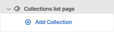
From the side menu, expand the Collection list page section menu.
To configure an existing block, select the block from the side menu.
To add a new block, select Add collection, and then select the block you added.
Note
Inside a Collections list page section, you can add, remove, show, hide, or move blocks. Refer to Configure blocks inside a section, and Shopify help: Sections and blocks.
Apply the corresponding block settings described in the following table.
| Setting name | Description |
|---|---|
| Choose collection | Use the Choose collection selector to set up a collection to display inside the block.
|
| Overlay text color | Select the Overlay text color dropdown to set a color for text inside the block, like the collection titles. Set the text color to use the section's color scheme color for Primary, Secondary or Tertiary text. Alternatively, set the text color to White or Black. Refer to Colors. This setting overrides the section's overlay text color setting. |
| Remove block | Select Remove block to delete the block from the current section. |