Appearance
Collage
This guide describes setting up a Collage section to display an arrangement of media on a store page, like images, products, collections, articles, stickers and shapes. Refer to Shopify help: Collage

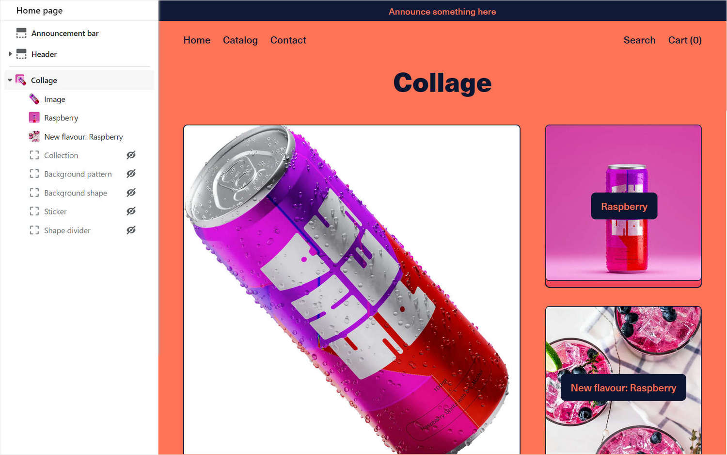
The previous image shows a Collage section in Theme editor with the following settings:
- On the left, the section menu has 7 blocks (Image, Product, Article, Collection, Background pattern, Background shape, Sticker, and Shape divider).
- The Image, Product, and Article blocks are enabled and contain media.
- On the right, the media for the 3 enabled blocks are displayed in a collage - Image (left), Product (upper right), and Article (lower right).
- The product and article blocks contain buttons that link to their respective product and article (blog) pages.
For general guidance with modifying sections, refer to Sections overview and Shopify help: Sections and blocks
Set up a collage section
To set up a collage section:
Go to Customize theme. At the top of the page, use the dropdown to select a template that contains a collage section.
Note
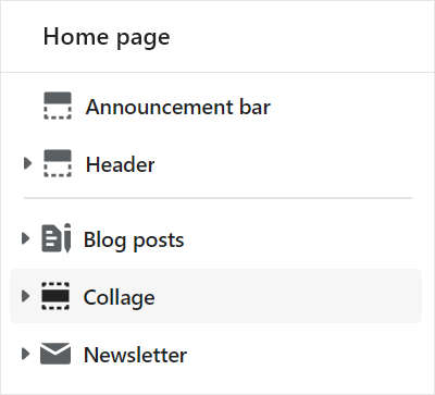
The collage section can be added into any page, except Checkout and Giftcard pages. To add a collage section into the current page, select Add section > Collage. Refer to Shopify help: Add a section
From the side menu, select Collage.

Select a section setting described in the following table.
| Section setting name | Description |
|---|---|
| Title | In the Title box, enter text to display as a heading inside the section. |
| First large image position on desktop | Select the radio buttons First large image position on desktop to position the first (large) image inside the section to the Top left or Top right. This setting applies to desktop display devices. |
| Crop | Use the Crop dropdown to set a shape for the images inside the section. The dropdown options are: No crop, Landscape, Square, and Portrait. |
| Buttons > Button style | Use the Button style dropdown to set the style for the section's buttons to Primary or Secondary. Refer to Buttons. |
| Buttons > Show buttons on mobile | Select the checkbox Show buttons on mobile to show/ hide the section's buttons on mobile display devices. |
| Only show buttons on hover on desktop | Select the checkbox Only show buttons on hover on desktop to show/ hide the section's buttons whenever a cursor is moved over the section. This setting applies to desktop display devices. |
| Color > Color scheme | Use the Color scheme dropdown to set the color scheme for the section to Primary, Secondary, Tertiary, or Quaternary. Refer to Colors. |
| Use gradient for background | Select the checkbox Use gradient for background to turn on/ off using a gradient as the section's background. |
| Theme settings | Select Theme settings to access additional settings for the section. Refer to Section theme settings menu. |
| Custom CSS | Select Custom CSS. In the box, enter custom CSS styles to apply only to the current section. Refer to Shopify help: Add custom CSS. To apply custom styles to your entire online store, refer to Theme settings > Custom CSS. |
| Remove section | Select Remove section to delete the section from the current page. |
Configure a block within a collage section
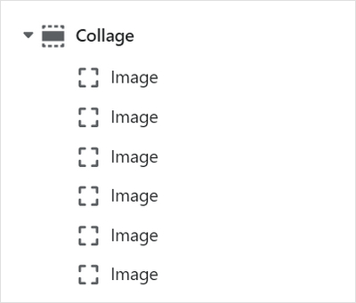
A default collage section contains six image blocks. To configure a block inside the section:
Go to Customize theme. At the top of the page, use the dropdown to select a template that contains a collage section.
From the side menu, expand the Collage section menu.
To configure an existing block, select the block from the side menu.
To add a new block, select Add block, choose a block to add, and then select the block you added.

Note
Inside a collage section, you can add, remove, show/ hide, or move blocks. Refer to Configure blocks inside a section, and Shopify help: Sections and blocks
Apply a block setting described in the Table: Collage blocks.
Table: Collage blocks
The following table describes the blocks inside the collage section, and their corresponding settings. The blocks indicated with an asterisk * are contained in a default collage section. To configure a block, refer to Configure a block within a collage section.
| Block name | Block description | Block setting(s) |
|---|---|---|
Image * | Displays an image inside the section. |
|
| Product | Displays a store product inside the section. |
|
| Collection | Displays a store collection inside the section. |
|
| Article | Displays an article from your store's blog inside the section. |
|
| Background pattern | Displays a stylistic pattern as a background inside the section. | Refer to Background pattern. |
| Background shape | Displays a stylistic shape as a background inside the section. | Refer to Background shape. |
| Sticker | Overlays the section with a stylized sticker. | Refer to Stickers. |
| Shape divider | Displays a stylized separator between the current section and the next/ previous section. | Refer to Shape divider. |