Appearance
Stickers
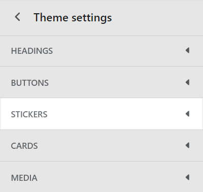
This guide describes the Theme settings > Stickers menu options. Use the settings to specify how stickers are displayed throughout your store.
In the previous video, a sticker is displayed, inside an Image with text section, on a store's homepage. To increase the shadow effect applied to the sticker, in Theme settings > Stickers, the Shadow > Size slider is adjusted. The slider adjustments increase the size of the sticker's shadow from 0px to 10px (pixels).
For general guidance with adjusting a theme setting, refer to Settings overview and Shopify help: Theme settings
Set up stickers
To set up stickers:
Go to Theme settings > Stickers.

Select a setting described in the following table.
| Setting name | Description |
|---|---|
| Border radius | Use the Border radius dropdown to set the shape of the sticker borders to None (off), Rounded small, Rounded medium, or Rounded full. |
| Border > Width | Adjust the Width slider to set a width for the sticker borders. The slider ranges from 0px to 5px (pixels). |
| Border > Color | Select the Color radio buttons to set the sticker borders to use the same color as the color scheme's Text, Accent 1 or Accent 2 color. |
| Shadow > Size | Adjust the Size slider to set a size for the sticker shadow effect. The slider ranges from 0px to 10px (pixels). |
| Shadow > Color | Use the Color dropdown to set a color for the sticker shadow effect. Set the shadow effect to Transparent, set it to use the same color as the Card, or to the current color scheme's Text, Accent 1, Accent 2 or Gradient color. |
| Shadow > Shadow direction | Use the Shadow direction dropdown to set a position for the sticker shadow effect. The dropdown options are:
|
| Show border on shadow | Select the checkbox Show border on shadow to show/hide borders around the sticker shadow effect. The sticker border color and width settings are applied to the shadow effect's borders. |