Appearance
Shape divider
This guide describes using a Shape divider block to add a stylized separator between sections.
The previous video demonstrates adding a Shape divider to a section.
Add a shape divider
You can add Shape divider blocks inside any appropriate section.
For example, in the following image, a Rich text section contains a Shape divider block. A Wave style is applied to the block.

To add a Shape divider block to a section:
In Theme editor, select an appropriate section from the side menu.
Note
Shape divider blocks can be added into most sections. But Shape divider blocks cannot be added to all sections.
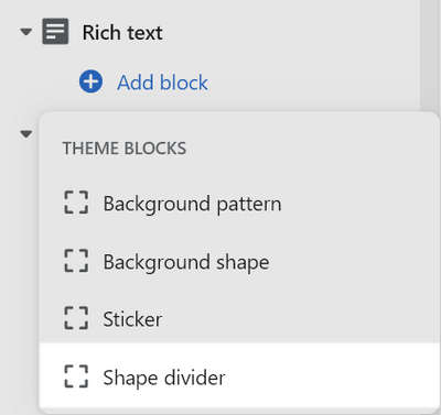
Select Add block, and then choose a Shape divider block.
For example, in the following image, a Shape divider block is added to a Rich text section.
Types of shape divider
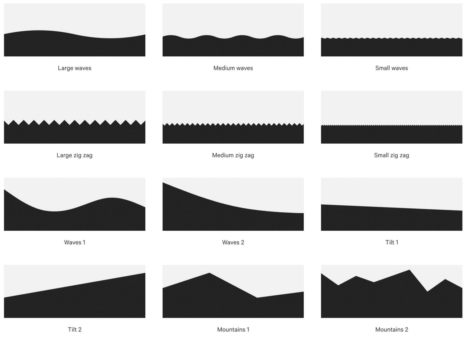
Shapes provides 12 style types to use with a Shape divider block. The available divider types are displayed in the following image.
How to position a shape divider
When you add a shape divider block to a section, set the divider to target the section above or below the block.
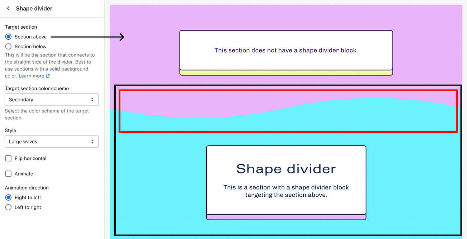
For example, in the following image, two sections are displayed. The lower section contains a shape divider block. In the block's setting menu, the checkbox option is set to target the section above the divider block.
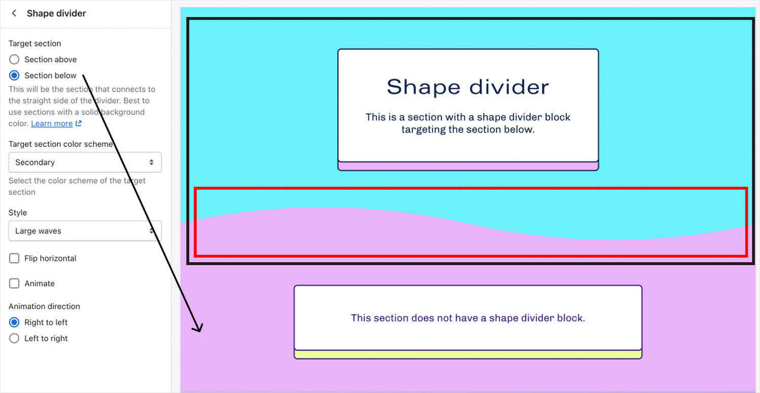
Two sections are displayed in the following image. The upper section contains a shape divider block. In the block settings menu, the checkbox option is set to target the section below the divider block.
In the following image, two sections are displayed. The lower section contains a shape divider block. In the block settings menu, the checkbox option is set to target the section above the divider block.
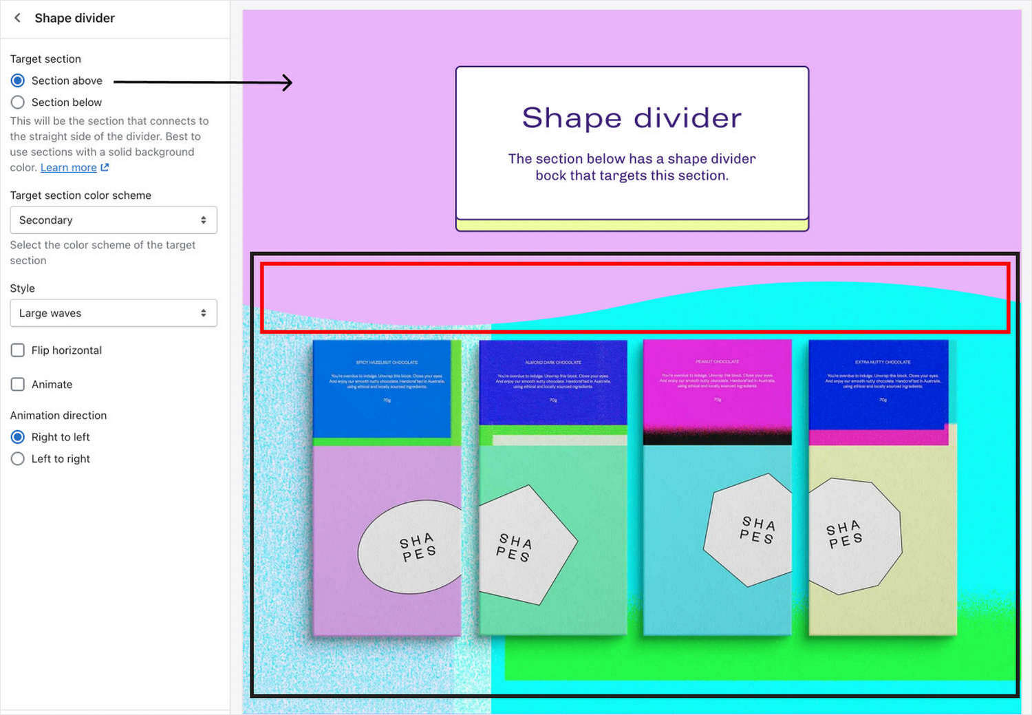
Apply color schemes to shape dividers
With Shape divider blocks, you must set the block to use the same color scheme as the target section.
As an example, two sections are displayed in the following image. The lower section contains a shape divider block. In the block settings menu, the dropdown option is set to match the color scheme of the target section. By setting the shape divider color to the target section color scheme, the sections above and below the divider blend together seamlessly.
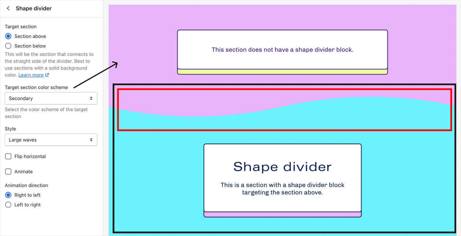
Note
For optimal color blending, the shape divider's color must match the color scheme of the section above or below it. Shape dividers work best when they're positioned below or above a section that has a solid color background.
Configure a Shape divider
To configure a Shape divider block:
In Theme editor, from the side menu, select a section that contains a Shape divider block.
Expand the section menu, and then select a Shape divider block.
Apply a block setting described in the following table.
| Block setting name | Description |
|---|---|
| Target section | Select the Target section radio buttons to specify a section to connect to the straight side of the divider. The options are Section above or Section below. Refer to How to position a shape divider. Using sections with a solid background color is recommended. |
| Target section color scheme | Use the dropdown Target section color scheme to set a color scheme for the block. You must select the same color scheme as the target section. The options are Primary, Secondary, Tertiary, and Quaternary. Refer to Apply color schemes to shape dividers. |
| Style | Use the Style dropdown to set a style type for the divider block. Refer to Types of shape divider. |
| Flip horizontal | Select the Flip horizontal checkbox to flip/ unflip the divider along the y-axis (horizontally). This setting applies only to asymmetrical divider style types. |
| Animation > Enable animation | Select the Enable animation checkbox to show/ hide divider animation effects. If enabled, symmetrical divider shapes move in one direction, and asymmetrical divider shapes sway. |
| Animation > Direction | Select the Direction checkbox to set the direction of the animation to move from Right to left or Left to right. |
| Remove block | Select Remove block to delete the block from the section. |