Appearance
Set up the Exhibit preset
This guide describes how to set up your store's home page to match the appearance of our Exhibit "art gallery" demo store.
Note
Before you follow this guide:
Download and install Exhibit theme from Shopify's Theme store. Refer to Install Exhibit.
Use Theme editor's Theme settings to set your store to the Exhibit preset Theme style. Refer to Theme style.
Customize your store's home page
To customize your store's home page to match our Exhibit Demo store, complete the following steps.
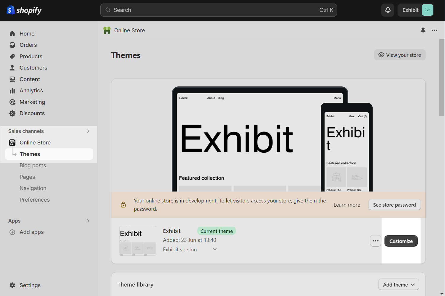
In your Shopify admin, select Sales channels > Online store > Themes.
In the Current theme or Theme library area, locate the Exhibit theme you installed.
Beside the theme's name, select Customize to open Theme editor.
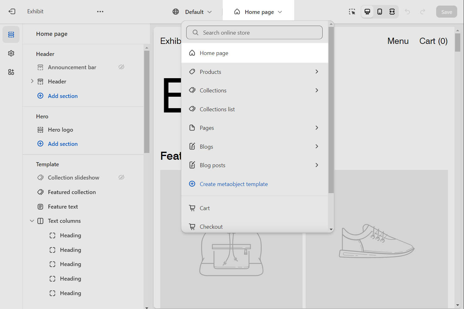
In Theme editor's menu, at the top of the page, use the dropdown to select the home page template.
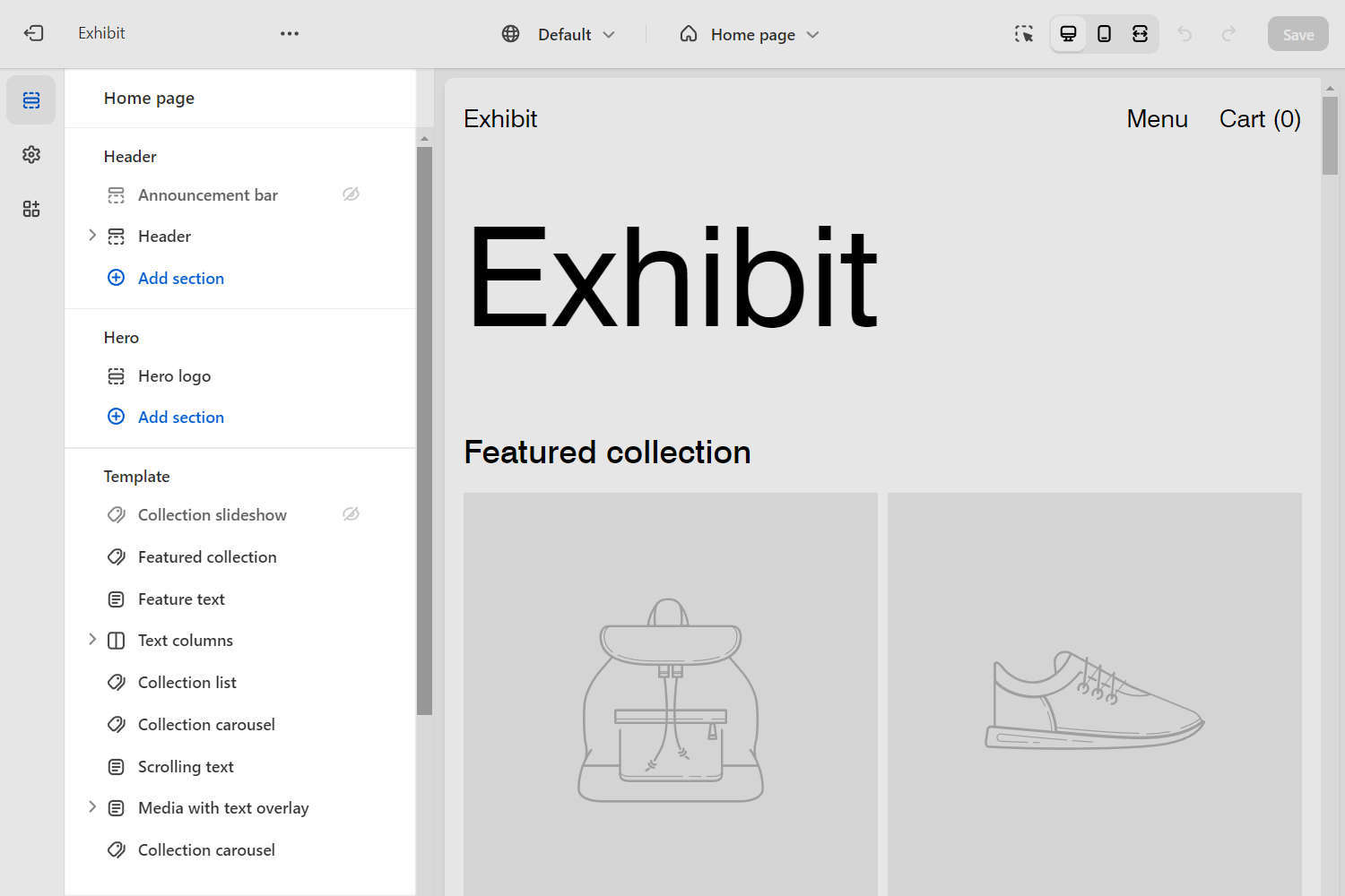
In Theme editor's home page sections menu, configure each section and block according to the specifications described later in this article.
Note
If a specification does not provide a value for a particular section, block or Theme setting, use the setting's default value. For example, this article does not provide a specification for the home page's Newsletter section. So, to match your store to our demo store, do not change the default Newsletter section settings.
For guidance with adding, removing, hiding, and rearranging sections and blocks, refer to Shopify help: Sections and blocks. For more information about Exhibit's sections and blocks, refer to Sections overview.
Select Save regularly, to avoid loosing your changes.
Static sections specifications
In Theme editor's home page sections menu, apply the following specifications to Exhibit's Static sections and blocks.
Header
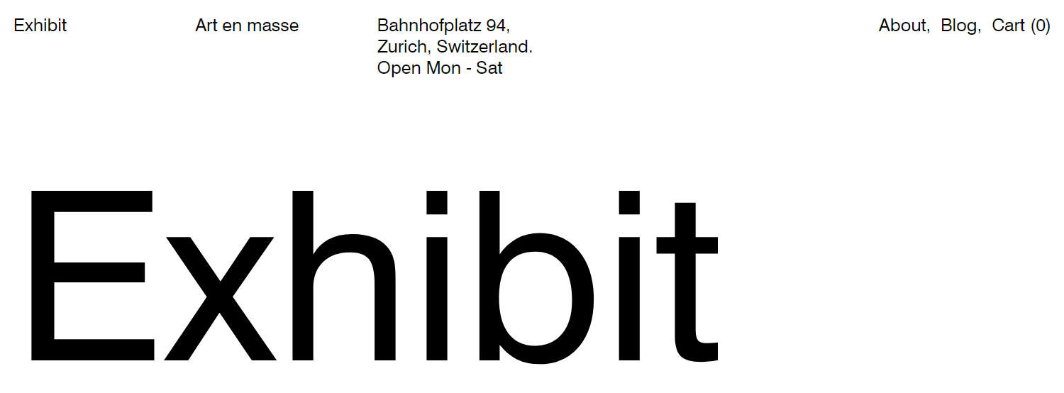
Complete the following steps to match the appearance of your store's Header section to the following image.
Note
For guidance with setting up a Header section, refer to Header.
Select the Header section.
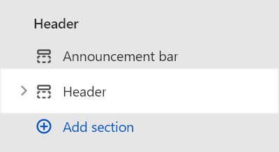
Apply the settings described in the following table.
Setting name Value Utility links > Cart Show on mobile only Utility links > Drawer menu Show on mobile only
Header - Rich text block 1
In the Header section, add a new Rich text block.
Position the block you added above the section's Horizontal (Main) menu block.
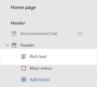
Select the block you added.
Apply the settings described in the following table.
Setting name Value Paragraph Enter text to display inside the block. For example, enter the text Art en masse. Block width on desktop One sixth (1/6) Review the appearance of your store's Header section.
Your Header section's Rich text block should look similar to the following image.

Header - Rich text block 2
In the Header section, add a second Rich text block.
Position the new block below the first Rich text block.
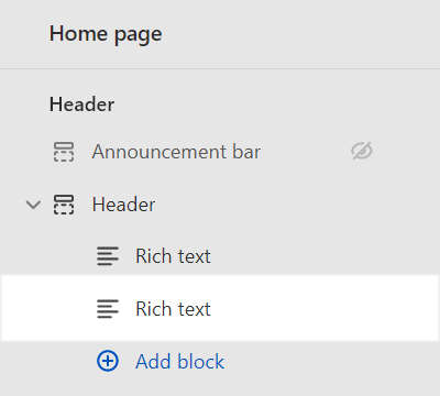
Select the new block you added.
Apply the settings described in the following table.
Setting name Value Paragraph Enter text to display inside the block. For example, enter the text Bahnhofplatz 94, Zurich, Switzerland. Open Mon - Sat. Use Shift + Return to create new lines to separate parts of the address text and the opening hours.Block width on desktop One quarter (1/4) Review the appearance of your store's Header section.
Your Header's second Rich text block should look similar to the following image.

Header - Horizontal (Main) menu block
Select the Header section's Horizontal (Main) menu block.
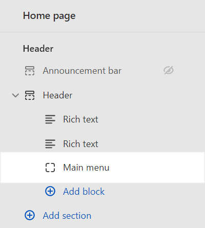
Apply the settings described in the following table.
Setting name Value Horizontal menu Use the Menu selector options to set up a menu inside the block. Refer to Set up a Header Menu block. Our demo store uses the Main menu. Desktop text alignment Right Show cart link as last menu item Checked (on). Separate menu items with a comma Checked (on). Review the appearance of your store's Header section.
Your Header section's Horizontal (Main) menu block should look similar to the following image.

Footer
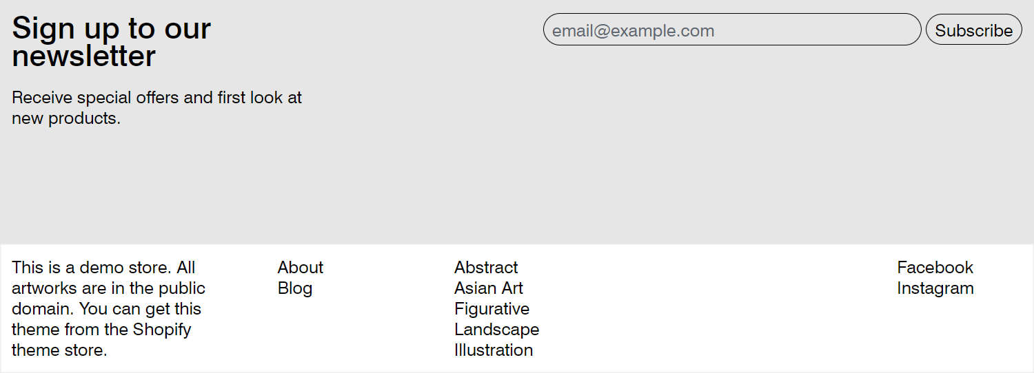
Complete the following steps to match the appearance of your store's Footer section to the following image.
Note
For guidance with setting up a Footer section, refer to Footer.
Footer - Rich text block
Expand the Footer section menu.
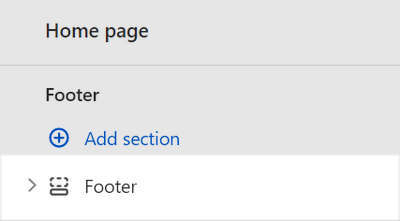
In the Footer section, add a new Rich text block.
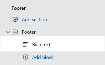
Select the block you added.
Apply the settings described in the following table.
Setting name Value Paragraph Enter text to display inside the block. For example, enter the text This is a demo store. All artworks are in the public domain. You can get this theme from the Shopify theme store.Review the appearance of your store's Footer section.
Your Footer section's Rich text block should look similar to the following image.

Footer - (Main) Menu block 1
In the Footer section, add a new Menu block.
Position the new Menu block below the Rich text block.
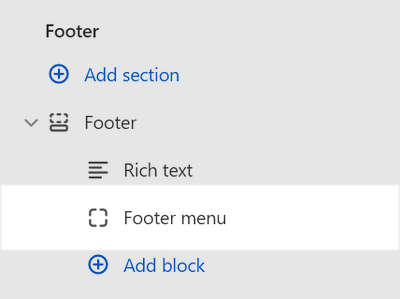
Select the new block you added.
Apply the settings described in the following table.
Setting name Value Menu Use the Menu selector options to set up a menu inside the block. Refer to Set up a Footer Menu block. Our demo store uses the Main menu. Separate menu items with a comma Checked (on). Layout > Block width on desktop One sixth (1/6) Review the appearance of your store's Footer section.
Your Footer section's Menu block should look similar to the following image.

Footer - (Collections) Menu block 2
In the Footer section, add a second Menu block.
Position the new (Footer) Menu block below the first (Main) Menu block.
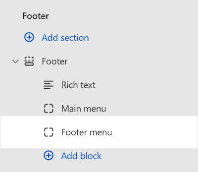
Select the new block you added.
Apply the settings described in the following table.
Setting name Value Menu Use the Menu selector options to set up a menu inside the block. Refer to Set up a Footer Menu block. The demo store uses the Collections menu. Layout > Block width on desktop One sixth (1/6) Review the appearance of your store's Footer section.
Your Footer's second (Footer) Menu block should look similar to the following image.

Footer - Spacer block
In the Footer section, add a new Spacer block.
Position the new Spacer block below the second (Collections) Menu block.
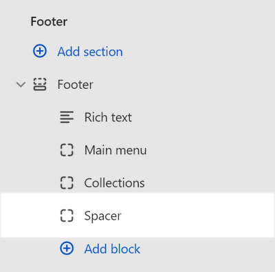
Select the new block you added.
Apply the settings described in the following table.
Setting name Value Layout > Block width on desktop One quarter (1/4) Review the appearance of your store's Footer section.
Your Footer section's Spacer block should look similar to the following image.

Footer - Social media block
In the Footer section, add a new Social media block.
Note
For guidance with configuring your store's Social media Theme settings, refer to Social media.
Position the new Social media block below the section's Spacer block.
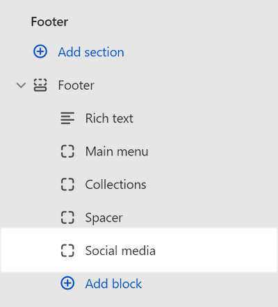
Select the new block you added.
Apply the settings described in the following table.
Setting name Value Display as Text Layout > Block width on desktop One sixth (1/6) Review the appearance of your store's Footer section.
Your Footer section's Social media block should look similar to the following image.

Menu drawer
Complete the following steps to match the appearance of your store's Menu drawer section to the following image.

Note
For guidance with setting up a Menu drawer section, refer to Menu drawer.
Menu drawer - Social media block
Expand the Menu drawer section menu.
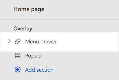
In the Menu drawer section, add a new Social media block.
Note
For guidance with configuring your store's Social media Theme settings, refer to Social media.
Position the new Social media block below the section's (Main) Menu block.
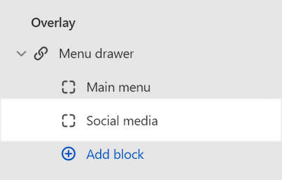
Select the new block you added.
Apply the settings described in the following table.
Setting name Value Display as Text Review the appearance of your store's Menu drawer section.
Your Menu drawer section's Social media block should look similar to the following image.

Content sections specifications
In Theme editor's home page sections menu, apply the following specifications to Exhibit's Content sections and blocks.
Featured collection
Complete the following steps to match the appearance of your home page's Featured collection section to the following image.

Note
For guidance with configuring a Featured collection section, refer to Featured collection.
Select the Featured collection section.
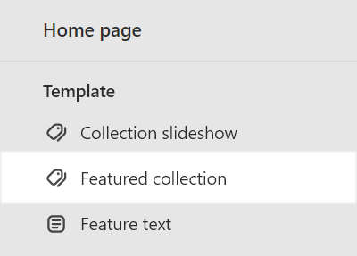
Apply the settings described in the following table.
Setting name Value Heading Remove the heading text Featured collection. Collection Use the Collection selector to set up a collection to display inside the section. Our demo store uses the Featured collection. Refer to Shopify help: Collections. Maximum products to show 25Layout > Grid type Justified Number of columns on desktop 5Labels > Show prices Unchecked (off). Labels > Display Text overlay on hover Spacing > Above 0.5x
Feature text
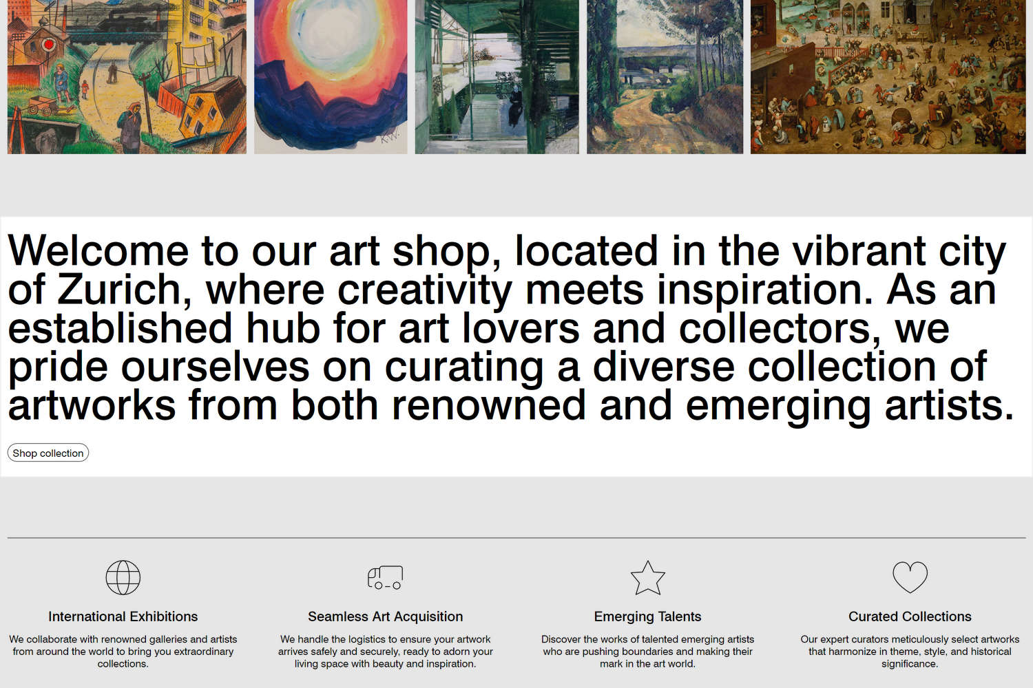
Complete the following steps to match the appearance of your home page's Feature text section to the following image.
Note
For guidance with configuring a Feature text section, refer to Feature text.
Select the Feature text section.
Apply the settings described in the following table.
Setting name Value Text Enter text to display inside the section. For example, enter the text Welcome to our art shop, located in the vibrant city of Zurich, where creativity meets inspiration. As an established hub for art lovers and collectors, we pride ourselves on curating a diverse collection of artworks from both renowned and emerging artists.Call to action > Link In our demo store, a link to All products is selected. Call to action > Label Shop collection
Text columns
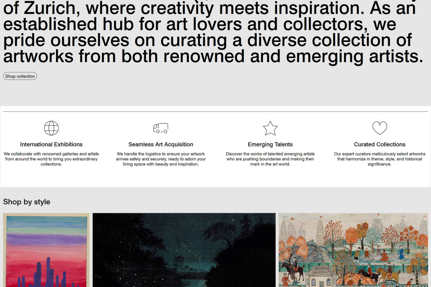
Complete the following steps to match the appearance of your home page's Text columns section to the following image.
Note
For guidance with configuring a Text columns section, refer to Text columns.
Select the Text columns section.
Apply the settings described in the following table.
Setting name Value Desktop columns 4Show top border Checked (on).
Text columns - Column block 1
Select the Text columns section's first (Heading) Column block.
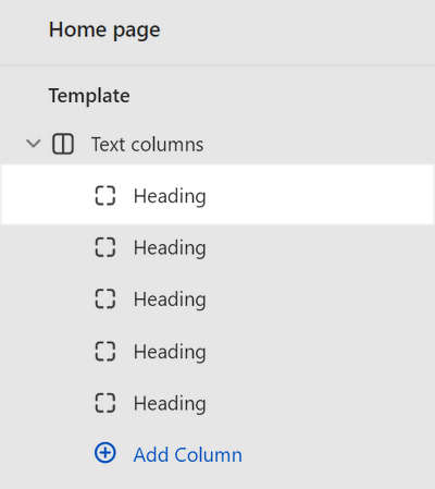
Apply the settings described in the following table.
Setting name Value Icon Globe Heading Enter heading text to display inside the block. For example, our demo store uses the heading text International Exhibitions. Text Enter text to display inside the block. For example, our demo store uses the text We collaborate with renowned galleries and artists from around the world to bring you extraordinary.collections.Review the appearance of your store's Text columns section.
Your Text columns section's first Column block block should look similar to the following image.

Text columns - Column block 2
Select the Text columns section's second Column block.
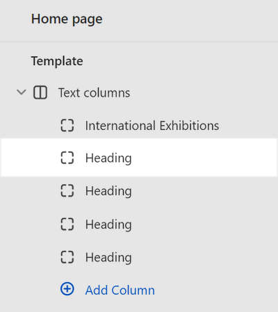
Apply the settings described in the following table.
Setting name Value Icon Truck Heading Enter heading text to display inside the block. For example, our demo store uses the heading text Seamless Art Acquisition. Text Enter text to display inside the block. For example, our demo store uses the text We handle the logistics to ensure your artwork arrives safely and securely, ready to adorn your living space with beauty and inspiration.Review the appearance of your store's Text columns section.
Your Text columns section's second Column block block should look similar to the following image.

Text columns - Column block 3
Select the Text columns section's third Column block.
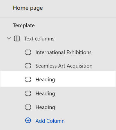
Apply the settings described in the following table.
Setting name Value Icon Star Heading Enter heading text to display inside the block. For example, our demo store uses the heading text Emerging Talents. Text Enter text to display inside the block. For example, our demo store uses the text Discover the works of talented emerging artists who are pushing boundaries and making their mark in the art world.Review the appearance of your store's Text columns section.
Your Text columns section's third Column block block should look similar to the following image.

Text columns - Column block 4
Select the Text columns section's forth Column block.
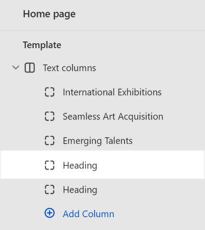
Apply the settings described in the following table.
Setting name Value Icon Heart Heading Enter heading text to display inside the block. For example, our demo store uses the heading text Curated Collections. Text Enter text to display inside the block. For example, our demo store uses the text Our expert curators meticulously select artworks that harmonize in theme, style, and historical significance.Review the appearance of your store's Text columns section.
Your Text columns section's forth Column block block should look similar to the following image.

Text columns - Column block 5
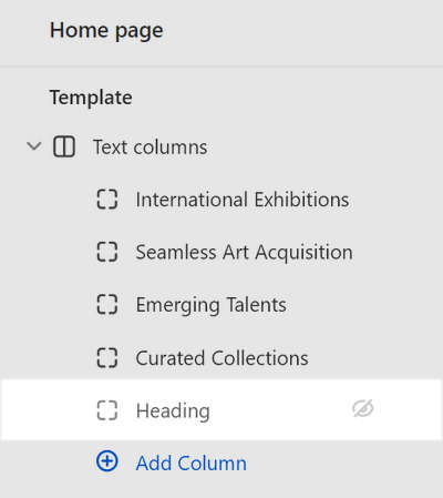
Hide the section's fifth Column block.
Collection list
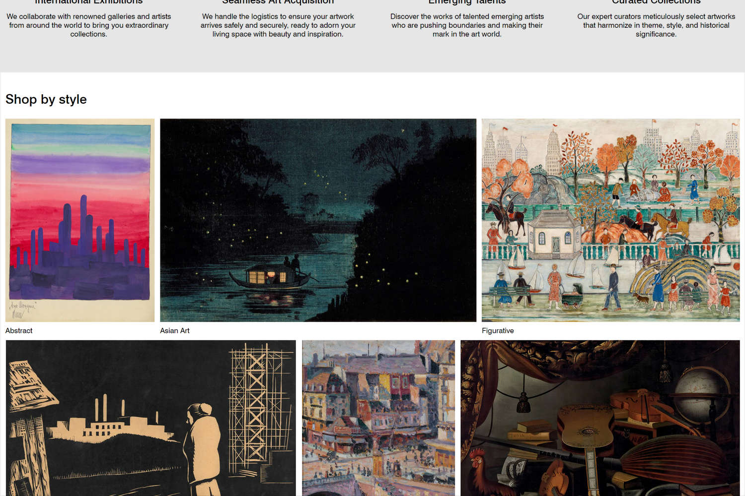
Complete the following steps to match the appearance of your home page's Collection list section to the following image.
Note
For guidance with configuring a Collection list section, refer to Collection list.
Select the Collection list section.
Apply the settings described in the following table.
Setting name Value Heading Enter heading text to display inside the section. For example, our demo store uses the heading text, Shop by style. Collections Use the Collections selector to set up collections inside the section. Our demo store's collections are: Abstract, Asian art, Figurative, Illustration, Landscape, and Still life. Refer to Shopify help: Collections. Layout > Grid type Justified Layout > Number of columns on desktop 3Standard > Alignment of items Baseline Irregular > Layout variation 3Media > Aspect ratio Landscape (4:3) Media > Maximize side Checked (on). Labels > Always show labels on mobile Checked (on).
Collection carousel 1
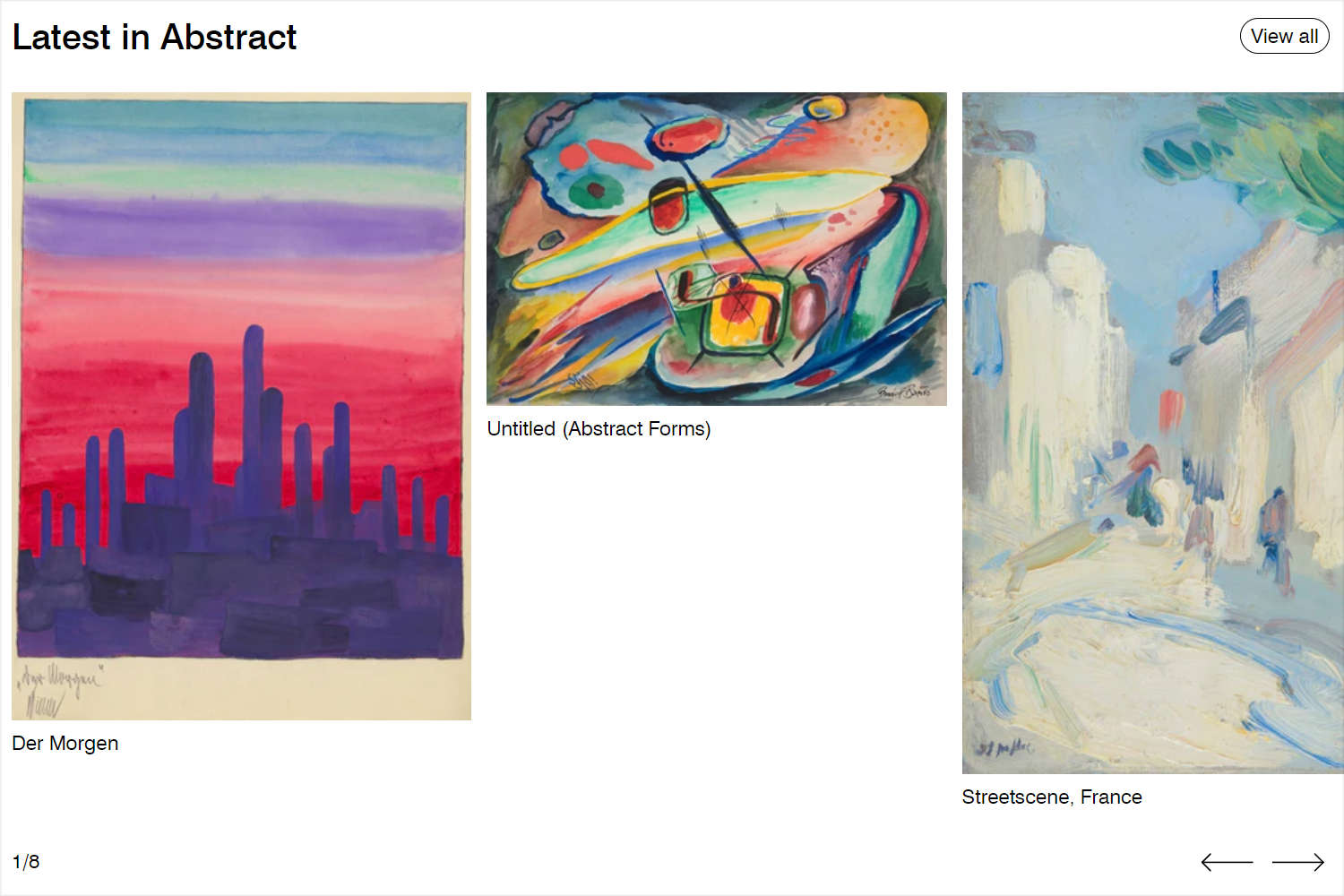
Complete the following steps to match the appearance of your store's first Collection carousel section to the following image.
Note
For guidance with configuring a Collection carousel section, refer to Collection carousel.
Select the first Collection carousel section.
Apply the settings described in the following table.
Setting name Value Heading Enter heading text to display inside the section. For example, our demo store uses the heading text, Latest in Abstract. Collections Use the Collection selector to set up a collection inside the section. Our demo store's collection is named Abstract. Refer to Shopify help: Collections. Maximum products to show 8Enable "View all" if collection has more products than shown Checked (on). Labels > Show prices Unchecked (off).
Scrolling text
Complete the following steps to match the appearance of your home page's Scrolling text section to the following video.
Note
For guidance with configuring a Scrolling text section, refer to Scrolling text.
Select the Scrolling text section.
Apply the settings described in the following table.
Setting name Value Text Enter text to display inside the section. For example, our demo store uses the text Art en masse. Text font Heading Speed 20secSpacing > Above 0Spacing > Below 0
Media with text overlay
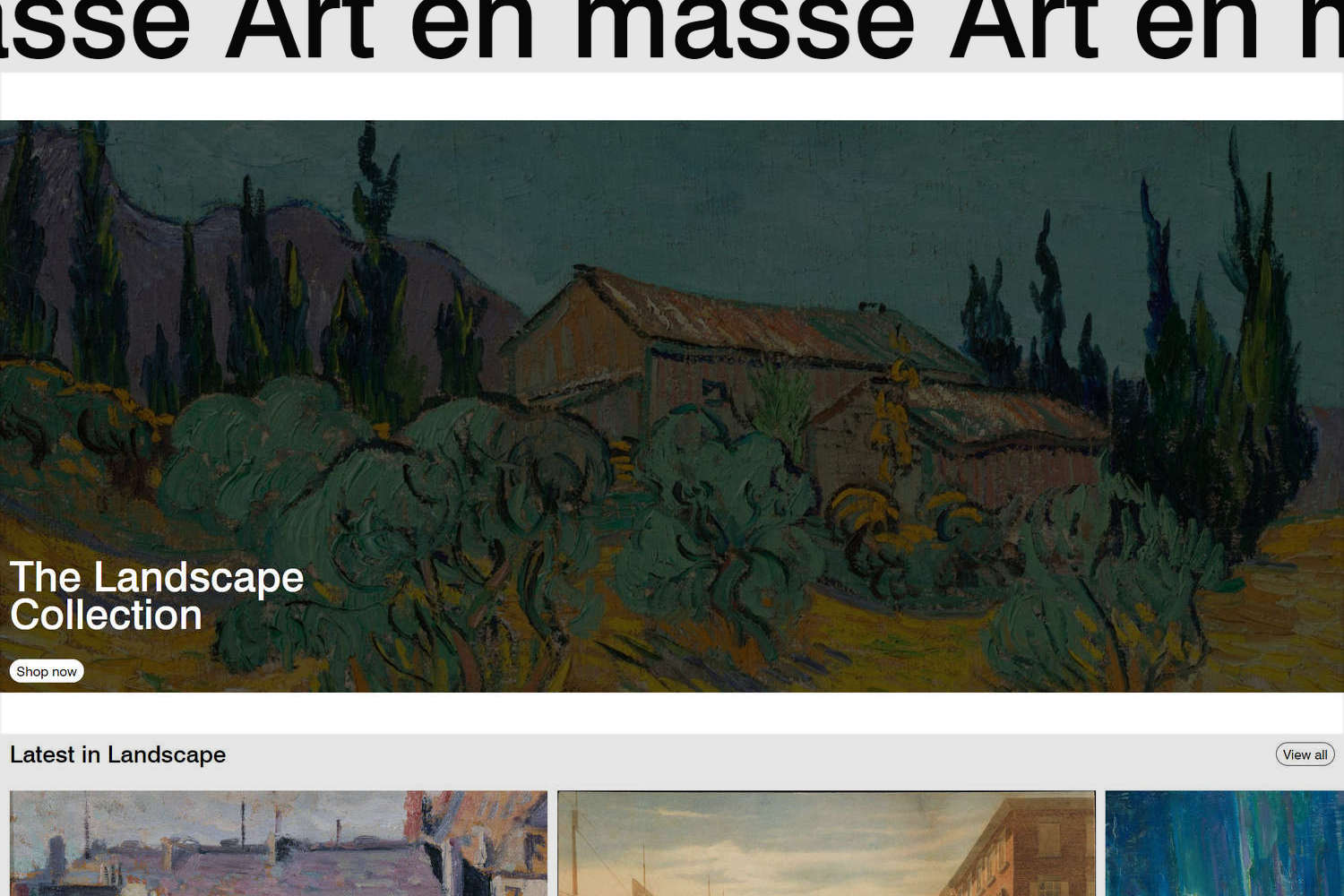
Complete the following steps to match the appearance of your home page's Media with text overlay section to the following image.
Note
For guidance with configuring a Media with text overlay section, refer to Media with text overlay.
Select the Media with text overlay section.
Apply the settings described in the following table.
Setting name Value Layout > Aspect ratio - mobile Square (1:1) Layout > Aspect ratio - desktop Cinematic (2.35:1) Layout > Content position Bottom left Layout > Text alignment Left Content > Heading Enter heading text to display inside the section. For example, our demo store uses the heading text The Landscape Collection. Content > Text None. Remove the default placeholder text. Call to action > Link On our demo store, a link to our Landscape collection page is selected. Call to action > Label Shop now Call to action > Button style Solid Color scheme Scheme 4
Media with text overlay - Image block
Select the Media with text overlay section's Image block.
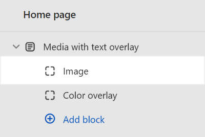
Apply the settings described in the following table.
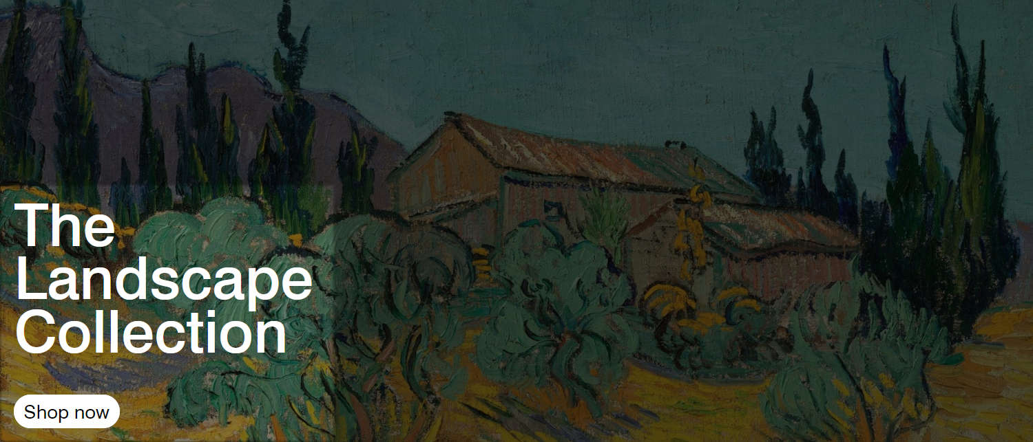
Setting name Value Image Use the Image selector options to set up an image inside the block. Our demo store uses an image to represent our Landscape collection. Refer to Add, replace or remove an image or video inside a section or block. Review the appearance of your store's Media with text overlay section.
Your Media with text overlay section's Image block should look similar to the following image.
Media with text overlay - Color overlay block
Select the Media with text overlay section's Color overlay block.
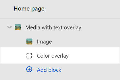
Apply the settings described in the following table.
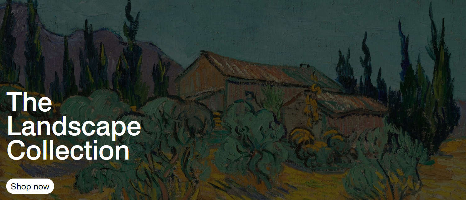
Setting name Value Effects > Opacity 67Review the appearance of your store's Media with text overlay section.
Your Media with text overlay section's Color overlay block should look similar to the following image.
Collection carousel 2
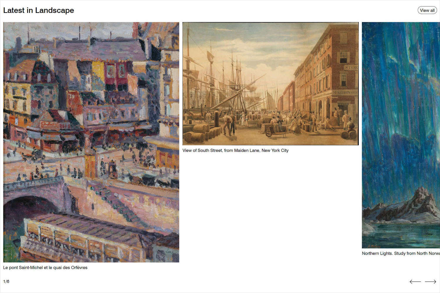
Complete the following steps to match the appearance of your home page's second Collection carousel section to the following image.
Note
For guidance with configuring a Collection carousel section, refer to Collection carousel.
Select the second Collection carousel section.
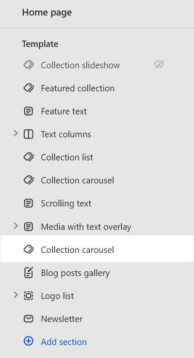
Apply the settings described in the following table.
Setting name Value Heading Enter heading text to display inside the section. For example, our demo store uses the heading text, Latest in Landscape. Collection Use the Collection selector options to set up a collection inside the section. Our demo store uses the Landscape collection. Refer to Shopify help: Collections. Enable "View all" if collection has more products than shown Check (on). Labels > Show prices Unchecked (off).
Blog posts gallery
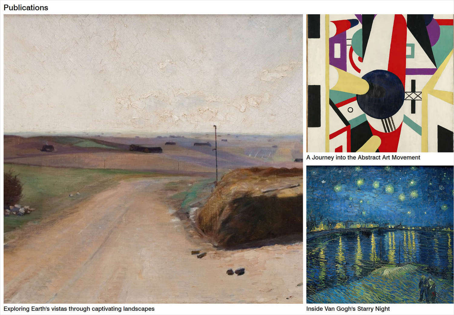
Complete the following steps to match the appearance of your home page's Blog posts gallery section to the following image.
Note
For guidance with configuring a Blog posts gallery section, refer to Blog posts gallery.
Select the Blog posts gallery section.
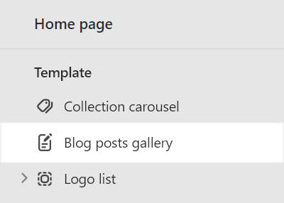
Apply the settings described in the following table.
Setting name Value Heading Enter heading text to display inside the section. For example, our demo store uses the heading text Publications. Blog Use the Blog selector options to set up a blog inside the section. Our demo store uses the Publications blog. Refer to Shopify help: Blogs. Labels > Title font Body
Logo list
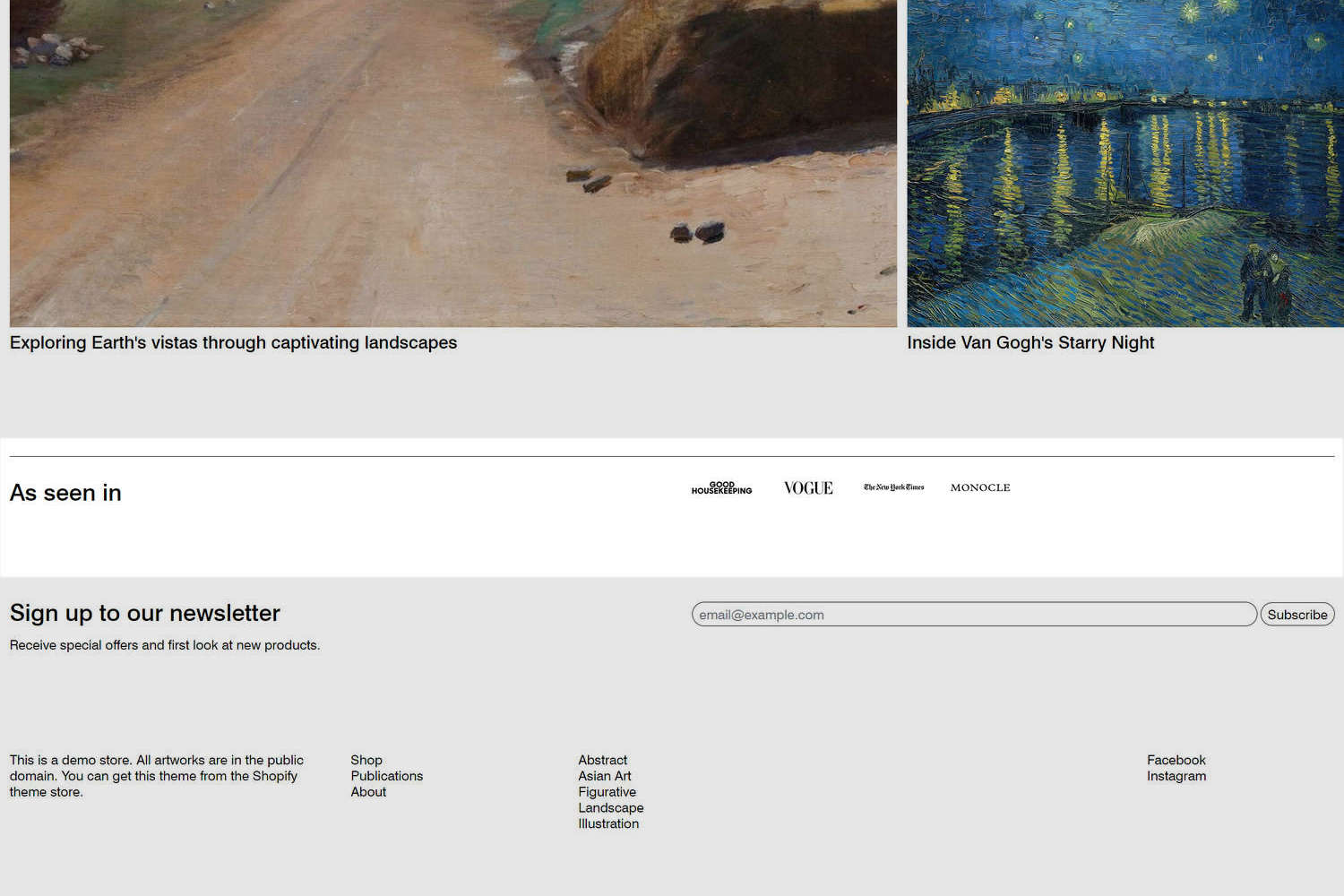
Complete the following steps to match the appearance of your home page's Logo list section to the following image.
Note
For guidance with configuring a Logo list section, refer to Logo list.
Select the Logo list section.
Apply the settings described in the following table.
Setting name Value Heading Enter heading text to display inside the section. For example, our demo store uses the heading text As seen in. Logo max width 90pxShow top border Checked (on).
Logo list - Logo block 1
Select the Logo list section's first Logo block.
Apply the settings described in the following table.
Setting name Value Image Use the Image selector options to set up an image to use as a logo, inside the block. Our demo store uses an image representing the Good housekeeping logo. Refer to Add, replace or remove an image or video inside a section or block. Review the appearance of your store's Logo list section.
Your Logo list section's first Logo block block should look similar to the following image.

Logo list - Logo block 2
Select the Logo list section's second Logo block.
Apply the settings described in the following table.
Setting name Value Image Use the Image selector options to set up an image to use as a logo, inside the block. Our demo store uses an image representing the Vogue logo. Refer to Add, replace or remove an image or video inside a section or block. Review the appearance of your store's Logo list section.
Your Logo list section's second Logo block block should look similar to the following image.

Logo list - Logo block 3
Select the Logo list section's third Logo block.
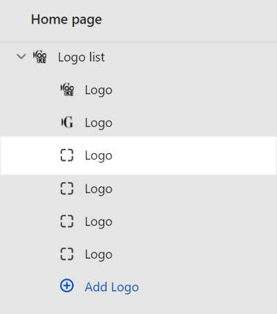
Apply the settings described in the following table.
Setting name Value Image Use the Image selector options to set up an image to use as a logo, inside the block. Our demo store uses an image representing the New York Times logo. Refer to Add, replace or remove an image or video inside a section or block. Review the appearance of your store's Logo list section.
Your Logo list section's third Logo block block should look similar to the following image.

Logo list - Logo block 4
Select the Logo list section's forth Logo block.
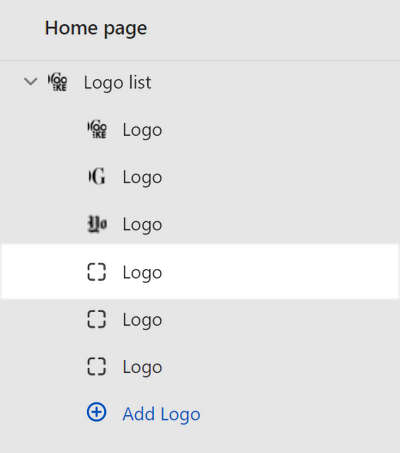
Apply the settings described in the following table.
Setting name Value Image Use the Image selector options to set up an image to use as a logo, inside the block. Our demo store uses an image representing the Monocle logo. Refer to Add, replace or remove an image or video inside a section or block. Review the appearance of your store's Logo list section.
Your Logo list section's forth Logo block block should look similar to the following image.

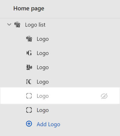
Logo list - Logo block 5
Hide the Logo list section's fifth Logo block.
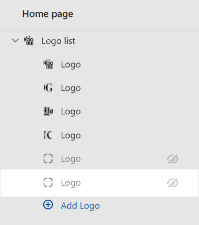
Logo list - Logo block 6
Hide the Logo list section's sixth Logo block.
Template sections specifications
In Theme editor's home page sections menu, apply the following specifications to Exhibit's Template sections and blocks.
Hero logo
Complete the following steps to configure a Hero logo section to match the appearance of your home page's Hero area to the following image.
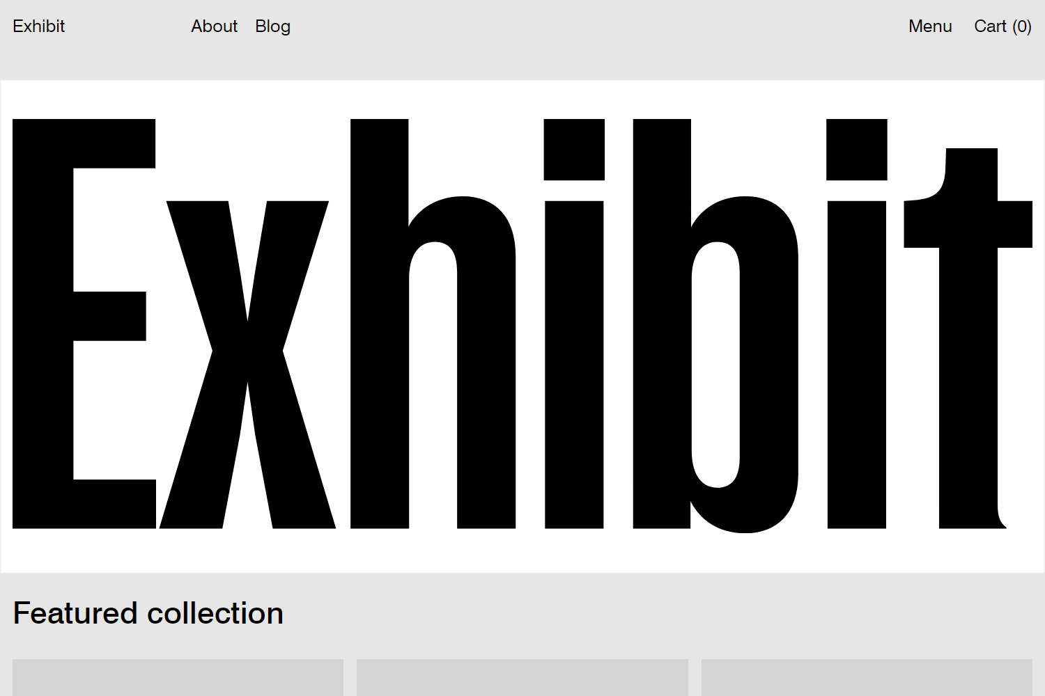
Note
For guidance with configuring a Hero logo section, refer to Hero logo.
In the Hero area, select the Hero logo section.
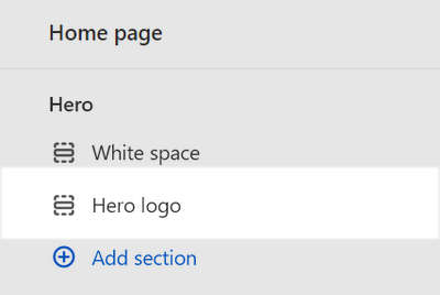
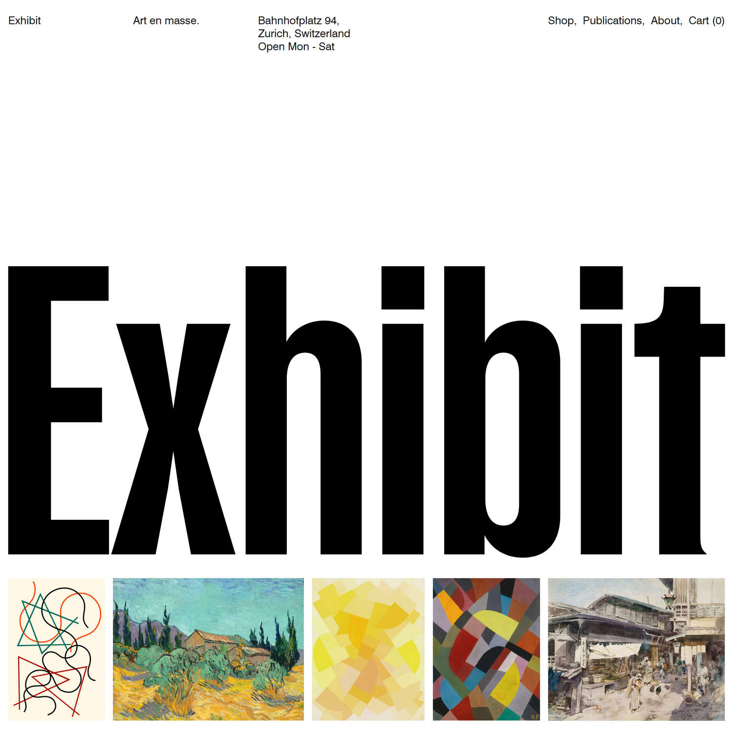
Apply the settings described in the following table.
Setting name Value Desktop font size scale 9SVG Enter Scalable Vector Graphics (SVG) code to use as your store's custom logo. For best results, remove the widthandheightattributes from the SVG. You can reuse the Example SVG code for Exhibit's logo that's provided later in this article.Spacing > Below 0
White space
Complete the following steps to configure a White space section to match the appearance of your home page's Hero area to the following image.

Note
For guidance with configuring a White space section, refer to White space.
In the Hero area, add a new White space section.
Position the new White space section above the Hero logo section.
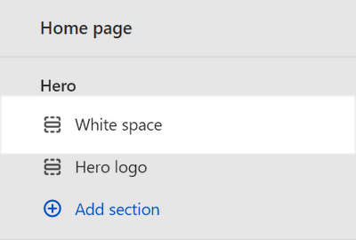
Retain the default settings for the White space section you added.
Hero logo (Footer)
Complete the following steps to configure a Hero logo section to match the appearance of your home page's Footer area to the following image.
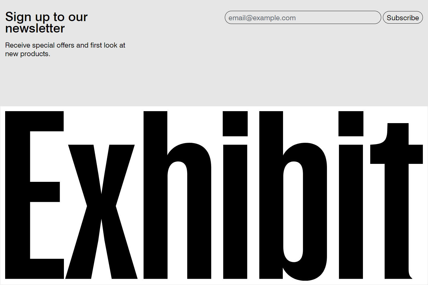
Note
For guidance with configuring a Hero logo section, refer to Hero logo.
In the Footer area, add a new Hero logo section.
Position the new section below the Footer section.
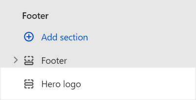
Select the new section you added.
Apply the settings described in the following table.
Setting name Value SVG Enter SVG code to use as your store's custom logo. For best results, remove the widthandheightattributes from the SVG. You can reuse the Example SVG code for Exhibit's logo that's provided later in this article.Spacing > Below 0.5x
Example Exhibit logo SVG code
The following SVG code is a custom logo from our Exhibit demo store. Copy the SVG code and use it in your store to recreate our custom logo.
html
<svg width="2000" height="813" viewBox="0 0 2000 813" fill="none" xmlns="http://www.w3.org/2000/svg">
<path d="M0 803.732V0H280.158V96.4478H119.412V338.715H261.787V435.163H119.412V707.284H281.306V803.732H0Z" fill="black"/>
<path d="M287.361 803.732L391.846 454.683L301.139 160.746H422.847L446.959 305.418L460.737 397.273L474.516 305.418L498.628 160.746H620.335L529.629 454.683L634.114 803.732H510.109L475.664 620.022L460.737 515.536L445.811 620.022L411.365 803.732H287.361Z" fill="black"/>
<path d="M662.54 803.732V0H776.211V211.267C795.73 174.525 834.769 151.561 881.844 151.561C948.439 151.561 986.329 194.044 986.329 268.676V803.732H871.511V299.677C871.511 260.639 856.584 241.12 827.879 241.12C795.73 241.12 777.359 267.528 777.359 314.604V803.732H662.54Z" fill="black"/>
<path d="M1043.77 803.732V160.746H1158.59V803.732H1043.77ZM1041.48 120.56V0H1160.89V120.56H1041.48Z" fill="black"/>
<path d="M1435.76 812.917C1381.79 812.917 1346.2 784.212 1328.97 749.767V803.732H1216.45V0H1330.12V212.415C1347.34 179.117 1382.94 151.561 1435.76 151.561C1500.05 151.561 1540.24 191.747 1540.24 268.676V695.802C1540.24 772.731 1500.05 812.917 1435.76 812.917ZM1381.79 723.359C1412.79 723.359 1425.42 700.395 1425.42 664.801V299.677C1425.42 264.083 1412.79 241.12 1381.79 241.12C1350.79 241.12 1331.27 266.38 1331.27 314.604V649.874C1331.27 698.098 1350.79 723.359 1381.79 723.359Z" fill="black"/>
<path d="M1597.69 803.732V160.746H1712.5V803.732H1597.69ZM1595.39 120.56V0H1714.8V120.56H1595.39Z" fill="black"/>
<path d="M1816.29 803.732V252.601H1747.4V160.746L1765.77 159.598C1812.85 156.154 1827.77 140.079 1828.92 93.0032L1830.07 57.4094H1931.11V160.746H2000V252.601H1931.11V756.656C1931.11 780.768 1935.7 792.25 1948.33 801.435V803.732H1816.29Z" fill="black"/>
</svg>
In the following image, the previous SVG code is displayed as a custom logo on a store's home page.

Color scheme Theme settings
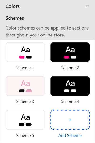
By default, Exhibit theme is pre configured with two color schemes. Refer to Colors. Our Exhibit preset demo store uses a total of five color schemes. The five demo store color schemes comprise Exhibit's two default color schemes plus three custom color schemes.
Add our Demo store's color schemes
To add our Demo store's three custom color schemes to your store, complete the following steps.
On your store's Shopify admin page, in the side menu, select Sales channels > Online store > Themes.
In the Current theme or Theme library area, locate Exhibit, and then select Customize.
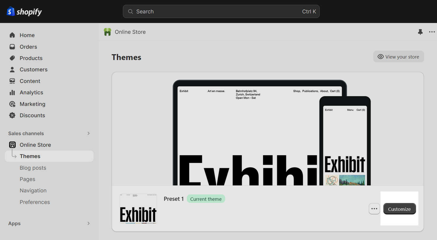
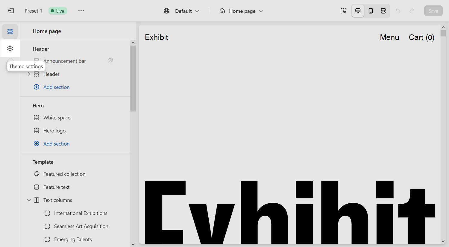
Select Theme settings.
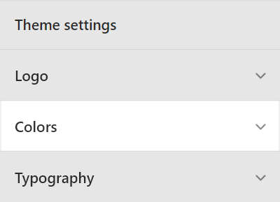
From the Theme settings menu, select Colors.
Select Add scheme, and then select the new color scheme you created from the Schemes pane.
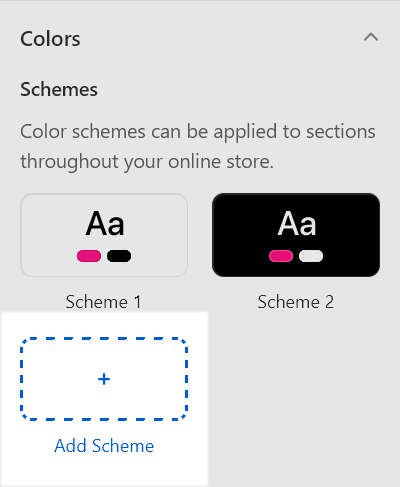
Configure the new color scheme as described in the following table.
Color scheme setting name Scheme 3 Scheme 4 Scheme 5 Background #FDF4F5 #000000 #FFFFFF Text #E8A0BF #FFFFFF #000000 Accent #121212 #FFFFFF #000000 Accent contrast #FFFFFF #000000 #FFFFFF Secondary #121212 #FFFFFF #000000 Border #121212 #FFFFFF #000000 Repeat the previous steps until you've added our three custom color schemes to your store.
