Appearance
Overlay labels
This guide describes how to set up the Overlay labels feature.

The previous image shows an example Overlay label on a store page.
Exhibit's theme sections and page templates include an Overlay labels feature. The feature displays when a store visitor places their cursor over a tile on a page or "tabs" through store content using their keyboard.
Exhibit's theme sections and pages provide two types of overlay labels:
- Text overlay
- Follow mouse
Sections that support overlay labels
The following sections include the Overlay labels feature:
- Collage
- Collection carousel
- Collection list carousel
- Collection list slideshow
- Collection list
- Featured collection
- Featured products
- Image carousel
- Image gallery
- Image slideshow
- Products carousel
- Products slideshow
- Related products
- Video carousel
- Video grid
- Video slideshow
Overlay labels are also supported in the following page templates:
- Collection
- List collections
Enable overlay labels
To enable overlay labels:
In Theme editor, select a section that supports overlay labels.
Refer to Sections that support overlay labels.
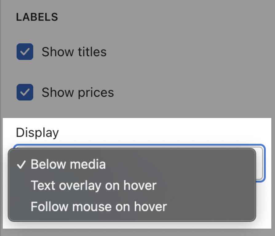
In the section menu, set the Display dropdown to Text overlay on hover or Follow mouse on hover.

Style overlay labels
Complete the following steps to set up default styles for overlay labels and customize their appearance.
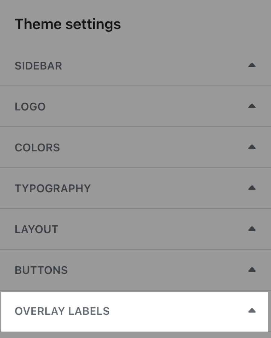
In Theme editor, select Theme settings > Overlay labels.

Select a setting described in the following table.
| Setting name | Description |
|---|---|
| Background color | Use the Background color dropdown to set a background color for labels. Choose a color from your store's color schemes or set the background to Transparent. |
| Text color | Use the Text color dropdown to set a color for label text. Choose a color from your store's color schemes. Alternatively, select White or Black. |
| Blend mode | Use the Blend mode dropdown to set how label content blends with the label background color. Refer to Mozilla developer documentation: Mix blend mode. |
| Line height | Adjust the Line height slider to display more or less space between lines of text inside a label. The slider ranges from 0 to 2. Depending on the font, adjustments to the line height may be required to display no gaps between lines of text. |
| Text overlay on hover > Desktop font size scale | Adjust the slider Desktop font size scale to specify a font size for the text that's display inside labels. The slider ranges between -2 and 10. This setting only affects "Text overlay on hover" type labels on desktop display devices. |
| Follow mouse on hover > Desktop font size scale | Adjust the slider Desktop font size scale to specify a font size for the text that's display inside labels. The slider ranges between -2 and 7. This setting only affects "Follow mouse on hover labels" type labels on desktop display devices. |
Note
Some combinations of blend modes and label colors might make overlay labels invisible or difficult to see.
We recommended using a suitable background color for overlay labels for high contrast and accessibility purposes.
Overlay label examples
The following images show examples of the overlay labels feature. A list of the Theme settings used to create each example is provided with each image.
Overlay label example 1
Background color set to White.
Text color set to Black.

Overlay label example 2
Background color set to White.
Text color set to Black.
Line height adjusted so that no gaps appear between lines.

Overlay label example 3
Background color set to (color) Scheme accent.
Text color set to White.
Blend mode set to Screen.
