Appearance
Customize Grid layouts
This guide describes how to customize the different Grid layouts available with with Exhibit theme.
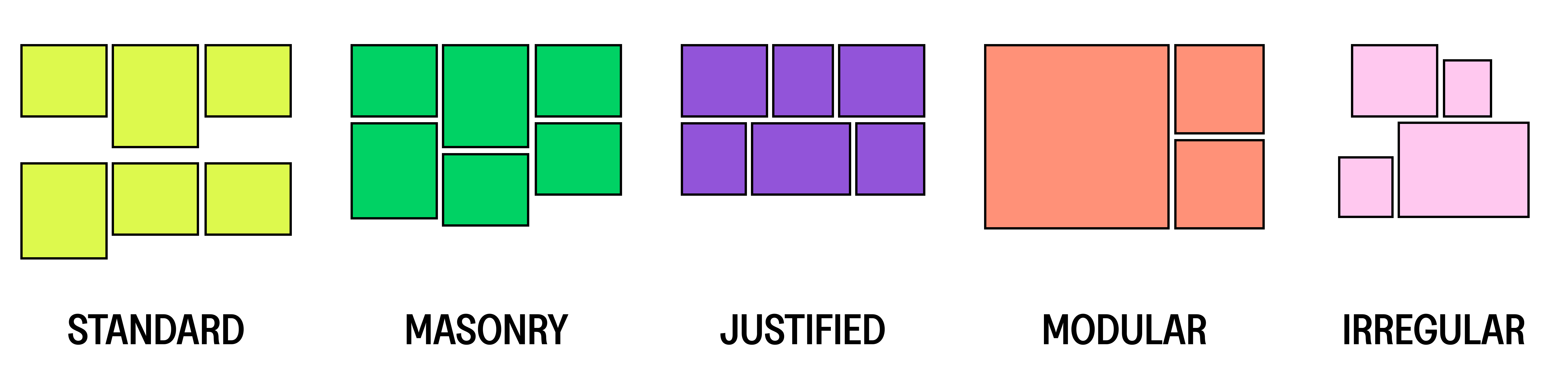
Grid types
Exhibit's Grid-based sections feature the following types of grid:
| Type | Description |
|---|---|
| Standard | A simple grid layout with equally sized columns. |
| Masonry | Tiles are arranged in a staggered or brick-like pattern. |
| Justified | Tiles are arranged in rows with equal heights, while preserving their original aspect ratios. |
| Modular | Tiles are placed into divisions of a specified size. |
| Irregular | Tiles are placed in an asymmetrical layout. |
Common grid settings
| Setting | Description |
|---|---|
| Mobile columns | Adjust the number of columns displayed on mobile devices. |
| Number of columns on desktop | Adjust the number of columns displayed on desktop devices. This setting does not apply if the Grid type is set to Modular or Irregular. |
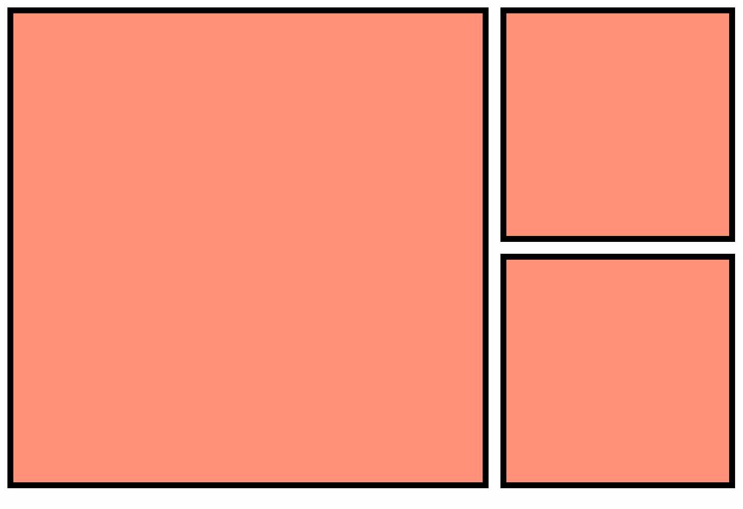
Standard grid type
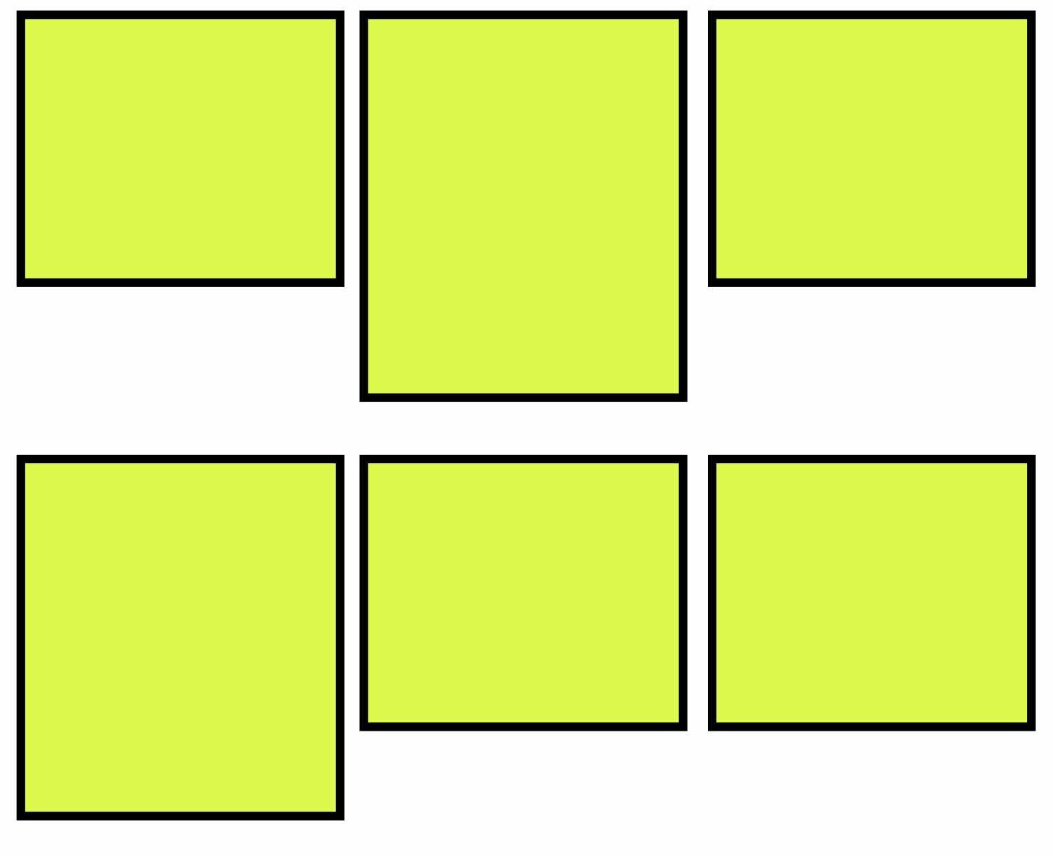
The default, Standard grid layout features a simple column-based arrangement.
The Standard grid includes the following additional settings:
| Setting | Description |
|---|---|
| Alignment of items | Set the alignment of items inside the grid to Top, Baseline, Center or Bottom. |
Masonry grid type
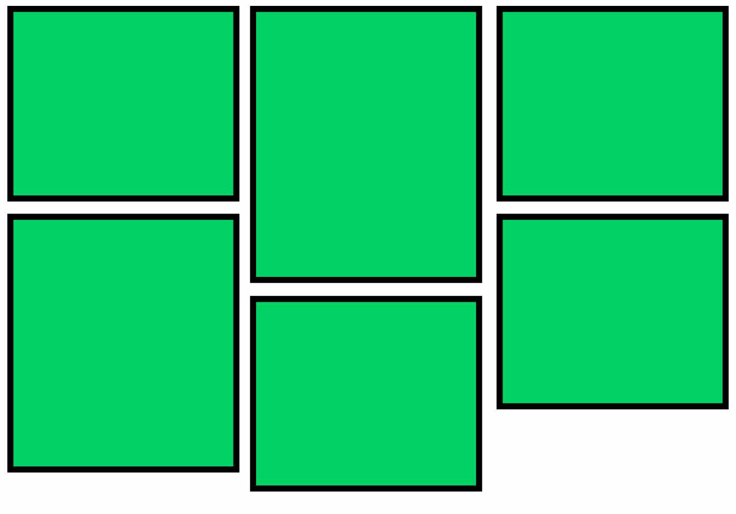
The Masonry grid type displays tiles in rows. Items in alternate rows are raised up to fill gaps, like a "bricklaying" pattern.
TIP
Masonry grid layout is best used with images of varying aspect ratios.
Justified grid type
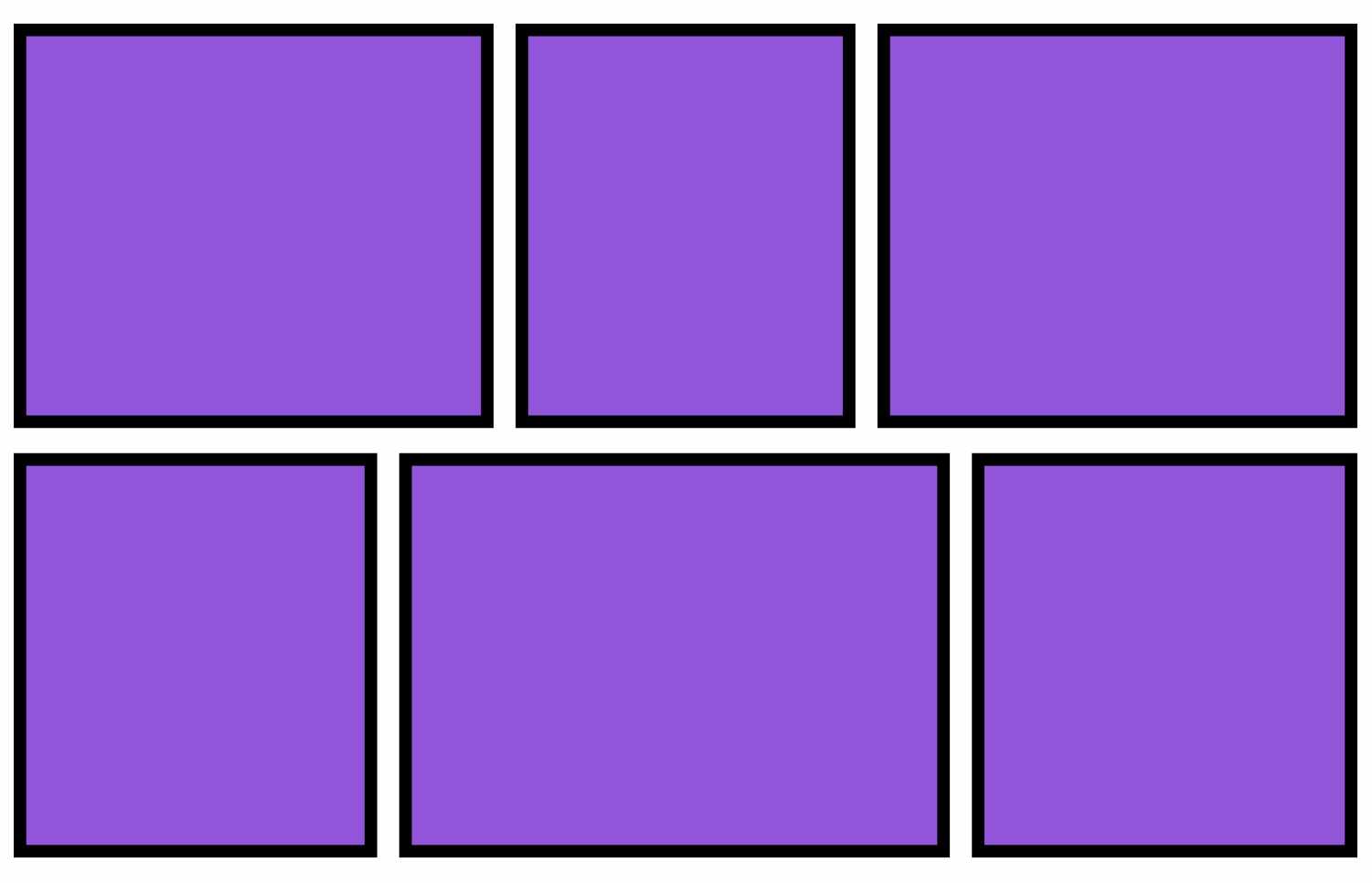
The Justified grid type arranges tiles in rows. Rows share the same height, and maintain their original aspect ratio. The tiles might have different widths, but are automatically resized to fit within the designated row height. The result is a harmonized and balanced presentation.
TIP
Justified grid layout is best used with images of varying aspect ratios.
Modular grid type
The Modular grid layout places tiles into predefined divisions consisting of square "modules". You can choose from 12 distinct modular layouts. Each module provides its own set of divisions, and you have the flexibility to select a layout that best suits your needs.
The Modular grid type includes the following additional settings:
| Setting | Description |
|---|---|
| Layout variation | Select from 12 variations. Each variation offers a unique "module" layout. |
| Grid base aspect ratio | The default aspect ratio is set to 1:1 which means the modular grid is based on square modules. A lower aspect ratio results in more landscape-style tiles, and a higher aspect ratio results in more portrait-style tiles. |
Irregular grid type
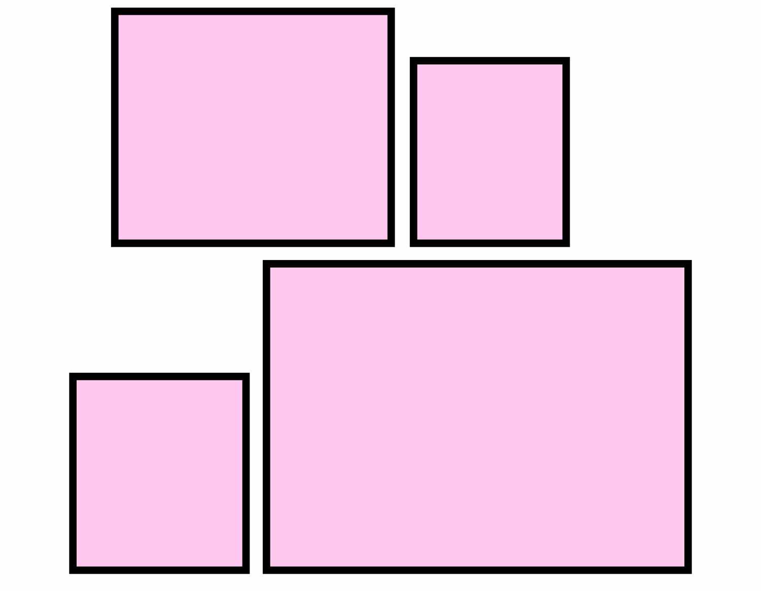
The Irregular grid type displays tiles with varying widths, and results in an asymmetrical look and feel.
The Irregular grid type includes the following additional settings:
| Setting | Description |
|---|---|
| Layout variation | Select from 15 variations. Each variation offers a unique layout. |
| Alignment of items | Select the alignment of items within the grid. The default alignment is set to Center. You can also choose from cardinal directions, including top, bottom, left, and right, to position items in the grid precisely. |
Row and column spacing
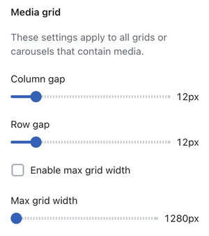
To ensure consistency and avoid redundant settings across sections, set gap sizes for Grid columns and rows using the following Theme settings.
| Setting | Description |
|---|---|
| Column gap | Set the gap between columns. |
| Row gap | Set the gap between rows. Row gap does not apply to the Modular grid type. |
| Enable max grid width | Enable a maximum width for grids. |
| Max grid width | Set a maximum width for grids, in pixels. |
TIP
For a grid without a "gutter" or no gaps, set the Row and Column gap to 0px.
Sections featuring grid layouts
Grid layouts are available across the theme in the following sections:
- Blog posts gallery
- Collage
- Collection list
- Featured collection
- Featured products
- Image gallery
- Related products
- Video grid
Grid layouts are also available in the following page templates:
- Blog template
- List collections
- Collection