Appearance
Colors
This guide describes the Theme settings > Colors menu options.
Use the settings to set how colors are displayed throughout your store. Refer to Shopify help: Colors.
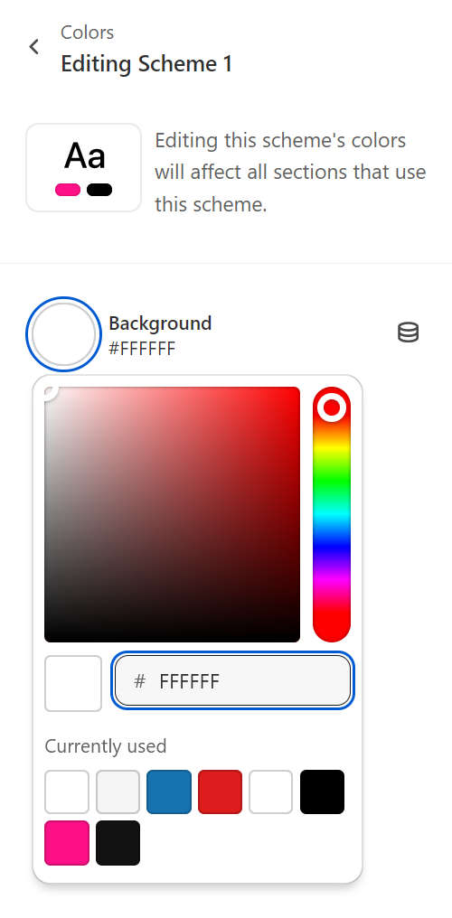
In the previous image, the Theme setting controls to adjust your color scheme's background color are displayed in Theme editor.
For general guidance with adjusting a theme setting, refer to Settings overview and Shopify help: Theme settings.
Color schemes
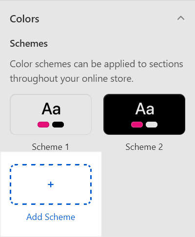
With Exhibit, you can create sets of colors called Color schemes. Exhibit support 21 different color schemes for your store. Refer to Shopify help: Color schemes.
Color schemes provide a quick and easy way to use colors consistently across your store. Instead of colorizing store elements individually, whenever you apply colors to blocks, sections and page templates, simply reuse the colors from your store's color schemes.
The following table describes Exhibit's default color schemes.
| Color scheme name | Description |
|---|---|
| Scheme 1 | This is your store's default color scheme. |
| Scheme 2 | A second default color scheme option for your store. |
Configure color schemes
To configure your store's color schemes:
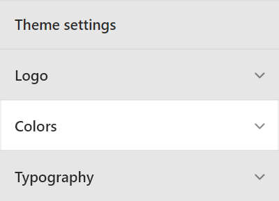
Go to Theme settings > Colors.
To edit an existing color scheme, select the color scheme from the Schemes pane.
Alternatively, to add a new color scheme, select Add scheme, and then select the color scheme you created from the Schemes pane.
Select a setting described in the following table.
| Setting name | Description |
|---|---|
| Background | To set up the color scheme's color for backgrounds, select Background, and then use the color picker, enter a hex color value, or choose a Currently used color. The background color applies to relevant sections, blocks and buttons. |
| Text | To set up the color scheme's color for text, select Text, and then use the color picker, enter a hex color value, or choose a Currently used color. The color applies to text inside the relevant sections, blocks and buttons. |
| Accent | To set up the color scheme's color for accented elements, like hover over text and hyperlinks, select Accent, and then use the color picker, enter a hex color value, or choose a Currently used color. |
| Accent contrast | To set the color scheme's second color option for accented elements, select Accent contrast, and then use the color picker, enter a hex color value, or choose a Currently used color. The color applies as a contrasting color to the elements that display using the (first) Accent color. |
| Secondary | To set up the color scheme's color for secondary elements, like social media share links, select Secondary, and then use the color picker, enter a hex color value, or choose a Currently used color. |
| Border | To set up the color scheme's color for borders, select Border, and then use the color picker, enter a hex color value, or choose a Currently used color. The color applies to the borders of elements inside the relevant sections, blocks and buttons. |
Note
All of the previous colors can be set to display a color from a dynamic source.
To display a color from a dynamic source, select the Connect dynamic source icon, beside the appropriate color selector, and then choose a dynamic source to add. You must define sources of dynamic content. Refer to Shopify help: Metafields.
Configure a section's color scheme
You can configure a color scheme for most sections in Exhibit theme. To configure a section's color scheme, refer to Configure a section's color scheme.