Appearance
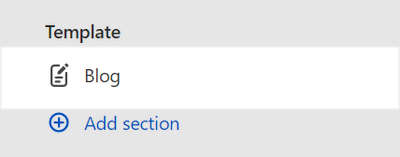
Blog
This guide describes setting up the Blog section.
Use the section to set how blog posts (articles) are displayed on blog pages created from the Default blog template.
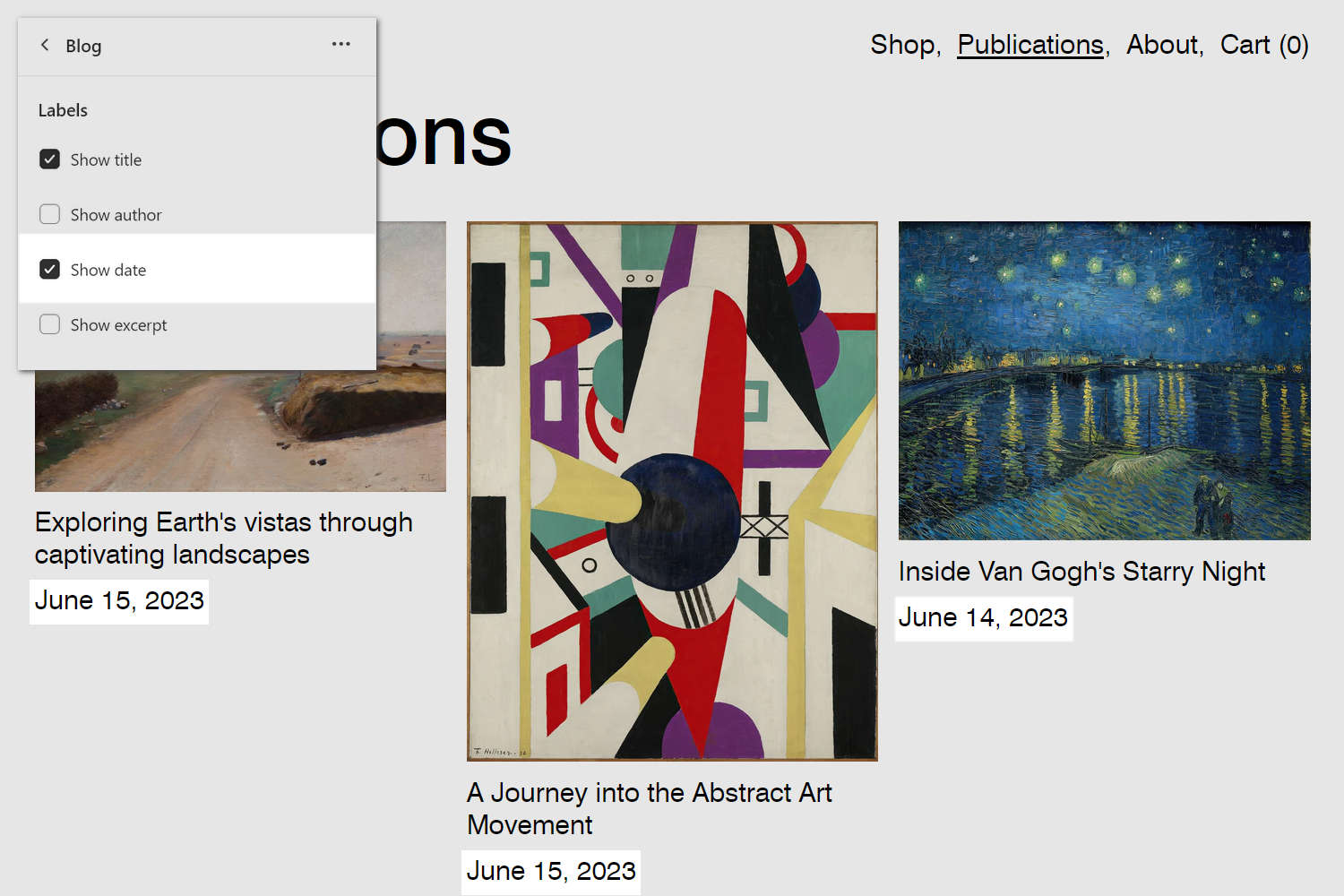
The previous image shows a Blog section on a store's Blog page. In the upper left, part of the Theme editor section menu is displayed. In the menu, the Show date checkbox is set to on. With this checkbox option enabled, the posting date of each blog post (article) is displayed inside the section.
For general guidance with modifying sections, refer to Sections overview, and Shopify help: Sections and blocks.
Set up a Blog section
To set up a Blog section:
Go to Customize theme.
In Theme editor, at the top of the page, use the dropdown to select the Blogs > Default blog page template.
Note
The section is available only on the Blogs > Default blog page template.
From the side menu, select Blog.
Select a setting described in the following table.
| Setting name | Description |
|---|---|
| Maximum number of posts per page | Adjust the slider Maximum number of posts per page to set the maximum number of blog posts (articles) to display inside the section. The slider values range from 2 to 20. |
| Layout > Grid type | Use the Grid type dropdown to select a grid layout for the section to use. The options are Standard, Masonry, Justified, Modular, and Irregular. Refer to Customize Grid layouts. |
| Layout > Mobile columns | Use the Mobile columns dropdown to set the section's grid to display 1 or 2 columns. This setting applies to mobile display devices. Refer to Customize Grid layouts. |
| Layout > Number of columns on desktop | Adjust the slider Number of columns on desktop to set the number of columns for section's grid to display. The slider ranges from 1 to 6. This setting applies to desktop display devices, and does not apply if the Grid type option is set to Modular or Irregular. Refer to Customize Grid layouts. |
| Standard > Alignment of items | Use the Alignment of items dropdown to align items inside the section's Standard grid layout to the Top, Baseline, Center, or Bottom. Refer to Customize Grid layouts. To use this option, set the Grid type dropdown to Standard. |
| Modular > Layout variation | Adjust the Layout variation slider to set a variation style for the section's Modular grid layout. The slider ranges from 1 to 12. Refer to Customize Grid layouts. To use this option, set the Grid type dropdown to Modular. |
| Modular > Grid base aspect ratio | Adjust the slider Grid base aspect ratio to set a width-to-height ratio for the tiles or "modules" inside the section's Modular grid layout. To use this option, set the Grid type dropdown to Modular. The slider ranges from 0.5:1 (wide) to 1.8:1 (tall). Setting a lower aspect ratio creates landscape-style tiles, and a higher aspect ratio creates portrait-style tiles. For square shaped modules, use the 1:1 default aspect ratio setting. |
| Modular > Do not crop media on mobile | Select the Do not crop media on mobile checkbox to turn on/off media cropping for media inside the section's Modular grid layout. This setting applies to mobile display devices. To use this option, set the Grid type to Modular. |
| Irregular > Layout variation | Adjust the Layout variation slider to set a variation style for the section's Irregular grid layout. The slider ranges from 1 to 15. Refer to Customize Grid layouts. To use this option, set the Grid type dropdown to Irregular. |
| Irregular > Alignment of items | Use the Alignment of items dropdown to set a position for items inside the section's Irregular grid layout. Refer to Customize Grid layouts. The options are:
|
| Media > Aspect ratio | Use the Aspect ratio dropdown to set a width-to-height ratio for (blog post) tiles inside the section's grid layout. The options areL The options are: Natural, Square (1:1), Landscape (4:3), Portrait (2:3), and Widescreen (16:9). To use this option, set the Grid type to Standard or Irregular. Refer to Customize Grid layouts. |
| Media > Maximize size | Select the Maximize size checkbox to turn on/off maximized images for tiles inside the section. With maximized images enabled, images fill the available space inside the section's tiles. Maximized images are not displayed if the Aspect ratio option is set to Natural. To use this option, set the Grid type to Standard or Irregular. Refer to Customize Grid layouts. |
| Tags > Enable tags navigation | Select the checkbox Enable tags navigation to turn on/off the Tags navigation feature. With this setting enabled, store visitors can select tags associated with blog posts (articles) to navigate your store's blog. |
| Labels > Show title | Select the Show title checkbox to show/hide each blog article's title, inside the section. |
| Labels > Show author | Select the Show author checkbox to show/hide the name of each blog article's writer, inside the section. |
| Labels > Show date | Select the Show date checkbox to show/hide each blog article's posting date, inside the section. |
| Labels > Show excerpt | Select the checkbox Show excerpt to show/hide a summary of each blog article, inside the section. |
| Labels > Title font | Select the Title font radio buttons to set a font for heading text inside the section. The font options are Body or Heading. |
| Color > Color scheme | Use the Change dropdown to set the section's color scheme to Scheme 1 or Scheme 2. Select Edit to configure the current color scheme. Refer to Colors. |
| Color > Color scheme > Theme settings (link) | Follow the Theme settings link to access the Theme settings > Colors menu in Theme editor. Use the Colors menu to set how colors are displayed throughout your store. |
| Spacing > Above | Move the Above slider to adjust the amount of empty or "white" space displayed above the section. The slider ranges from 0x (times) to 2x. |
| Spacing > Below | Move the Below slider to adjust the amount of empty or "white" space displayed below the section. The slider ranges from 0x (times) to 2x. |
| Spacing > Disable left and right margins | Select the checkbox Disable left and right margins to show/hide the empty or "white" space displayed on the left and right sides of the section. |
| Spacing > Remove grid gaps | Select the Remove grid gaps checkbox to show/hide the empty or "white" space displayed around each item inside the section's grid layout. |
| Theme settings | Select Theme settings to access additional settings for the section. Refer to Section theme settings menu. |
| Custom CSS | Select Custom CSS. In the box, enter custom CSS styles to apply only to the current section. Refer to Shopify help: Add custom CSS. To apply custom styles to your entire online store, refer to Theme settings > Custom CSS. |