Appearance
Product media slideshow
This guide describes setting up the Product media slideshow section.
Use the section to display media associated with a product on a Product page, arranged in a slideshow layout.
Note
The section does not change to current media dynamically or display product models.

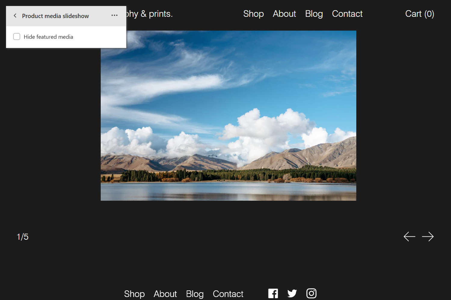
The previous image shows a Product media slideshow section on a store's (default) Product page. In the upper left, part of the Theme editor section menu is displayed. In the menu, the checkbox option to Hide featured media is set to off. This checkbox setting shows a product's featured media as part of the section's slideshow.
For general guidance with modifying sections, refer to Sections overview, and Shopify help: Sections and blocks.
Set up a Product media slideshow section
To set up a Product media slideshow section:
Go to Customize theme.
At the top of the page, use the dropdown to select a template that contains a Product media slideshow section. For example, select the Products > Default product page template.
Note
The section is available only on the Products > Default product and Products > Quick view page templates.
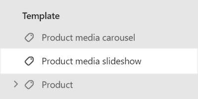
From the side menu, select Product media slideshow.

Select a setting described in the following table.
| Setting name | Description |
|---|---|
| Hide featured media | Select the checkbox Hide featured media to show/hide a product's featured media inside the section. |
| Layout > Mode | Use the Mode options to apply a Horizontal or Vertical layout to the section's slideshow. In Horizontal mode, the section's slides move left and right. In Vertical mode, the section's slides move up and down. |
| Layout > Style | Use the Style options to apply an Inset or Full screen display style to the section's slideshow. Applying a Full screen display style crops the section's media. |
| Layout > Section height - mobile | Use the Section height - mobile options to set a height for the section on mobile display devices. The options are: 50% screen height, 60% screen height, 70% screen height, 80% screen height, Full screen (height), and Adaptive full screen. The Adaptive full screen option accounts for the size of the Header and Hero sections to calculate the height of the section. |
| Layout > Section height - desktop | Use the Section height - desktop options to set a height for the section on desktop display devices. The options are: Same as mobile, 50% screen height, 60% screen height, 70% screen height, 80% screen height, Full screen (height), and Adaptive full screen. The Same as mobile option applies the Section height - mobile setting to desktop display devices. The Adaptive full screen option accounts for the size of the Header and Hero sections to calculate the height of the section. |
| Layout > Max width of slides on desktop | Adjust the slider Max width of slides on desktop to set a maximum width for slides inside the section. This setting applies to desktop display devices. The default is set to 80% (percent) of the screen's width, and the slider ranges from 20% to 100%. To use this option, set the section's Layout > Style option to Inset. |
| Media > Enable image zoom | Select the checkbox Enable image zoom to show/hide a media panel. The panel opens when a slide is selected inside the section. The panel provides zoom in/out for images. |
| Media > Video mode | Select the Mode radio buttons to set a mode for the section's video to Preview or Autoplay. Preview mode plays a few seconds of the video. Autoplay mode plays the entire video automatically. Autoplay does not not play the video's sound or show playback controls during automatic playback. Autoplay does not support videos hosted on YouTube or Vimeo. |
| Media > Video playback | Select the Playback radio buttons to set a video playback mode for the section's video player to Inline or Modal. This setting does not apply if Mode is set to Autoplay. |
| Controls > Show current index and total slides | Select the checkbox Show current index and total slides to show/hide pagination for the section's slideshow. Enable this setting to display the index number of the current slideshow item, and the total number of items in the section's slideshow. |
| Autoplay > Auto-rotate slides | Select the Auto-rotate slides checkbox to turn on/off automatic slideshow mode. With this option set to on the series of slides in the slideshow are progressed automatically. |
| Autoplay > Change slides every | Adjust the Change slides every slider to set a time for transitioning to the next/previous slide automatically. The slider ranges from 3s to 9s (seconds). |
| Color > Color scheme | Use the Change dropdown to set the section's color scheme to Scheme 1 or Scheme 2. Select Edit to configure the current color scheme. Refer to Colors. |
| Color > Theme settings (link) | Follow the Theme settings link to access the Theme settings > Colors menu in Theme editor. Use the Colors menu to set how colors are displayed throughout your store. |
| Theme settings | Select Theme settings to access additional settings for the section. Refer to Section theme settings menu. |
| Custom CSS | Select Custom CSS. In the box, enter custom CSS styles to apply only to the current section. Refer to Shopify help: Add custom CSS. To apply custom styles to your entire online store, refer to Theme settings > Custom CSS. |
| Remove section | Select Remove section to delete the section from the current page. |