Appearance
Buttons
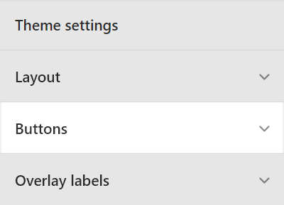
This guide describes the Theme settings > Buttons menu options.
Use the setting to specify how buttons are displayed throughout your store. Refer to Shopify help: Buttons.

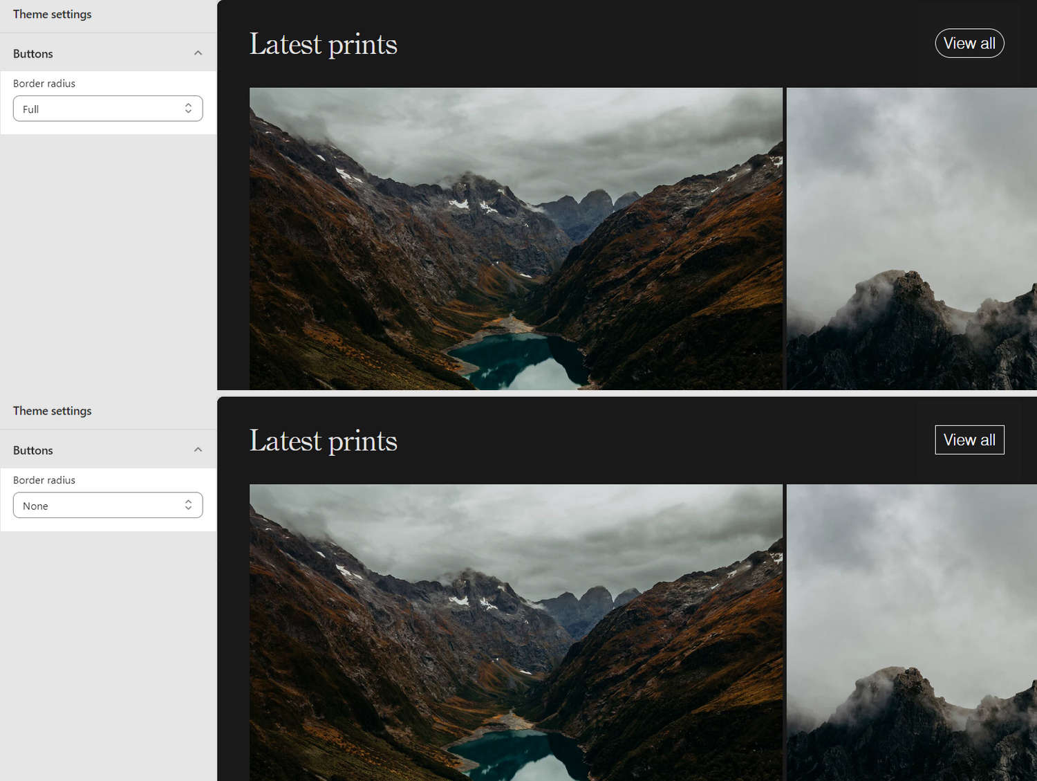
In the previous image, on the left side, the Theme settings > Buttons menu is displayed. The menu shows the following two options, selected for the Border radius dropdown:
- Full. Displays buttons with fully rounded border edges.
- None. Sets rounded edges to
off, and displays buttons with squared border edges
On the right side of the image, a store's Homepage is displayed in Theme editor. On the Homepage, each Border radius dropdown option is applied to set a shape for the edges of the borders around the View all button.
For general guidance with adjusting a theme setting, refer to Settings overview and Shopify help: Theme settings.
Configure Buttons
To set how Buttons are displayed on your store's pages:
Go to Theme settings > Buttons.

Select a setting described in the following table.
| Setting name | Description |
|---|---|
| Padding | Use the Padding setting to resize the empty space that's displayed inside your store's buttons. The empty space displays between a button's label text and border. The options are Small, Medium, and Large. |
| Border radius | Use Border radius options to set a shape for the buttons' border edges. The options are:
|
| Solid buttons > Background color | Select the Background color radio buttons to set the background color for solid (primary) buttons to the current color scheme's Text or Accent color. |