Appearance
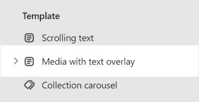
Media with text overlay
This guide describes setting up the Media with text overlay section.
Use the section to display images, videos, and color backgrounds, overlaid with text, on a page.
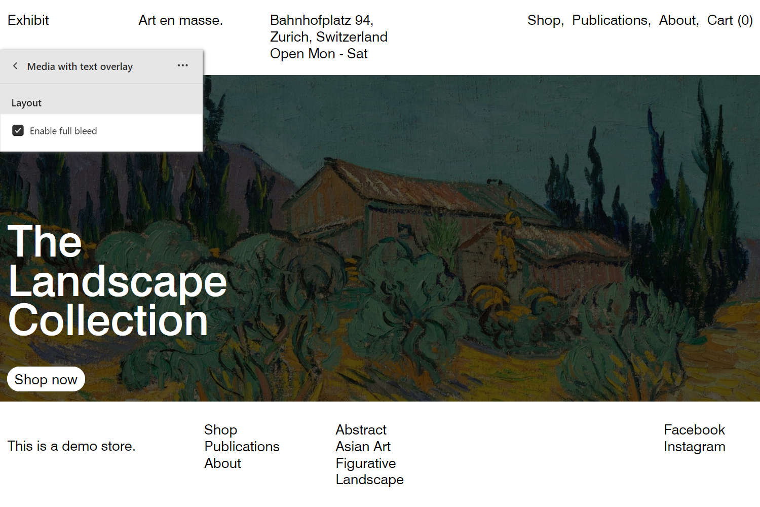
The previous image shows a Media with text overlay section on a store's Homepage. In the upper left, part of the Theme editor section menu is displayed. The menu's Enable full bleed checkbox is set to on. With this setting enabled, the section fills the entire page to the outer edges (or "bleed" area).
For general guidance with modifying sections, refer to Sections overview, and Shopify help: Sections and blocks.
Set up a Media with text overlay section
To set up a Media with text overlay section:
Go to Customize theme.
In Theme editor, at the top of the page, use the dropdown to select a template that contains a Media with text overlay section. For example, select the Homepage template.
Note
The section can be added into any page, except Checkout and Giftcard pages. To add the section into the current page, select Add section > Media with text overlay. Refer to Shopify help: Add a section.
From the side menu, select Media with text overlay.
Select a setting described in the following table.
| Setting name | Description |
|---|---|
| Enable full bleed | Select the Enable full bleed checkbox to turn on/off "Full bleed" mode. With this setting enabled, the section fills the entire page to the outer edges (or "bleed" area). |
| Aspect ratio - mobile | Use the Aspect ratio - mobile dropdown to set a width-to-height ratio for media items (tiles) inside the section. This setting applies to mobile display devices. The options are: Portrait (2:3), Square (1:1), Landscape (4:3), and Full screen. |
| Aspect ratio - desktop | Use the Aspect ratio - desktop dropdown to set a width-to-height ratio for media items (tiles) inside the section. This setting applies to desktop display devices. The options are: Same as mobile, Classic (4:3), Widescreen (16:9), Cinematic (2.35:1), and Full screen. |
| Content position | Use the Content position dropdown to set a position for content inside the section. The options are:
|
| Text alignment | Use the Text alignment dropdown to align text inside the section to the Left, Center, or Right. |
| Content width on desktop | Use the dropdown Content width on desktop to set a width for the section's content area to One third, One half, Two thirds, or Full width. |
| Content > Heading | In the Heading box, enter text to display as title text (heading) inside the section. |
| Content > Heading font size | Select the Heading font size radio buttons to set a size for the section's heading (title) text. Set headings to use the same font size as Feature, Standard, or Secondary text. |
| Content > Text | In the Text box, enter text to display as body text inside the section. Format the text and add links using the Text editor pane. |
| Content > Text > Insert dynamic source | To display body text from a dynamic source, select the Insert dynamic source icon beside the Text box, and then choose a metafield to add. Refer to Shopify help: Metafields. |
| Call to action > Link | In the Link box, enter a URL or select a store page to link to. With this setting enabled, the section's text is hyperlinked. To remove a link, select the X icon inside the Link box. |
| Call to action > Link > Insert dynamic source | To display a link from a dynamic source, select the Connect dynamic source icon beside the Link box, and then choose a metafield to add. Refer to Shopify help: Metafields. |
| Call to action >Label | In the Label box, enter text to display as a label for the section's (optional) button. To use this setting, add a URL or select a store page in the Link box. |
| Call to action > Button style | Select the Button style radio buttons to set the style for the section's buttons to Outline or Solid. |
| Color > Color scheme | Use the Change dropdown to set the section's color scheme to Scheme 1 or Scheme 2. Select Edit to configure the current color scheme. Refer to Colors. |
| Color > Theme settings (link) | Follow the Theme settings link to access the Theme settings > Colors menu in Theme editor. Use the Colors menu to set how colors are displayed throughout your store. |
| Custom CSS | Select Custom CSS. In the box, enter custom CSS styles to apply only to the current section. Refer to Shopify help: Add custom CSS. To apply custom styles to your entire online store, refer to Theme settings > Custom CSS. |
| Remove section | Select Remove section to delete the section from the current page. |
Configure a block within a Media with text overlay section
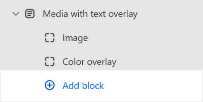
A default Media with text overlay contains 2 blocks. To configure a block inside the section:
Go to Customize theme.
In Theme editor, at the top of the page, use the dropdown to select a template that contains a Media with text overlay section. For example, select the Homepage template.
From the side menu, expand the Media with text overlay section menu.
To configure an existing block, select the block from the side menu.
To add a new block, select Add block, and then select the block you added.
Note
Inside the section, you can add, remove, show/ hide, or move blocks. Refer to Configure blocks inside a section, and Shopify help: Sections and blocks.
Apply a block setting described in the Table: Media with text overlays blocks.
Table: Media with text overlay blocks
The following table describes the blocks inside the Media with text overlay section, and their corresponding settings.
The blocks indicated with an asterisk * are contained in a default Media with text overlay section. To configure a block, refer to Configure a block within a Media with text overlay section.
| Block name | Block description | Block setting(s) |
|---|---|---|
Image * | Display images inside the section. |
|
Color overlay * | Overlay the section with a block of color. |
|
| Video | Display a video inside the section. |
|