Appearance
Set up a desktop header layout
This guide describes setting up a header layout for desktop display devices.
Use Exhibit's flexible, desktop header layout to add and reorder blocks, and specify a width for blocks inside the Header section.
Anatomy of the header section on desktop

The previous image shows a Header section that contains the following areas:
- Logo.
- Blocks, like the Menu or Rich text block.
- Utility links, like the Cart or Menu button link.
Note
The Utility links area is hidden if the Menu and Cart buttons are disabled on desktop display devices.
Columns
The Header section's layout is based on a twelve column grid. Each header area occupies space inside the header that's equivalent to a number of columns.

For example, the previous image shows a Header section. A red color indicates each column inside the Header section, with the following configuration:
- On the left side, the Logo area occupies 2 of the Header's 12 columns.
- The Menu block, in the center, uses 8 columns.
- On the right side, the Utility links area occupies 2 columns.
You can specify a width for each content area and block inside the Header section. The width options for the header are described in the following table. In Theme editor, access the width options from the Header section menu or from the corresponding block menu.
| Width option | Description |
|---|---|
| Fill remaining space | This option is available only for blocks inside the Header section. If you select this option, the block occupies all the available space that remains inside the header. |
| One sixth (1/6) | Content spans 2 of the 12 available columns. |
| One quarter (1/4) | Content spans 3 of the 12 available columns. |
| One third (1/3) | Content spans 4 of the 12 available columns |
| Five twelfths (5/12) | Content spans 5 of the 12 available columns. |
| One half (1/2) | Content spans 6 of the 12 available columns. |
Adjust the width of logo and utility links areas
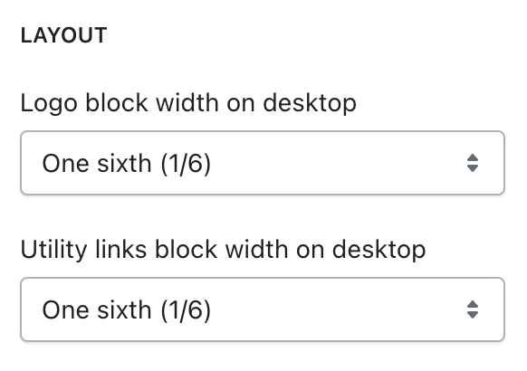
The Header section's Layout menu provides dropdown options for setting the width of the Logo and Utility links areas in Theme editor.
To use the dropdown options to adjust the width of the Logo and Utility links areas inside the Header section, refer to Set up a header section.
The following image shows the Header section's Layout menu in Theme editor.

Customize block widths
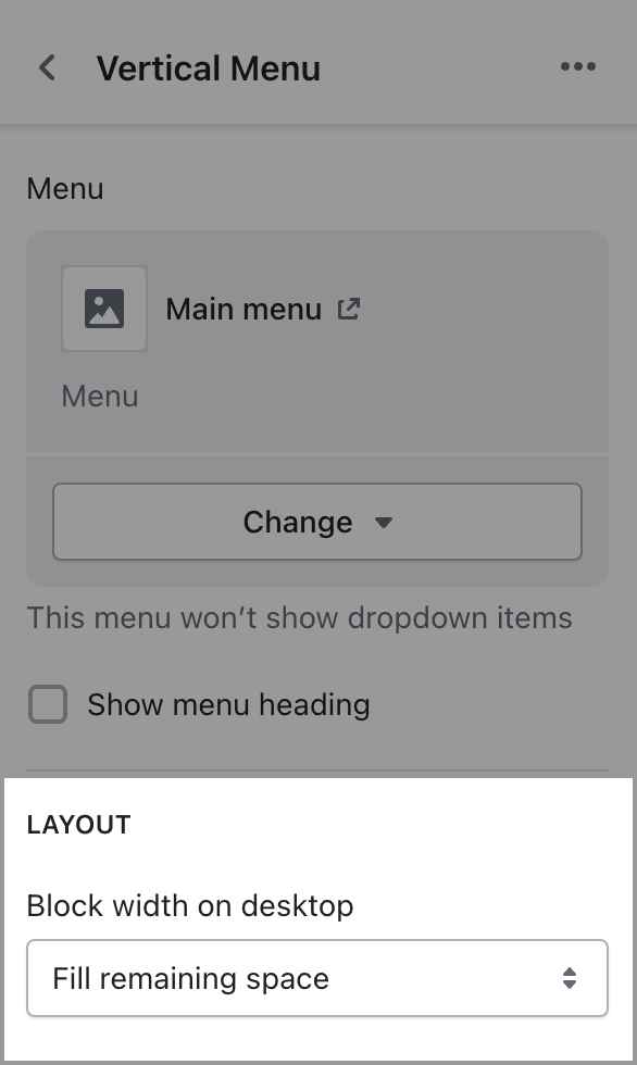
The blocks inside the Header section's provide dropdown options for setting the width the block. By default, the block width is set to Fill remaining space.
The following image shows the dropdown options for setting the width of a Vertical menu block, inside the Header section, in Theme editor.

To use the dropdown options to adjust the width of a block inside the Header section, refer to Configure a block within a Header section.
Add spacer blocks
You can add a Spacer block into the Header. A Spacer block does not add visible content into the Header section. Instead, a Spacer block displays an area of empty or "white" space inside the section.
Use Spacer blocks to add empty space between elements, to create a custom Header layout. A Spacer block's width can be set One twelfth (1/12) to occupy 1 of the 12 columns inside the Header section.
To add a Spacer block into the Header section, refer to Configure a block within a Header section.
Show layout grid guidelines in Theme editor

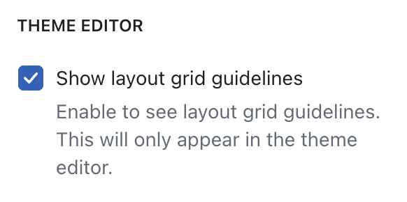
To assist you with customizing the Header layout and setting up block widths, you can show grid lines inside the Header section in Theme editor.
To display enable grid lines:
Select the Header section in Theme editor.
In the section menu, enable the checkbox option to Show layout grid guidelines.
With this option enabled, Theme editor displays the Header section's 12 columns with a border around each header area and block.
Note
The grid layout guidelines display only in Theme editor. The grid layout guidelines do not display on your live store or in any theme previews.
Example header layouts
The following images show example Header section layouts. A list of the Theme settings used to create each example is provided with each image.
Header layout example 1

| Content | Width |
|---|---|
| Logo | One sixth (1/6) |
| Rich text | One sixth (1/6) |
| Rich text | One quarter (1/4) |
| Horizontal navigation | Fill remaining space |
| Utility links | Hidden because the Menu and Cart buttons are set to "hide on desktop". |
Header layout example 2

| Content | Width |
|---|---|
| Logo | One sixth (1/6) |
| Rich text | One quarter (1/4) |
| Horizontal navigation | Fill remaining space |
| Utility links | One sixth (1/6) |