Appearance
Collection carousel
This guide describes setting up the Collection carousel section.
Use this section to display products from a collection in a carousel layout.
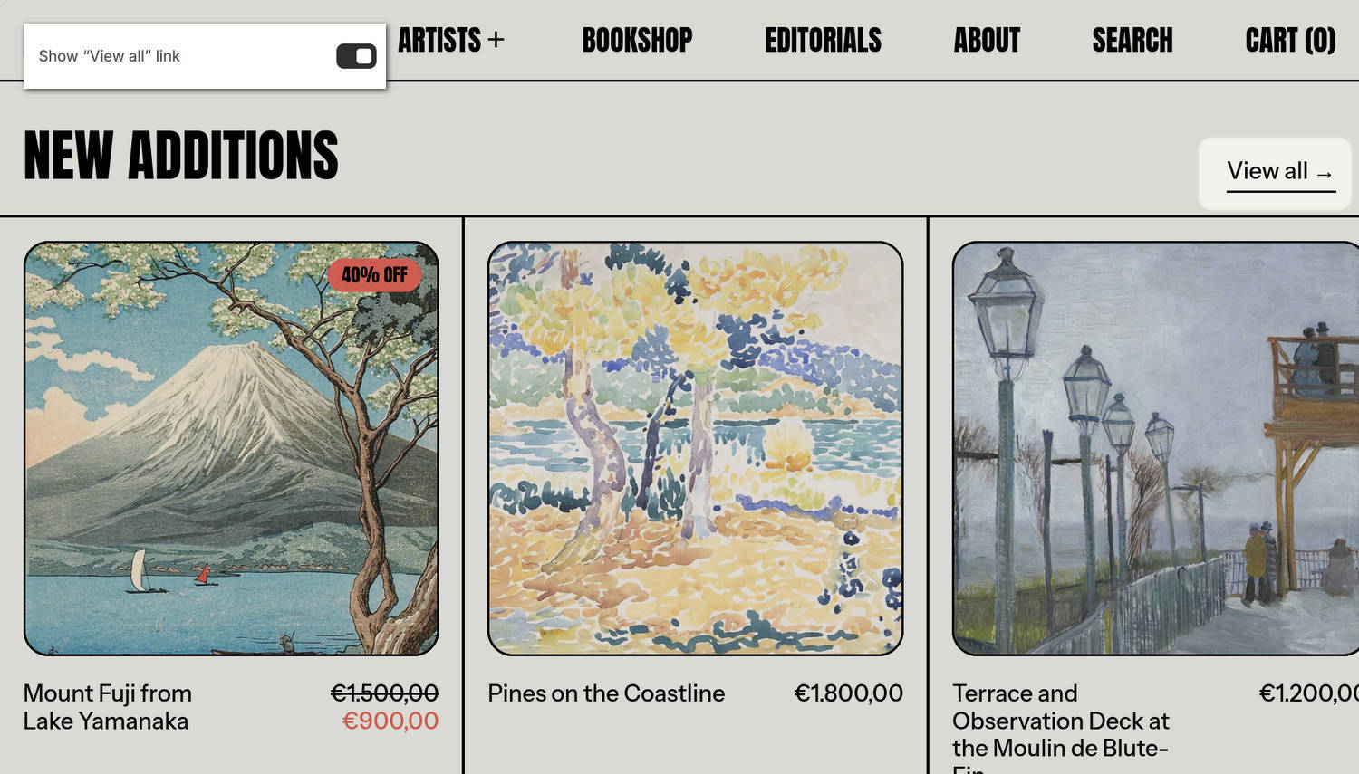
The previous image shows a Collection carousel section on a store's home page. In the upper left, part of the Theme editor's section menu is displayed. The menu's Show "View all" link option is enabled. With this option enabled, a View all link is displayed in the top-right corner of the section. Visitors can follow the link to access the full collection page.
For general guidance with modifying sections, refer to Sections overview and Shopify help: Sections and blocks.
Set up a Collection carousel section
To set up a Collection carousel section:
In the Theme editor, at the top of the page, use the theme templates dropdown menu to select a page that contains a Collection carousel section.
Note
The section can be added to any page except Checkout and Gift card pages. To add the section to the current page, select Add section > Collection carousel. Refer to Shopify help: Add a section.
From the side menu, select Collection carousel.
Select a setting described in the following table.
| Setting name | Description |
|---|---|
| Collection | Use the Collection picker to select a collection to display in the section. |
| Product tile type | Use the Product tile type option to choose the type of product tile displayed in the section. The options are Standard or Text overlay. With Standard product tiles, product details, like product title and price, are displayed below the section's product images. With Text overlay product tiles, product details overlay the section's product images. |
| Product limit | Adjust the Product limit slider to specify the maximum number of products from a collection to display in the section. The minimum number is 5 and the maximum is 20. |
| Product tiles > Use custom image crop | Select the Use custom image crop option to turn on or off custom image cropping for the section's product tile images. With this option enabled, the cropping shape you select for the Image crop option is applied to the section's product tile images. |
| Product tiles > Image crop | Use the Image crop option to choose the crop shape for the section's product tile images. The options are Natural, Square, Landscape, and Portrait. To use this option, enable the Use custom image crop option. |
| Product tiles > Image crop style | Use the Image crop style option to choose Fill or Fit for cropped images in the section's product tiles. To use this option, enable the Use custom image crop option and set the Image crop option to Square, Landscape, or Portrait. |
| Product tiles > Mobile width | Use the Mobile width option to specify the width of the section's product tiles on mobile devices. The options are 60%, 80%, and 100% of the section width. |
| Product tiles > Desktop width | Adjust the Desktop width slider to specify the width of the section's product tiles on desktop devices. The slider ranges from 20% to 40% of the section width. |
| Quick buy > Enable quick buy | Use the Enable quick buy option to show or hide a "Choose options" button on product tiles in the section. Visitors can use the button to choose product options, such as variants, before adding a product to the cart. To use this option, set the Product tile type to Standard. |
| Header > Subheading | In the Subheading field, enter text to display as a subheading for the section. Note that the Subheading field is hidden in the Theme editor when the Heading field is empty. |
| Header > Heading | In the Heading field, enter text to display as a heading for the section. |
| Header > Show "View all" link | Use the Show "View all" link option to show or hide a link to the full collection. |
| Header > Show collection products count as superscript | Use the Show collection products count as superscript option to show or hide a number in the section. The number is displayed as superscript and indicates how many products are in the collection. |
| Color > Color scheme | Use the Color scheme picker to select a color scheme for the section. Refer to Colors. |
| Theme settings | If available, select Theme settings to access additional settings for the section. Refer to Section theme settings menu. |
| Custom CSS | Select Custom CSS. In the CSS field, enter custom CSS styles to apply only to the current section. Refer to Shopify help: Add custom CSS. To apply custom styles to your entire online store, refer to Theme settings > Custom CSS. |
| Remove section | Select Remove section to delete the section from the current page. |
Note
To connect a metafield to a setting that supports metafields, select the Connect dynamic source icon displayed beside the setting in the Theme editor.
To learn how to connect a metafield to a supported setting, refer to Shopify help: Connecting metafields to your theme by using the Theme editor.