Appearance
Blog post
This guide describes setting up the Blog post section.
Use the section to set how blog content displays on a blog post (article) page.
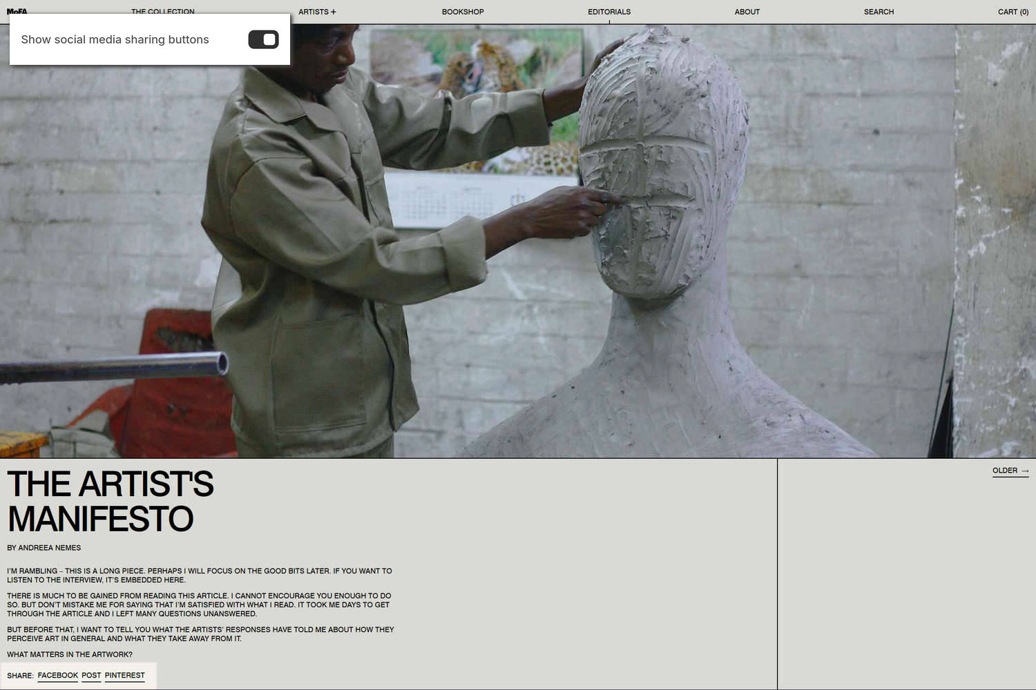
The previous image shows a Blog post section on a store's blog post page. In the upper left, part of Theme editor's section menu is displayed. The menu's Show social media sharing buttons option is enabled. With this option enabled, a Share list is displayed at the bottom of the section. Store visitors use the Share list area to share links to the store's blog articles via social media.
For general guidance with modifying sections, refer to Sections overview and Shopify help: Sections and blocks.
Set up a Blog post section
To set up a Blog post section:
In Theme editor, at the top of the page, use the theme templates dropdown menu to select Blog posts > Default blog post.
Note
The section is only available on Blog posts > Default blog post pages.
From the side menu, select Blog post.
Select a setting described in the following table.
| Setting name | Description |
|---|---|
| Show author | Use the Show author options to show or hide the name of the blog article's writer inside the section. |
| Show date | Use the Show date options to show or hide the blog article's posting date inside the section. |
| Show social media sharing buttons | Use the Show social media sharing buttons options to show or hide a Share list area inside the section. Visitors use the area to share links to your store's blog articles via social media. Refer to Social media. |
| Show tags | Use the Show tags options to show or hide tags associated with the section's blog article. Refer to Shopify help: Creating and using tags in Shopify. |
| Show links to next / previous articles | Use the Show links to next / previous articles options to show or hide links to next and previous blog articles inside the section. |
| Image > Crop image | Use the Crop images options to set a cropping shape for images inside the section. The options are No crop, Full portrait (9:16), Portrait (4:5), Square (1:1), Standard (4:3), Widescreen (16:9), Cinema (1.85:1), Ultrawide (2.35:1), and Letterbox (4:1). |
| Image > Image width on desktop | Use the Image width on desktop setting to specify a width for the section's images on desktop display devices. The options are Full, One half, and One third. |
| Image > Deep inset | Set the Deep inset option to on or off. With this option enabled, a margin is applied around the section's image. |
| Content > Text align | Use the Text align option to align the section's text to the Left or Center. |
| Content > Center content | Use the Center content options to turn on or off "Center content" mode. With this setting enabled, the section's content area is positioned horizontally in the center of the section. To use this setting, set the Image width on desktop option to Full. |
| Content > Desktop content width | Use the Desktop content width setting to specify a width for the section's content area on desktop display devices. The options are One half and Two thirds. |
| Color > Color scheme | Use the Color scheme picker to select a color scheme for the section. Refer to Colors. |
| Color > Use this color scheme for header and footer | Select the Use this color scheme for header and footer option to turn on or off "header and footer color" mode. With this setting enabled, the color scheme you choose for the section is also applied to the current page's header and footer. This option only applies to the blog post template. |
| Theme settings | If available, select Theme settings to access additional settings for the section. Refer to Section theme settings menu. |
| Custom CSS | Select Custom CSS. In the CSS field, enter custom CSS styles to apply only to the current section. Refer to Shopify help: Add custom CSS. To apply custom styles to your entire online store, refer to Theme settings > Custom CSS. |