Appearance
Custom links over image
This guide describes the Custom links over image section.
Use the section to display an image overlaid with a selection of links to your store's pages.
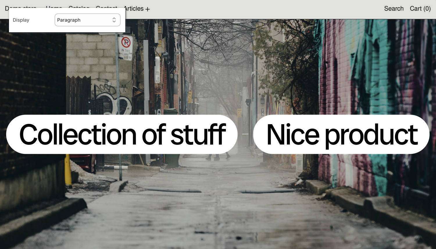
The previous image shows a Custom links over image section on a store's home page. In the upper left, part of Theme editor's section menu is displayed. The menu's Display option is set to Paragraph. With this option enabled, the section's Collection of stuff and Nice product links are displayed horizontally, in a single line of text, like a paragraph.
For general guidance with modifying sections, refer to Sections overview and Shopify help: Sections and blocks.
Configure the Custom links over image section
To configure your Custom links over image section:
In Theme editor, at the top of the page, use the theme templates dropdown menu to select a page that contains a Custom links over image section.
Note
The section can be added to any page, except Checkout and Gift card pages. To add the section to the current page, select Add section > Custom links over image. Refer to Shopify help: Add a section.
From the side menu, select Custom links over image.
Select a setting described in the following table.
| Setting name | Description |
|---|---|
| Minimum height | Use the Minimum height option to select Natural, Full screen, 3/4 screen, 2/3 screen, 1/2 screen, and more. Use this option to specify the minimum height of the section, with options ranging from natural sizing to preset tall or short layouts. |
| Align content | Use the Align content option to select Top, Center or Bottom. Use this option to choose how featured-link content is aligned within the section, positioning it at the start, center, or end for a different storefront layout and browsing feel. |
| Mobile font size scale | Adjust the Mobile font size scale slider to set a font size for the section's text on mobile display devices. The minimum value is -2 and the maximum is 4. |
| Desktop font size scale | Adjust the Desktop font size scale slider to set a font size for the section's text on desktop display devices. The minimum value is -2 and the maximum is 9. |
| Display | Use the Display options to specify a style for displaying the section's items (links). The options are List, Paragraph, and List mobile, paragraph desktop. The List option displays the section's items as a list, with one item "stacked" vertically above the next item. The Paragraph option displays the items horizontally, in a single line of text, like a paragraph, with each item separated by a "Paragraph word separator". |
| Paragraph word separator | Use the Paragraph word separator setting to specify a symbol to display between items (links) inside the section. The options are: None, Hyphen, Emdash, Dot, or Bullet. To use this option, set the Display option to anything other than List. |
| Show index as superscript | Use the Show index as superscript option to show or hide a prefix for each (link) item inside the section. With this setting enabled, each item is prefixed with an ascending index number, like a numbered list, to help customers see the order at a glance. The first item is prefixed with 1, the second item is prefixed with 2, etc. |
| Text alignment | Use the Text alignment options to align the section's text to the Left, Center or Right. |
| Maximum desktop width | Use the Maximum desktop width option to select 9/12, 10/12, 11/12 or Full. Use this setting to specify the widest desktop layout, changing how broad the section appears on larger screens and how much horizontal space the section's media and text can occupy. This option applies when the Display option is set to Paragraph. |
| Uppercase | Set the Uppercase option to on or off. With this option enabled, link titles appear in uppercase. |
| Show media on hover | Set the Show media on hover option to on or off. With this option enabled, customers reveal associated media by hovering a cursor over links. |
| Dim other links on hover | Set the Dim other links on hover option to on or off. With this option enabled, when a link is hovered, other links are dimmed to help highlight the currently hovered item. This option does not apply to links displayed as buttons with an accented background color. |
| Default media > Enable default media | Set the Enable default media option to on or off. With this option enabled, the section uses default media for featured links, so customers see the standard image or video instead of relying only on hover media. Media are visible until a link is hovered. |
| Default media > Type | Use the Type option to set the section to display an Image or Video. |
| Default media > Image | Use the Image picker to select an image to display inside the section. To use this option, set the Type option to Image. |
| Default media > Video | Use the Video picker to select a video to display inside the section. To use this option, set the Type option to Video. |
| Buttons > Show links as buttons | Set the Show links as buttons option to on or off. With this option enabled, the section's links appear as buttons instead of plain text. |
| Buttons > Button style | Use the Button style option to apply the Primary or Secondary button style to the section's buttons. To use this option, enable the Show links as buttons option. |
| Color > Color scheme | Use the Color scheme picker to select a color scheme for the section. Refer to Colors. |
| Theme settings | If available, select Theme settings to access additional settings for the section. Refer to Section theme settings menu. |
| Custom CSS | Select Custom CSS. In the CSS field, enter custom CSS styles to apply only to the current section. Refer to Shopify help: Add custom CSS. To apply custom styles to your entire online store, refer to Theme settings > Custom CSS. |
| Remove section | Select Remove section to delete the section from the current page. |
Note
To connect a metafield to a setting that supports metafields, select the Connect dynamic source icon displayed beside the setting in Theme editor.
To learn how to connect a metafield to a supported setting, refer to Shopify help: Connecting metafields to your theme by using the Theme editor.
Configure a link inside a Custom links over image section
A default Custom links over image section contains six Link blocks. To configure a Link block inside the section:
In Theme editor, at the top of the page, use the theme templates dropdown menu to select a page that contains a Custom links over image section.
From the side menu, expand the Custom links over image section menu.
To configure an existing block, select the block from the side menu.
To add a new block, select Add link, and then select the block you added.
Note
Inside the section, you can add, remove, show, hide, or move blocks. Refer to Configure blocks inside a section and Shopify help: Sections and blocks.
Apply a block setting described in the following table.
| Block name | Description | Setting |
|---|---|---|
| Link | Display a link to a store page inside the section. |
|