Skip to content

Countdown timer with image

This guide describes the Countdown timer with image section.

Use this section to display a countdown timer on a page with an optional image, text, and link.

A Countdown timer with image section on a store's home page in the Theme editor.

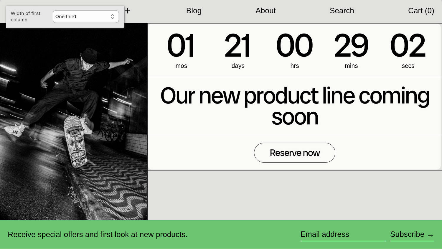
​The previous image shows a Countdown timer with image section on a store's home page. On the left, the section's first block is an Image block. In the upper left, part of the Theme editor's section menu is displayed. The menu's Width of first column option is set to One third. This option sets the width of the image block to one-third of the section's width.

For general guidance with modifying sections, refer to Sections overview and Shopify help: Sections and blocks.

Configure the Countdown timer with image section

To configure your Countdown timer with image section:

  1. In the Theme editor, at the top of the page, use the theme templates dropdown menu to select a page that contains a Countdown timer with image section.

    Note

    The section can be added to any page, except Gift card and Customer pages. To add the section to the current page, select Add section > Countdown timer with image. Refer to Shopify help: Add a section.

  2. From the side menu, select Countdown timer with image.

  3. Select a setting described in the following table.

Setting nameDescription
Width of first columnUse the Width of first column options to select One third, Two fifths, One half, Three fifths, or Two thirds. This option specifies the width of the section's first column relative to the width of the section.
Color > Color schemeUse the Color scheme picker to select a color scheme for the section.
Theme settingsIf available, select Theme settings to access additional settings for the section. Refer to Section theme settings menu.
Custom CSSSelect Custom CSS. In the CSS field, enter custom CSS styles to apply only to the current section. Refer to Shopify help: Add custom CSS. To apply custom styles to your entire online store, refer to Theme settings > Custom CSS.
Remove sectionSelect Remove section to delete the section from the current page.

Note

To connect a metafield to a setting that supports metafields, select the Connect dynamic source icon displayed beside the setting in the Theme editor.

To learn how to connect a metafield to a supported setting, refer to Shopify help: Connecting metafields to your theme by using the Theme editor.

Configure a block within a Countdown timer with image section

To configure a block for your Countdown timer with image section:

  1. In the Theme editor, at the top of the page, use the theme templates dropdown menu to select a page that contains a Countdown timer with image section.

  2. From the side menu, expand the Countdown timer with image section menu.

  3. To configure an existing block, select the block from the side menu.

    To add a new block, select Add block, choose a block to add, and then select the block you added.

    Note

    Inside the section, you can add, remove, show, hide, and move blocks. Refer to Configure blocks inside a section and Shopify help: Sections and blocks.

  4. Apply a block setting described in the following table.

Block nameDescriptionSetting
ImageDisplays an image inside the section.
  • Use the Column option to choose a column for displaying the block's image. To display the image in the block's first column, select 1, or select 2 to use the second column.
  • Use the Image picker to select an image to display inside the block.
  • Use the Deep inset option to show or hide a margin around the block's image.
  • Use the Crop options to specify an image cropping style to apply to the block's image. The options are No crop, Landscape, Square, or Portrait.
  • Use the Fill space option to turn "Fill space" mode on or off. With this option enabled, the entire area of the block is used to display the block's content. This option applies only if the block's content is inside a column. Enabling this option overrides the block's Crop setting.
  • Select Remove block to delete the block from the current section.
VideoDisplays a video inside the section.
  • Use the Column option to choose a column for displaying the block's video. To display the video in the block's first column, select 1, or select 2 to use the second column.
  • Use the Video picker to select a video to display inside the block.
  • Use the Mode options to select Preview or Autoplay playback mode for the block's video. Autoplay mode plays the entire video automatically. Autoplay does not play the video's sound or show playback controls during automatic playback.
  • Use the Deep inset option to show or hide a margin around the block's video.
  • Use the Crop options to specify a cropping style to apply to the block's video. The options are No crop, Landscape, Square, or Portrait.
  • Use the Fill space option to turn "Fill space" mode on or off. With this option enabled, the entire area of the block is used to display the block's content. This option applies only if the block's content is inside a column. Enabling this option overrides the block's Crop setting.
  • Select Remove block to delete the block from the current section.
Rich textDisplays an area with formatted body text and links inside the section.
  • Use the Column option to choose a column for displaying the block's body text content. To display the content in the block's first column, select 1, or select 2 to use the second column.
  • In the Subheading field, enter text to display as a subheading inside the block. This option is hidden in the Theme editor when the Heading field is empty.
  • In the Heading field, enter text to display as a title inside the block.
  • In the Text field, enter text to display as body text inside the block. Format the text and add links using the inline editor.
  • Use the Text alignment options to align the block's text to Left, Center, or Right.
  • Use the Link field to enter an external URL or to select a link to display inside the block. Adding a dedicated "Call to action" block will override this option.
  • In the Text field, enter text to display as a label for the block's link. Adding a dedicated "Call to action" block will override this option.
  • Use the Style options to apply a standard text Link or Button style for displaying links inside the block. Adding a dedicated "Call to action" block will override this option.
  • Use the Button style options to apply the Primary or Secondary button style to the block's button. To enable this option, set the Style option to Button. Adding a dedicated "Call to action" block will override this option.
  • Use the Width options to set a maximum width for the block's text area to Full, Two thirds, or Half. This option applies only on desktop display devices.
  • Use the Position options to specify a position for the block's text. The options are Left, Center, or Right. This option applies only on desktop display devices, and does not apply when the Width option is set to full.
  • Select Remove block to delete the block from the current section.
Feature textDisplays an area with formatted heading text and links inside the section.
  • Use the Column option to choose a column for displaying the block's text content. To display the content in the block's first column, select 1, or select 2 to use the second column.
  • In the Subheading field, enter text to display as a subheading inside the block.
  • In the Text field, enter text to display as body text inside the block. Format the text and add links using the inline editor.
  • Adjust the Mobile font size scale slider to set a font size for the block's body text on mobile devices. The minimum value is -2, and the maximum is 4.
  • Adjust the Desktop font size scale slider to set a font size for the block's body text on desktop devices. The minimum value is -2, and the maximum is 9.
  • Use the Font options to set the block's body text to use the same font as Heading or Body text.
  • Use the Text alignment options to align the block's text to Left, Center, or Right.
  • Use the Link field to enter an external URL or to select a link to display inside the block. Adding a dedicated "Call to action" block will override this option.
  • In the Text field, enter text to display as a label for the block's link. Adding a dedicated "Call to action" block will override this option.
  • Use the Style options to apply a standard text Link or Button style for displaying links inside the block. Adding a dedicated "Call to action" block will override this option.
  • Use the Button style options to apply the Primary or Secondary button style to the block's button. To enable this option, set the Style option to Button. Adding a dedicated "Call to action" block will override this option.
  • Use the Width options to set a maximum width for the block's text area to Full, Two thirds, or Half. This option applies only on desktop display devices.
  • Use the Position options to specify a position for the block's text. The options are Left, Center, or Right. This option applies only on desktop display devices, and does not apply when the Width option is set to full.
  • Select Remove block to delete the block from the current section.
Call to actionDisplays a button that links to a store page.
  • Use the Column option to choose a column for displaying the block's button. To display the button in the block's first column, select 1, or select 2 to use the second column.
  • Adjust the Mobile font size scale slider to set a font size for the block's button label text on mobile devices. The minimum value is -2, and the maximum is 4.
  • Adjust the Desktop font size scale slider to set a font size for the block's button label text on desktop devices. The minimum value is -2, and the maximum is 9.
  • Use the Font options to set the block's button label text to use the same font as Heading or Body text.
  • Use the Text alignment options to align the block's button to Left, Center, or Right.
  • Use the Link field to enter an external URL or to select a link to display inside the block's button.
  • In the Text field, enter text to display as a label for the block's button.
  • Use the Style options to apply a standard text Link or Button style to the block's button.
  • Use the Button style options to apply the Primary or Secondary button style to the block's button. To enable this option, set the Style option to Button.
  • Select Remove block to delete the block from the current section.
Countdown timerDisplays a countdown timer inside the section.
  • Use the Column option to choose a column for displaying the block's countdown timer. To display the countdown timer in the block's first column, select 1, or select 2 to use the second column.
  • Set the Use current year option to on or off. With this option enabled, the block's countdown timer uses the current year. Alternatively, to set the block's countdown timer to use a specific year, set this option to off and then enter a year in the Year option field.
  • In the Year field, enter a four-digit number that represents the year you want the block's countdown timer to display. For example, enter the year 1916. To use this option, disable the Use current year option.
  • Use the Month option to select the month you want the block's countdown timer to display. For example, select 1 – January, 2 – February, 3 – March, 4 – April, 5 – May, etc.
  • Use the Day option to select the date (day of the month) you want the block's countdown timer to display.
  • Use the Hour (24-hour time) option to select the hour (in 24-hour format) you want the block's countdown timer to display. For example, select 00 (12 a.m. / midnight), 01 (1 a.m.), 02 (2 a.m.), etc.
  • Use the Minute option to select the minute you want the block's countdown timer to display. For example, select 00, 01, 02, etc.
  • Use the Style option to apply a Numbers, Timer, or Grid style to the block's countdown timer.
  • Use the Number padding option to select S (small), M (medium), L (large) or XL (extra large). This option specifies the spacing between each block of numbers in the countdown timer.
  • Use the Size option to specify a text size for the block's countdown timer. The options are S (small), M (medium), L (large), or XL (extra large). Alternatively, select Full to set the countdown timer text to fill the available text area inside the block.
  • Set the Flash separators option to on or off. With this option enabled, a "flashing" or "blinking" animation is applied to the text characters that separate parts of the block's countdown timer. To use this option, set the Style option to Timer.
  • Use the Font options to set the block's text to use the same font as Heading or Body text.
  • Use the Always show options to override the countdown timer's auto-hide behavior. By default, the block's countdown timer automatically hides text labels for expired days, months, and years. Use the Always show options to select which labels will not be hidden. For example, set the timer to always display expired Minutes, seconds, Hours, minutes, seconds, or Days, hours, minutes, seconds, etc.
  • In the Metafield namespace and key field, enter a namespace and key value to display countdown timer text from a dynamic source. Refer to Shopify help: Metafields. This option overrides the block's date settings, and it is supported on Products, Collections, Blogs, Articles, and Pages.
  • Select Remove block to delete the block from the current section.
SpacerDisplays an area of empty (white) space inside the section.
  • Use the Column option to choose a column for displaying the block's empty space. To display empty space in the block's first column, select 1, or select 2 to use the second column.
  • Select Remove block to delete the block from the current section.
NewsletterDisplays a newsletter sign-up form inside the section.
  • Use the Column option to choose a column for displaying the block's newsletter. To display the newsletter in the block's first column, select 1, or select 2 to use the second column.
  • In the Text field, enter text to display inside the block.
  • Use the Horizontal options to specify a horizontal position for the newsletter inside the block. The options are Left, Center, or Right. This option applies only when the Text option field is empty, and only on desktop display devices.
  • Use the Vertical options to specify a vertical position for the newsletter inside the block. The options are Top, Center, or Bottom. This option applies only when the Text option field is empty, and only on desktop display devices.
  • Select Remove block to delete the block from the current section.