Appearance
Free shipping bar
This guide describes how to set up the Free shipping bar section.
Use this section to display an indicator that compares a customer's order amount with your store's free shipping threshold. You specify the threshold in Theme settings > Cart > Free shipping threshold. After the customer's order amount meets or exceeds the specified threshold, their order qualifies for free shipping.
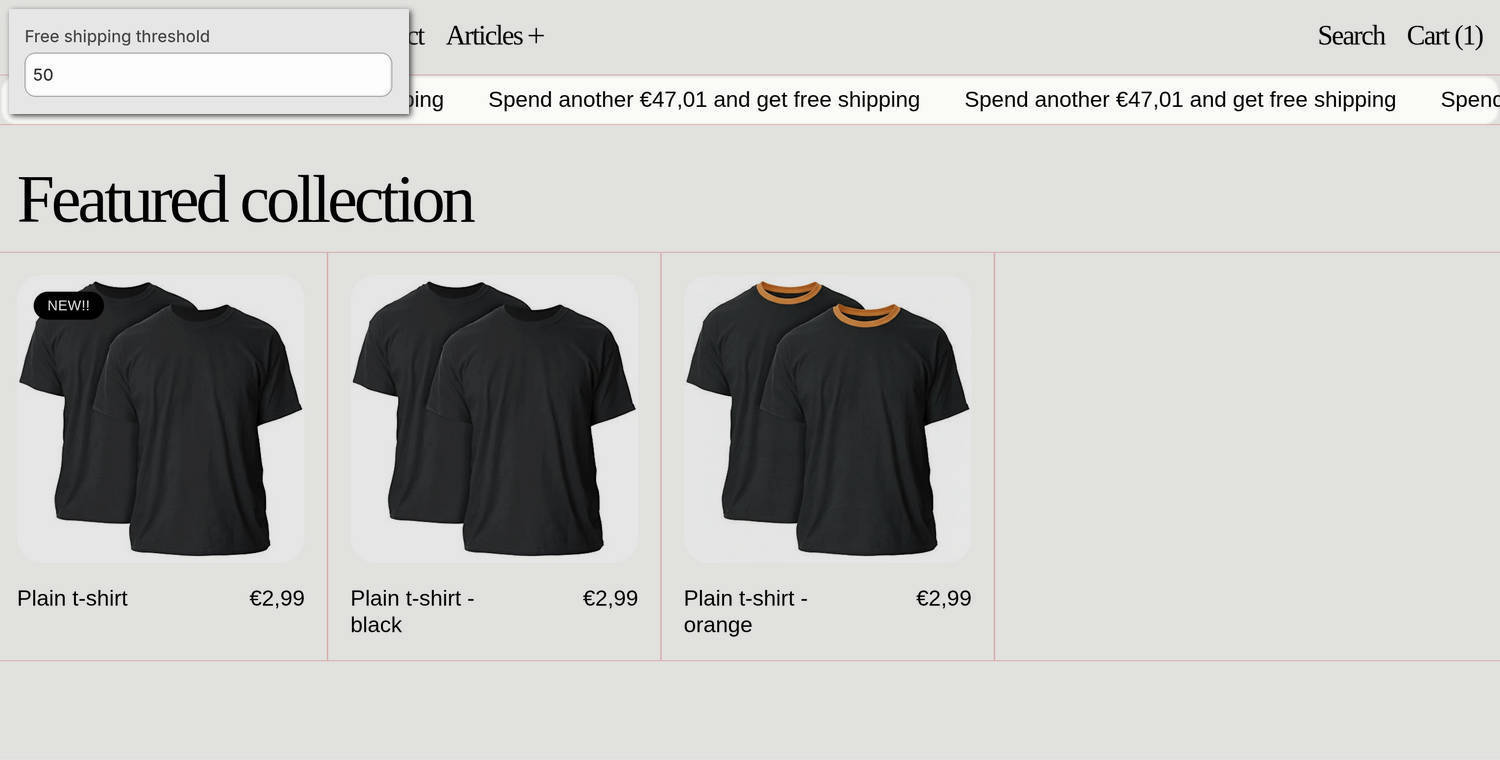
The previous image shows a Free shipping bar section on a store's home page. At the top of the page, the section displays the message Spend another €47.01 and get free shipping. The store's free shipping threshold is €50.00 and an item priced at €2.99 is in the cart.
For general guidance with modifying sections, refer to Sections overview and Shopify help: Sections and blocks.
Set up the Free shipping bar section
To set up the Free shipping bar section:
In the Theme editor, at the top of the page, use the theme templates dropdown menu to select a page that contains a Free shipping bar section. For example, select the home page.
Note
The section can be added to the header area of any page except Checkout, Gift card, and Password pages. To add the section to the current page, in the Header area, select Add section > Free shipping bar. Refer to Shopify help: Add a section.
From the side menu, select Free shipping bar.
Select a setting described in the following table.
| Setting name | Description |
|---|---|
| Home page only | Set the Home page only option to on or off. With this option enabled, the section displays only on the home page. |
| Hide on mobile | Use the Hide on mobile option to show or hide the section on mobile display devices. |
| Uppercase | Set the Uppercase option to on or off. With this option enabled, uppercase is applied to the section's text. To use this option, set Theme settings > Typography > Body text > Uppercase to off. |
| Link | In the Link field, enter a URL or select a link to a store page. The link opens when a customer selects the section. |
| Display | Use the Display options to show the section's text as Static or Scrolling text. |
| Scroll > Speed | Adjust the Speed slider between 20 and 400 to specify how quickly scrolling content moves in the section. If a user has reduced motion enabled, the scrolling text does not animate and instead displays as a static banner. |
| Scroll > Direction | Use the Direction options to set the section's text to scroll from Right to left or Left to right. |
| Scroll > Repeat text | Set the Repeat text option to on or off. With this option enabled, the section's text repeats automatically, creating an endless scrolling effect. |
| Repeat text separator > Spacing | Use the Spacing options to select S (small), M (medium), L (large), or XL (extra large). This option specifies the amount of spacing between each occurrence of repeated text. |
| Repeat text separator > Type | Use the Type options to select Gap, Character, or Button. This option specifies how the spacing between each occurrence of repeated text is displayed. The Gap option displays empty space between each occurrence. The Character option displays a specific text character between each occurrence. The Button option displays a button between each occurrence. |
| Repeat text separator > Character | Use the Character option to select ·, •, ↑, →, ↓, and more. This option specifies the text character displayed between each occurrence of repeated text in the section. To use this option, set the Type option to Character. |
| Repeat text separator > Repeat character | Adjust the Repeat character slider between 1x and 6x. This option specifies the number of text characters that are displayed between each occurrence of repeated text in the section. To use this option, set the Type option to Character. |
| Repeat text separator > Spacing between repeated characters | Use the Spacing between repeated characters options to select None, Hair, Thin, Punctuation, 4-per-em, and more. This option changes the spacing between text characters that separate each occurrence of repeated text in the section. To use this option, set the Type option to Character. |
| Repeat text separator > Button label | In the Button label field, enter text to use as a label for the button that separates each occurrence of repeated text in the section. The button uses the URL or store page you provide in the Link field. To use this option, set the Type option to Button. |
| Repeat text separator > Button style | Use the Button style option to apply a Primary or Secondary button style to the button that separates each occurrence of repeated text in the section. To use this option, set the Type option to Button. |
| Color > Color scheme | Use the Color scheme picker to select a color scheme for the section. Refer to Colors. |
| Theme settings | If available, select Theme settings to access additional settings for the section. Refer to Section theme settings menu. |
| Custom CSS | Select Custom CSS. In the CSS field, enter custom CSS styles to apply only to the current section. Refer to Shopify help: Add custom CSS. To apply custom styles to your entire online store, refer to Theme settings > Custom CSS. |
| Remove section | Select Remove section to delete the section from the current page. |
Note
To connect a metafield to a setting that supports metafields, select the Connect dynamic source icon displayed beside the setting in the Theme editor.
To learn how to connect a metafield to a supported setting, refer to Shopify help: Connecting metafields to your theme by using the Theme editor.
Configure a block in the Free shipping bar section
To configure a block in the Free shipping bar section:
In the Theme editor, at the top of the page, use the theme templates dropdown menu to select a page that contains a Free shipping bar section. For example, select the home page.
From the side menu, expand the Free shipping bar section menu.
To configure an existing block, select the block from the side menu.
To add a new block, select Add block, choose a block to add, and then select the block you added.
Note
Inside the section, you can add, remove, show, hide, and move blocks. Refer to Configure blocks inside a section and Shopify help: Sections and blocks.
Apply a block setting described in the following table.
| Block name | Description | Setting |
|---|---|---|
| Text | Displays text inside the section. |
|
| Free shipping | Displays a free shipping bar inside the section. |
|
| Countdown timer | Displays a countdown timer inside the section. Note that the block's time is set in the store's time zone. |
|