Appearance
Collection list
This guide describes setting up the Collection list section.
Use the section to display a selection of collections on a store page.
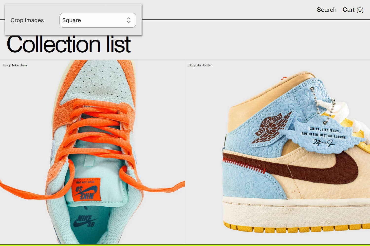
The previous image shows a Collection list section on a store's home page. In the upper left, part of Theme editor's section menu is displayed. The menu's Crop images option is set to Square. This option applies a square cropping shape to the section's collection tile image.
For general guidance with modifying sections, refer to Sections overview and Shopify help: Sections and blocks.
Set up a Collection list section
To set up a Collection list section:
In Theme editor, at the top of the page, use the theme templates dropdown menu to select a page that contains a Collection list section.
Note
The section can be added to any page, except Checkout and Gift card pages. To add the section to the current page, select Add section > Collection list. Refer to Shopify help: Add a section.
From the side menu, select Collection list.
Select a setting described in the following table.
| Setting name | Description |
|---|---|
| Font | Use the Font options to specify a font for text inside the section. Set the section's text to use the same font as Heading or Body text. |
| Text size | Use the Text size options to specify a text size for the section's text. Set the section's text to use the same text size as Body, Standard heading, Feature heading, or Secondary heading text. |
| Crop images | Use the Crop images options to set a cropping shape for images inside the section. The options are No crop, Landscape, Square, and Portrait. |
| Header > Subheading | In the Subheading field, enter text to display as a subheading for the section. Note that the Subheading field is hidden in Theme editor when the Heading field is empty. |
| Header > Heading | In the Heading field, enter text to display as a heading for the section. |
| Color > Color scheme | Use the Color scheme picker to select a color scheme for the section. Refer to Colors. |
| Theme settings | If available, select Theme settings to access additional settings for the section. Refer to Section theme settings menu. |
| Custom CSS | Select Custom CSS. In the CSS field, enter custom CSS styles to apply only to the current section. Refer to Shopify help: Add custom CSS. To apply custom styles to your entire online store, refer to Theme settings > Custom CSS. |
| Remove section | Select Remove section to delete the section from the current page. |
Note
To connect a metafield to a setting that supports metafields, select the Connect dynamic source icon displayed beside the setting in Theme editor.
To learn how to connect a metafield to a supported setting, refer to Shopify help: Connecting metafields to your theme by using the Theme editor.
Configure a collection within a Collection list section
A default Collection list section contains two Collection blocks. To configure a Collection block within a Collection list section:
In Theme editor, at the top of the page, use the theme templates dropdown menu to select a page that contains a Collection list section.
From the side menu, expand the Collection list section menu.
To configure an existing block, select the block from the side menu.
To add a new block, select Add Collection, and then select the block you added.
Note
Inside the section, you can add, remove, show, hide, and move blocks. Refer to Configure blocks inside a section and Shopify help: Sections and blocks.
Select a block setting described in the following table.
| Setting name | Description |
|---|---|
| Collection | Use the Collection picker to select a collection to display inside the block. Refer to Shopify help: Collections. |
| Deep inset | Set the Deep inset option to on or off. With this option enabled, empty space is displayed around the block's image. |
| Content > Caption | In the Caption field, enter text to display as caption text for the block. Note that this option overrides the collection title. |
| Content > Position | Use the Position options to specify a position for text inside the block. The options are: Top left, Top center, Top right, and more. |
| Color > Follow section color scheme | Use the Follow section color scheme option to turn "Follow section" mode on or off. With this option enabled, the section's color scheme is applied to the block. |
| Color > Color scheme | Use the Color scheme picker to select a color scheme for the block. Refer to Colors. To use this option, turn off the Follow section color scheme option. |
| Color > Apply text color only | Use the Apply text color only option to turn "text color only" mode on or off. With this option enabled, only the text color from your chosen color scheme is applied to the block. To use this option, turn off the Follow section color scheme option. |
| Remove block | Select Remove block to delete the block from the current section. |