Appearance
Header
This guide describes the Header section.
Use the section to provide your store's visitors with a menu for navigating the pages in your store. The Header section is typically displayed across the top of your store's pages.
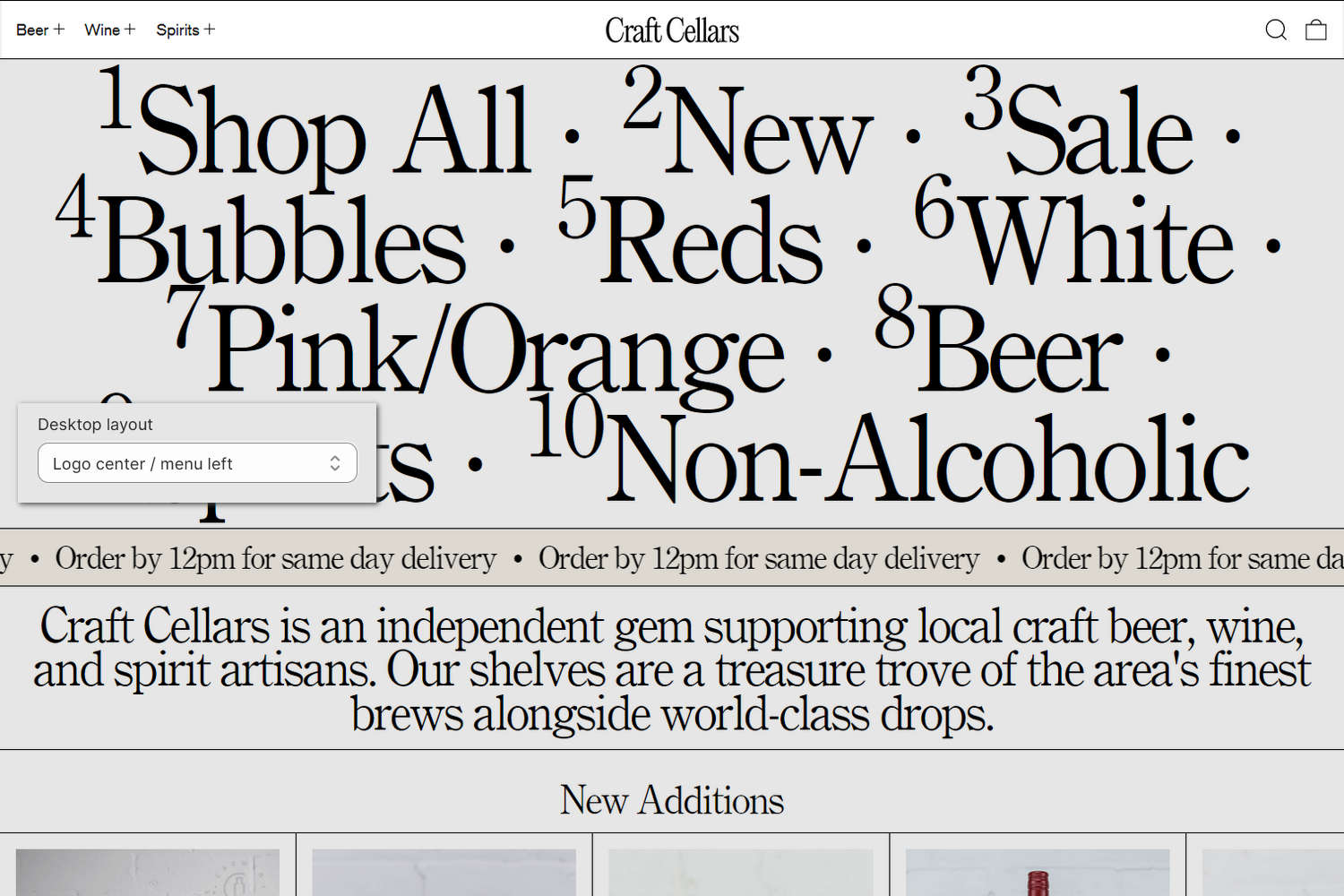
The previous image shows a Header section on a store's home page. In the center left, part of Theme editor's section menu is displayed. The menu's Desktop layout option is set to Logo center/menu left. This setting specifies the position of the section's logo image and navigation menu.
For general guidance with modifying sections, refer to Sections overview and Shopify help: Sections and blocks.
Configure the Header section
To configure your Header section:
In Theme editor, at the top of the page, use the theme templates dropdown to select the home page.
Note
The section is accessible from all pages, excluding Checkout, Password, and Gift card pages.
From the side menu, select Header.
Select a setting described in the following table.
| Setting name | Description |
|---|---|
| Logo > Theme settings (link) | Follow the Theme settings link to open Theme editor's Logo theme settings. Use the settings to configure the logo for your entire store. |
| Logo > Logo width | Adjust the Logo width slider to set a width for the logo image inside the section between 20 px and 350 px (pixels). This setting applies to desktop display devices. |
| Logo > Mobile logo width | Adjust the Mobile logo width slider to set a width for the logo image inside the section between 20 px and 180 px (pixels). This setting applies to mobile display devices. |
| Logo > Menu | Use the Menu picker to set up a menu inside the section. Refer to Set up a Header menu. The menu displays only on desktop display devices. To change navigation for the mobile/drawer menu, refer to Menu drawer. |
| Logo > Desktop layout | For desktop devices, use the Desktop layout options to select a position for the logo and menu items inside the section. The options are
|
| Logo > Vertical spacing | Use the Vertical spacing setting to specify the amount of spacing to display between items inside the section. The options are Medium and Small spacing. |
| Logo > Show search | Set the Show search option to show or hide the search icon and search field inside the section. |
| Logo > Sticky header | Use the Sticky header option to turn on or off "sticky header" mode. With this setting enabled, the header remains at the top of the page when store visitors browse the page's content. |
| Logo > Show icons | Use the Show icons option to show or hide icons inside the section. With this setting enabled, the section displays (linked) icons to represent to your store's menu items, user account, search, and cart. |
| Logo > Show products count on top-level collection links | Set the Show products count on top-level collection links option to on or off. For collections linked as a menu item in the header, enabling this option suffixes the name of the collection with a count of the total number of products in the collection. To use this option, add a collection as a menu item to the header. |
| Logo > Show current page indicator | Set the Show current page indicator option to on or off. When enabled, the setting displays a centered bottom bar beneath the active navigation link to indicate the customer's current page within the store's navigation. |
| Dropdown menus > Heading font | Use the Heading font options to set the section's (dropdown menu) heading text to use the same font as Heading or Body text. |
| Dropdown menus > Text align | Use the Text align options to align the section's (dropdown menu) text to the Left, Center, or Right. |
| Dropdown menus > Style | Use the Style setting to specify a style for displaying the section's dropdown menu items. The Grid option displays grid lines around the section's menu items. The Columns option applies a "stacked" column layout to display the section's menu items. |
| Dropdown menus > Enable links to dropdown link headings | Set the Enable links to drop-down link headings option to on or off. This option controls whether a dropdown’s top-level menu heading behaves like a link. When enabled, selecting the heading opens the dropdown and navigates to the linked parent page or collection. |
| Dropdown menus > Show top-level menu link in dropdown | Set the Show top-level menu link in dropdown option to on or off. This option controls whether the parent (top-level) link is shown as the first item inside its own dropdown. When enabled, customers see the parent link repeated within the dropdown list. To use this option, enable Enable links to drop-down link headings. |
| Drop-down menus > Show collection products count | Set the Show collection products count option to on or off. This setting toggles display of product counts next to collection links inside the section's top navigation and in dropdown menus. The product counts show customers how many items each collection contains. |
| Language selector > Language settings (link) | Follow the language settings link to open the Languages area of your store's Shopify admin. Use the Languages admin settings to configure your store's supported languages. Refer to Shopify help: Selling in multiple languages. |
| Language selector > Show language selector | For stores that support multiple languages, use the Show language selector option to show or hide a language selector inside the section. The language selector allows store visitors to switch between different language versions of your store. |
| Country/region selector > Payment settings (link) | Follow the payment settings link to open the Payments area of your store's Shopify admin. Use the Payments admin settings to configure your store's supported payment methods, regions, and currencies. Refer to Shopify help: Payments. |
| Country/region selector > Show country/region selector | For stores that support multiple regions and currencies, use the Show country/region selector option to show or hide a region selector inside the section. The region selector allows store visitors to switch between your store's supported regions and currencies. |
| Color > Color scheme | Use the Color scheme picker to select a color scheme for the section. Refer to Colors. |
| Overlay settings > Overlay header over home page | Use the Overlay header over home page option to turn on or off positioning the header over the home page, as an overlay. |
| Overlay settings > Text color scheme | Use the Color scheme picker to select a color for (overlaid) text when the header overlays the home page. Set the section's overlay text color to use a text color from one of your store's color schemes. Refer to Colors. To use this option, enable the Overlay header over home page option. |
| Overlay settings > Logo image | Use the Logo image picker to set up an image inside the section. Refer to Add, replace or remove an image or video inside a section or block. |
| Theme settings | If available, select Theme settings to access additional settings for the section. Refer to Section theme settings menu. |
| Custom CSS | Select Custom CSS. In the CSS field, enter custom CSS styles to apply only to the current section. Refer to Shopify help: Add custom CSS. To apply custom styles to your entire online store, refer to Theme settings > Custom CSS. |
Note
To connect a metafield to a setting that supports metafields, select the Connect dynamic source icon displayed beside the setting in Theme editor.
To learn how to connect a metafield to a supported setting, refer to Shopify help: Connecting metafields to your theme by using the Theme editor.
Configure a block within a Header section
To configure a block for your Header section:
In Theme editor, at the top of the page, use the theme templates dropdown menu to select the home page.
From the side menu, expand the Header section menu.
To configure an existing block, select the block from the side menu.
To add a new block, select Add block, choose a block to add, and then select the block you added.
Note
Inside the section, you can add, remove, show, hide, and move blocks. Refer to Configure blocks inside a section and Shopify help: Sections and blocks.
Apply a block setting described in the following table.
| Block name | Description | Setting |
|---|---|---|
| Drop-down featured images | Adds images to a Header section’s dropdown menu (desktop only). Each dropdown menu can contain one featured images block. |
|
Set up a Header menu
To select a menu to display inside the Header section, apply the following settings in Header > Menu.
If the section has no menu, to select a menu, choose Select. Enter the name of a menu into the Search box, or pick a menu from the list.
To edit the current menu, select the Menu picker and then choose the Edit link. The link opens the Menus editor in your store's Shopify admin. Use the editor to modify the menu. Refer to Shopify help: Add, remove, or edit menu items in your online store.
To create a new menu, select the Menu picker:
- If you have an existing menu, follow the Edit link.
- If no menu is present, follow the Create menu link.
The link opens the Menus editor in your store's Shopify admin. Use the menu editor to create a new menu, and then select the new menu. Refer to Shopify help: Add, remove, or edit menu items in your online store.
To replace the current menu, select the Menu picker and then choose Replace. Enter the name of the replacement menu into the Search box, or pick a replacement menu from the list.
To delete the current menu, select the Menu picker and then choose Remove menu.
Note
Note that this Header menu is only displayed on desktop devices. To change navigation for the mobile/drawer menu, refer to Menu drawer.