Appearance
Video with text
This guide describes setting up the Video with text section.
Use the section on a page to display a video side by side with text.
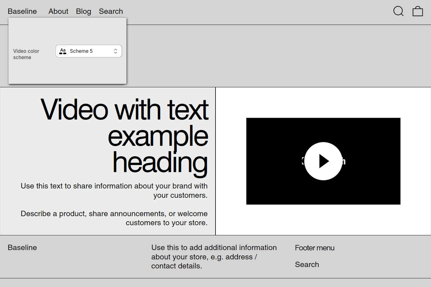
The previous image shows a Video with text section on a store's home page. In the upper left, part of Theme editor's section menu is displayed. To specify a color scheme for the section's video area, the menu's Video color scheme picker is set to Scheme 5. The color scheme's background color is applied as a background color to the section's video area. To use this option, the section's Deep inset option must be enabled.
For general guidance with modifying sections, refer to Sections overview and Shopify help: Sections and blocks.
Set up a Video with text section
To set up a Video with text section:
In Theme editor, at the top of the page, use the theme templates dropdown menu to select a page that contains a Video with text section.
Note
The section can be added to any page, except Checkout and Gift card pages. To add the section to the current page, select Add section > Video with text. Refer to Shopify help: Add a section.
From the side menu, select Video with text.
Select a setting described in the following table.
| Setting name | Description |
|---|---|
| Content > Video | Use the Video picker to select a video to display inside the section. Refer to Add, replace or remove an image or video inside a section or block. |
| Content > Mode | Use the Mode options to select Preview or Autoplay playback mode for the section's video. Preview mode plays a few seconds of the video. Autoplay mode plays the entire video automatically. Autoplay does not play the video's sound or show playback controls during automatic playback. |
| Content > Video position on desktop | Use the Video position on desktop options to position the section's video to the Left or Right on desktop display devices. |
| Content > Video size on desktop | Use the Video size on desktop options to specify a width for the section's video on desktop display devices. The options are One third, One half, and Two thirds. |
| Content > Aspect ratio | Use the Aspect ratio options to set a width-to-height ratio for displaying the section's video. The options are: Natural, Square (1:1), Landscape (4:3), Portrait (2:3), and Widescreen (16:9). |
| Content > Deep inset | Use the Deep inset option to show or hide an area of empty space around the section's video. |
| Content > Fit video to text | Use the Fit video to text option to turn "Fit video to text" mode on or off. With this option enabled, the section's video is cropped to match the size of the section's text area. On desktop display devices, enabling this option crops the section's video. |
| Content > Video color scheme | Use the Video color scheme picker to select a color scheme. Refer to Colors. The selected color scheme is used as the background color when Deep inset is enabled. |
| Content > Subheading | In the Subheading field, enter text to display as a subheading for the section. Note that the Subheading field is hidden in Theme editor when the Heading field is empty. |
| Content > Heading | In the Heading field, enter text to display as a heading for the section. |
| Content > Text | In the Text field, enter body text to display inside the section. Use the inline text editor to format the text and add links, as needed. |
| Content > Text font | Use the Text font options to set the section's body text to use the same font as Heading or Body text. Note that the Text font field is hidden in Theme editor when the Text field is empty. |
| Content > Text size | Use the Text size options to set the size of the section's body text to the same size as Body, Standard heading, Feature heading, or Secondary heading text. Refer to Typography. Note that the Text size field is hidden in Theme editor when the Text field is empty. |
| Content > Alignment | Use the Alignment options to align the section's text to the Left, Center, or Right. |
| Content > Position | Use the Position options to position the section's text at the Top, Middle, or Bottom. |
| Color > Color scheme | Use the Color scheme picker to select a color scheme for the section. Refer to Colors. |
| Call to action > Link | In the Link field, enter a URL or select a store page for the section's call-to-action. |
| Call to action > Text | In the Text field, enter a single line of text to display as a label for the section's call-to-action. |
| Call to action > Style | Use the Style options to select Link or Button. This option lets you choose whether the call-to-action appears as a simple text link or as a button. |
| Call to action > Button style | Use the Button style options to apply the Primary or Secondary button style to the section's call-to-action button. To use this option, set the Style to Button. |
| Theme settings | If available, select Theme settings to access additional settings for the section. Refer to Section theme settings menu. |
| Custom CSS | Select Custom CSS. In the CSS field, enter custom CSS styles to apply only to the current section. Refer to Shopify help: Add custom CSS. To apply custom styles to your entire online store, refer to Theme settings > Custom CSS. |
| Remove section | Select Remove section to delete the section from the current page. |
Note
To connect a metafield to a setting that supports metafields, select the Connect dynamic source icon displayed beside the setting in Theme editor.
To learn how to connect a metafield to a supported setting, refer to Shopify help: Connecting metafields to your theme by using the Theme editor.