Appearance
Feature text
This guide describes setting up the Feature text section.
Use the section to display formatted text on a store page, with or without links.
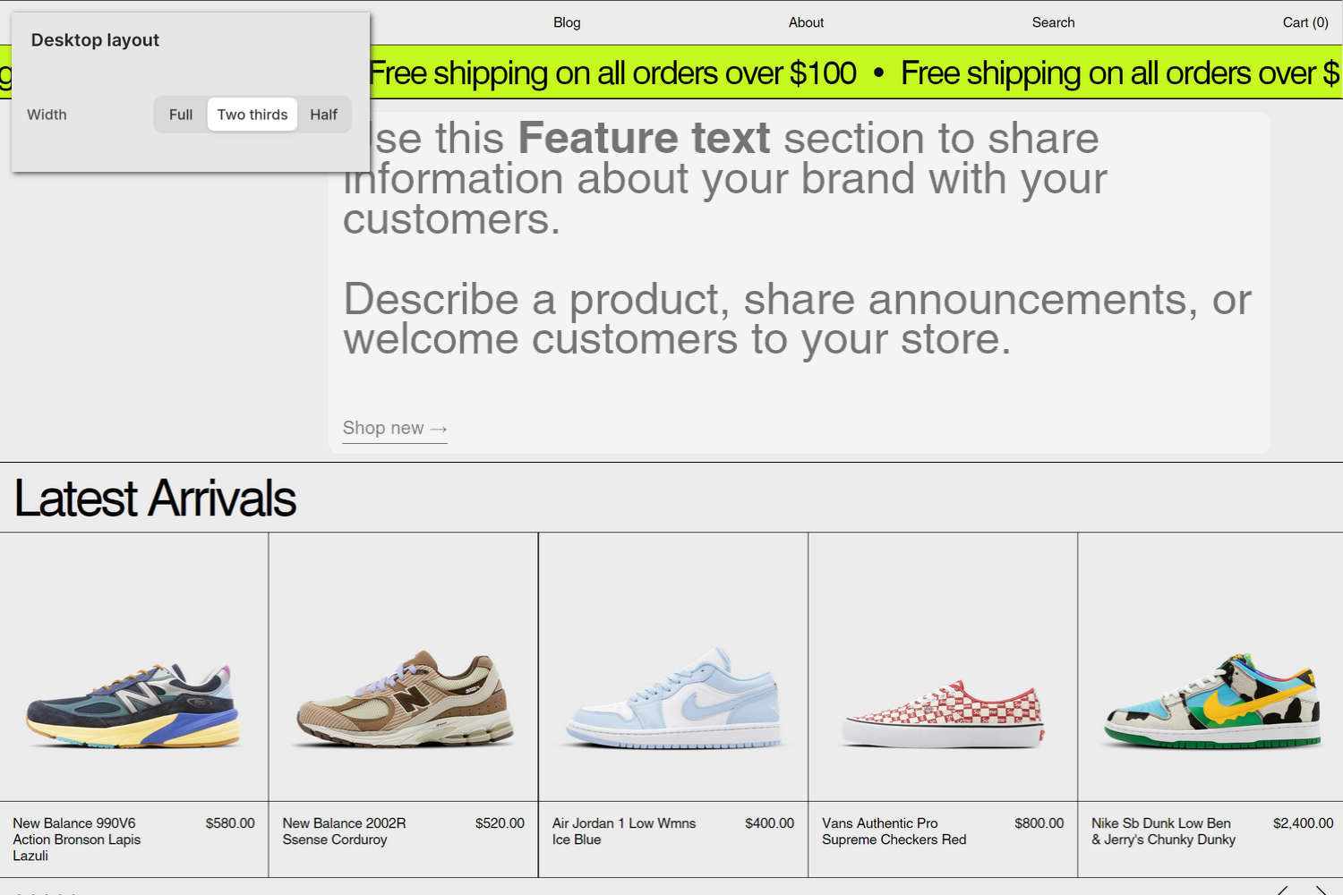
The previous image shows a Feature text section on a store's home page. In the upper left, part of Theme editor's section menu is displayed. The menu's Desktop layout > Width option is set to Two thirds. This option sets the section to occupy two-thirds of the page's width on desktop display devices.
For general guidance with modifying sections, refer to Sections overview and Shopify help: Sections and blocks.
Set up a Feature text section
To set up a Feature text section:
In Theme editor, at the top of the page, use the theme templates dropdown menu to select a page that contains a Feature text section.
Note
The section can be added to any page, except Checkout and Gift card pages. To add the section to the current page, select Add section > Feature text. Refer to Shopify help: Add a section.
From the side menu, select Feature text.
Select a setting described in the following table.
| Setting name | Description |
|---|---|
| Subheading | In the Subheading field, enter text to display as a subheading for the section. |
| Text | In the Text field, enter body text to display inside the section. Use the inline editor to format the text and add links, as needed. |
| Mobile font size scale | Adjust the Mobile font size scale slider to set a font size for the section's feature text on mobile display devices. The minimum value is -2 and the maximum is 4. |
| Desktop font size scale | Adjust the Desktop font size scale slider to set a font size for the section's feature text on desktop display devices. The minimum value is -2 and the maximum is 9. |
| Font | Use the Font options to set the section's feature text to use the same font as Heading or Body text. |
| Text alignment | Use the Text alignment options to align feature text inside the section to the Left, Center, or Right. |
| Add space above | Use the Add space above options to show or hide an area of whitespace above the section. |
| Call to action > Link | In the Link field, enter an external URL or select a store page for the section's call to action link. To use this option, set the Style option to Link. |
| Call to action > Text | In the Text field, enter a single line of text to display as a label for the section's call to action link. To use this option, set the Style option to Link. |
| Call to action > Style | Use the Style option to select Link or Button. This setting lets you choose whether the call-to-action appears as a simple text link or as a button. |
| Call to action > Button style | Use the Button style option to apply a Primary or Secondary button style to the section's buttons. To use this option, set the Style option to Button. |
| Desktop layout > Width | Use the Width options to specify a width for the section on desktop display devices. The options are Full, Two thirds, and Half. |
| Desktop layout > Position | Use the Position options to specify a position for the section on desktop display devices. The options are Left, Center, and Right. |
| Color > Color scheme | Use the Color scheme picker to select a color scheme for the section. Refer to Colors. |
| Custom CSS | Select Custom CSS. In the CSS field, enter custom CSS styles to apply only to the current section. Refer to Shopify help: Add custom CSS. To apply custom styles to your entire online store, refer to Theme settings > Custom CSS. |
| Remove section | Select Remove section to delete the section from the current page. |
Note
To connect a metafield to a setting that supports metafields, select the Connect dynamic source icon displayed beside the setting in Theme editor.
To learn how to connect a metafield to a supported setting, refer to Shopify help: Connecting metafields to your theme by using the Theme editor.