Appearance
Customize color schemes
This guide describes how to use Baseline's Color schemes feature.
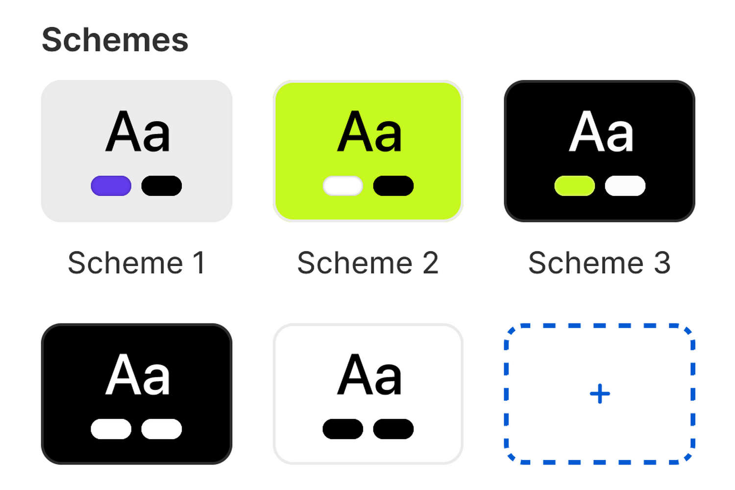
With Baseline, you can create different sets of colors called Color schemes. Baseline provides 5 default color schemes and supports up to 21 additional color schemes for your store. Refer to Shopify help: Color schemes.
Color schemes provide a quick and easy way to use colors consistently across your store. Instead of colorizing store elements individually, to apply colors to blocks, sections, and pages, simply reuse colors from your store's color schemes.
The following table describes Baseline's default color schemes.
| Color scheme name | Description |
|---|---|
| Scheme 1 | This is your store's default color scheme. |
| Schemes 2 to 5 | Additional default color schemes for your store. |
Set up a color scheme
To set up a color scheme, complete the following steps:
In your store's Shopify admin, select Sales channels > Online store > Themes.
In the Themes pane, locate the version of Baseline you want to modify.
Next to the name of the theme, select Edit theme to open the Theme editor.
In the Theme editor, select Theme settings (the gears icon), and then expand the Colors menu.
For information about Baseline's Colors theme settings, refer to Colors.
To edit an existing color scheme, select the color scheme from the Schemes pane.
Alternatively, to add a new color scheme, select Add scheme, then choose the new scheme in the Schemes pane.
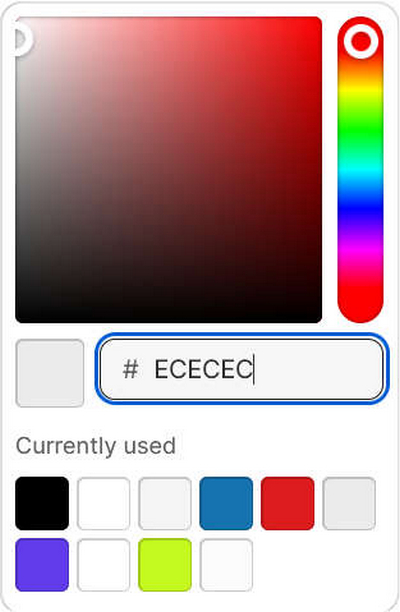
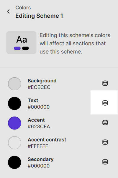
Select one of the following color scheme elements to colorize.
Element name Description Background Choose the background color for the color scheme. The background color applies to relevant sections, blocks, and buttons. Text Choose the color scheme's default color for primary text. The color applies to text inside relevant sections, blocks, and buttons. Accent Choose the color scheme's color for accented text, such as hover text and hyperlinks. Accent contrast Choose the color scheme's secondary accent color for accented elements. This color provides contrast for elements that use the primary Accent color. Secondary Choose the color scheme's color for secondary text, such as social media share links on product pages. Use one of the following methods to set a color for the selected element.
- Choose a color with the Color picker.
- Enter a hexadecimal (hex) color value. Refer to Colors HEX.
- Select a Currently used color.
- Choose the Connect dynamic source icon.
Note
All of Baseline's color schemes can be set to display a color from a dynamic source.
An example of how to colorize an element using a color from a dynamic source
To colorize an element using a color from a dynamic source, select the Connect dynamic source icon beside the element selector, and then choose a dynamic source to add. To use this feature, you must define sources of dynamic content for colors. Refer to Shopify help: Metafields.
For example, to set the Scheme 1 color scheme's Text element to use the Primary contrasting color metafield:
Define the Primary contrasting color metafield as a dynamic color source. Refer to Shopify help: Metafields.
In Theme settings > Colors > Scheme 1, select the Connect dynamic source icon beside the Text element selector.
From the Brand menu, select the Primary contrasting color metafield.
Select Save.
After adjusting a color setting, select Save to avoid losing unsaved changes.
Apply a color scheme to a store section
To apply a color scheme to a section of your store, complete the following steps:
In the Theme editor, use the side menu to select a store section to colorize.
In the expanded section menu, locate the Color menu area.
Use the Color scheme picker to select a color scheme to apply to the section.
To save your changes, select Save.