Appearance
Product links
This guide describes how to set up the Product links section.
Use this section to display links to a selection of products on a page.
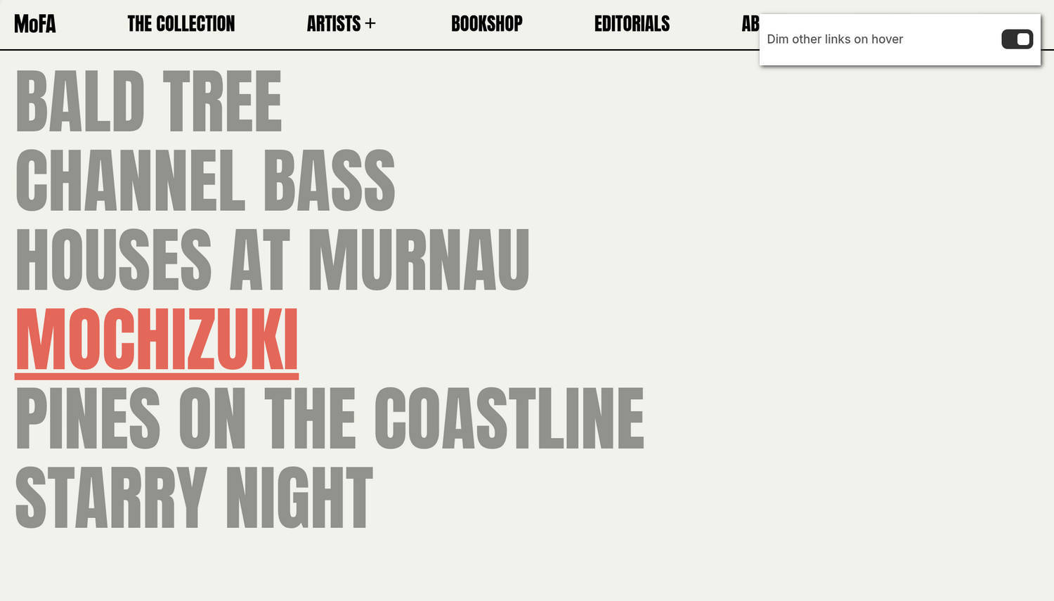
The previous image shows the home page of an example store. In the upper right, part of the Theme editor's Product links section menu is displayed. The menu's Dim other links on hover option is enabled. This option applies dimming effects to links that are not currently being hovered over. For example, in the previous image, the highlighted Mochizuki link is hovered over and the remaining links are dimmed.
For general guidance with modifying sections, refer to Sections overview and Shopify help: Sections and blocks.
Configure the Product links section
To configure your Product links section:
In the Theme editor, at the top of the page, use the theme templates dropdown menu to select a page that contains a Product links section.
Note
The section can be added to any page except Checkout, Gift card, and Customer pages. To add the section to the current page, select Add section > Product links. Refer to Shopify help: Add a section.
From the side menu, select Product links.
Select a setting described in the following table.
| Setting name | Description |
|---|---|
| Products | Use the Products picker to select products to display as links in the section. |
| Mobile font size scale | Adjust the Mobile font size scale slider to set a font size for the section's text on mobile display devices. The minimum value is -2 and the maximum is 4. |
| Desktop font size scale | Adjust the Desktop font size scale slider to set a font size for the section's text on desktop display devices. The minimum value is -2 and the maximum is 9. |
| Display | Use the Display options to specify a style for the section's links. The options are List, Paragraph, and List mobile, paragraph desktop. The List option displays the section's items as a list, with each item stacked vertically above the next. The Paragraph option displays the items horizontally, in a single line of text, like a paragraph, with each item separated by a Paragraph word separator. The List mobile, paragraph desktop option shows the section's items as a list on mobile display devices and as a paragraph on desktop display devices. |
| Paragraph word separator | Use the Paragraph word separator option to specify a symbol to display between links in the section. The options are None, Hyphen, Emdash, Dot, and Bullet. To use this option, set the Display option to anything other than List. |
| Show index as superscript | Set the Show index as superscript option to on or off. With this option enabled, each link is prefixed with an ascending index number, like a numbered list. The first item is prefixed with 1, the second item is prefixed with 2, etc. |
| Text alignment | Use the Text alignment options to align the text in the section to the Left, Center, or Right. |
| Maximum desktop width | Use the Maximum desktop width options to select a maximum width constraint for the section's content on desktop displays. The options are 9/12, 10/12, 11/12, and Full. Note that this option applies when the Display option is set to Paragraph. |
| Uppercase | Use the Uppercase option to turn uppercase text on or off for the section's links. To use this option, set Theme settings > Typography > Headings > Uppercase to off. |
| Show product image on hover | Use the Show product image on hover option to show or hide product images for links in the section. The images are displayed when a customer hovers over a link. |
| Dim other links on hover | Use the Dim other links on hover option to turn dimming effects on or off for links that are not currently being hovered over. Note that this option does not apply to links displayed as buttons with an accented background color. |
| Buttons > Show links as buttons | Set the Show links as buttons option to on or off. With this option enabled, the section's links appear as buttons instead of plain text links. |
| Buttons > Button style | Use the Button style option to apply the Primary or Secondary button style to the section's buttons. To use this option, enable the Show links as buttons option. |
| Color > Color scheme | Use the Color scheme picker to select a color scheme for the section. Refer to Colors. |
| Theme settings | If available, select Theme settings to access additional settings for the section. Refer to Section theme settings menu. |
| Custom CSS | Select Custom CSS. In the CSS field, enter custom CSS styles to apply only to the current section. Refer to Shopify help: Add custom CSS. To apply custom styles to your entire online store, refer to Theme settings > Custom CSS. |
| Remove section | Select Remove section to delete the section from the current page. |
Note
To connect a metafield to a setting that supports metafields, select the Connect dynamic source icon displayed beside the setting in the Theme editor.
To learn how to connect a metafield to a supported setting, refer to Shopify help: Connecting metafields to your theme by using the Theme editor.