Skip to content

Product - three column

This guide describes the Product - three column section.

Use the section to set how products are displayed on product pages assigned to the three-column template.

A Product - three column section on a store's three-column product page in Theme editor.

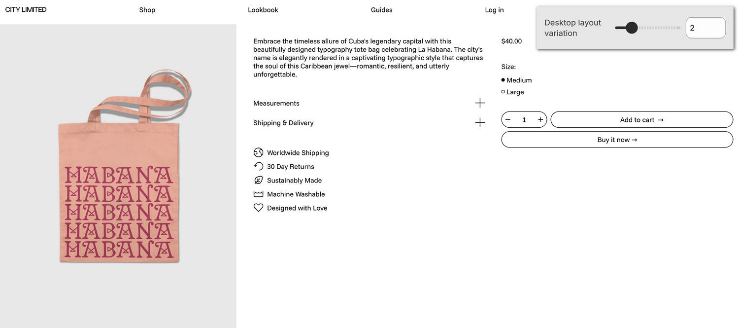
The previous image shows an example store's three-column product page. In the upper right, part of Theme editor's Product - three column section menu is displayed. The menu's Desktop layout variation option is set to 2. This option applies the second of six column-layout presets to the section's content.

For general guidance with modifying sections, refer to Sections overview and Shopify help: Sections and blocks.

Configure the Product - three column section

To configure your Product - three column section:

  1. In Theme editor, at the top of the page, use the theme templates dropdown menu to select Products > Three column.

    Note

    The section is available only on Products > Three column pages. To use the section, apply the Three column template to a product. Refer to Shopify help: Apply a new template.

  2. From the side menu, select Product - three column.

  3. Select a setting described in the following table.

Setting nameDescription
Desktop layout variationAdjust the Desktop layout variation slider between 1 and 6. Use this option to choose from among six preset column layout variations that change how product media and content are arranged on three-column product pages. This option applies only to desktop displays.
Desktop column width > MediaUse the Media option to set the product media area to occupy One third or One half of the available space inside the section.
Desktop column width > Product formUse the Product form option to set the product form area to occupy One half or Two thirds of the available space inside the section.
Media > Enable two media per row on desktopSet the Enable two media per row on desktop option to on or off. With this setting enabled, two (product) media items are displayed in each row inside the section's media area. For a product with an odd number of media items, the section displays the product's first media item at full width. This setting applies to desktop display devices.
Media > Full width first media on desktopSet the Full width first media on desktop option to on or off. With this setting enabled, the section displays a product's first media item at full width. This setting applies to desktop display devices.
Media > Enable image zoomSet the Enable image zoom option to on or off. With this option enabled, the section displays product images inside a panel that opens when a customer selects a product image. The panel provides zoom in and out options for images, arrow icons for navigating between images, and an X icon to close the panel.
Media > Enable video loopingSet the Enable video looping option to on or off. With this option on, product videos loop continuously for customers viewing the section's product media. With this option off, product videos play once. Refer to Shopify help: Product media.
Media > Enable video autoplaySet the Enable video autoplay option to on or off. With this option enabled, product videos play automatically for customers viewing the section's product media, instead of requiring customers to start playback manually. Videos are muted during automatic playback. The setting does not apply to videos hosted on YouTube or Vimeo.
Product variants > Select the first available variantSet the Select the first available variant option to on or off. Enabling this setting automatically selects the first available product variant for customers, so a default option is already chosen when customers view the product.
Product variants > Variant media change behavior on desktopUse the Variant media change behavior on desktop option to select Swap with first media or Scroll to media. This option specifies a behavior for the section's media area. The behavior applies when a store visitor selects a product variant inside the section. This setting applies to desktop display devices.
  • With the Swap with first media option, the section's media area displays (product) media items for all variants - arranged in a column layout. The item displayed at the top of the column is the first product media item that's associated with the currently selected product variant. When a store visitor selects a different product variant, the item displayed at the top of the column changes to match the newly selected variant.
  • With the Scroll to media option, the section's media area displays (product) media items for all variants - arranged in a column layout. The item displayed at the top of the column is the first product media item that's associated with the currently selected product variant. When a store visitor selects a different product variant, a scroll animation effect moves to display the first media item that's associated with the newly selected variant.
Product variants > Always show product featured media firstSet the Always show product featured media first option to on or off. Enabling this option keeps the product’s featured media displayed first in the media gallery, even when a specific variant is not preselected. To use this option, enable the Select the first available variant option.
Product variants > Single variant modeSet the Single variant mode option to on or off. With this setting enabled, the section's media area displays a single (product) media item only. The item that's displayed is the first product media item associated with the currently selected product variant. When a store visitor selects a different product variant, the item that's displayed changes to match the newly selected variant. By default, Single variant mode applies to products with no variants. Enabling this setting overrides the section's Variant media change behavior on desktop setting.

Due to a hard limitation on the Shopify platform, variant media features do not work if a product has more than 250 variants. For products with more than 250 variants, instead of using variant media, set up a separate product for each product variant, add your required media to each product, and then link sibling products using our Product groups feature. Refer to Link related products with Product groups.
Product variants > Enable multiple variant mediaUse the Enable multiple variant media option to show or hide multiple media inside the section for products with variants.

Due to a hard limitation on the Shopify platform, variant media features do not work if a product has more than 250 variants. For products with more than 250 variants, instead of using variant media, set up a separate product for each product variant, add your required media to each product, and then link sibling products using our Product groups feature. Refer to Link related products with Product groups.
Mobile spacing > Space above extra information contentAdjust the Space above extra information content slider between 0.5x and 2x to set the amount of space that's displayed above the section's extra information column.
App blocks > App block areaUse the App block area option to set app content to display in the section's Product form or Extra information column.
App blocks > Space aboveAdjust the Space above slider between 0.5x and 2x to set the amount of space that's displayed above the section's app content area.
Color > Color schemeUse the Color scheme picker to select a color scheme for the section. Refer to Colors.
Color > Use this color scheme for header and footerSet the Use this color scheme for header and footer option to on or off. With this option enabled, the section's color scheme is applied to the header and footer.
Theme settingsIf available, select Theme settings to access additional settings for the section. Refer to Section theme settings menu.
Custom CSSSelect Custom CSS. In the CSS field, enter custom CSS styles to apply only to the current section. Refer to Shopify help: Add custom CSS. To apply custom styles to your entire online store, refer to Theme settings > Custom CSS.

Note

To connect a metafield to a setting that supports metafields, select the Connect dynamic source icon displayed beside the setting in Theme editor.

To learn how to connect a metafield to a supported setting, refer to Shopify help: Connecting metafields to your theme by using the theme editor.

Configure a block within a Product - three column section

To configure a block for your Product - three column section:

  1. In Theme editor, at the top of the page, use the theme templates dropdown menu to select Products > Three column.

  2. From the side menu, expand the Product - three column section menu.

  3. To configure an existing block, select the block from the side menu.

    To add a new block, select Add block, choose a block to add, and then select the block you added.

    Note

    Inside the section, you can add, remove, show, hide, and move blocks. Refer to Configure blocks inside a section and Shopify help: Sections and blocks.

  4. Apply a block setting described in the following table.

Block nameBlock descriptionBlock setting(s)
Title *Displays a product's title inside the section.
  • Use the Desktop column options to set the block's content to display in the section's Product form or Extra information column.
  • Adjust the Space above slider between 0.5x and 2x to set the amount of space that's displayed above the block.
  • Select Remove block to delete the block from the section.
Description *Displays a text area to contain a product's description text inside the section.
  • Use the Desktop column options to set the block's content to display in the section's Product form or Extra information column.
  • Set the Truncate description option to on or off. With this setting enabled, a Read more button is displayed inside the block. Selecting the button opens an expanded text area that contains a product's description text. This setting is useful for products with variant images and longer descriptions. To use this option, turn off collapsible tabs.
  • Adjust the Maximum words before truncation slider between 10 and 100. This setting controls how many words are shown before product description text is truncated. To use this setting, enable the Truncate description option.
  • Adjust the Space above slider between 0.5x and 2x to set the amount of space that's displayed above the block.
  • Select Remove block to delete the block from the section.
Price *Displays a product's price inside the section.
  • Use the Font and text size option to apply the Body, Standard heading, Feature heading, or Secondary heading font and text size to the block's price text.
  • Set the Show discount tag option to on or off. With this option enabled, a discount tag is displayed on products with a sale price.
  • Use the Type option to display a Percentage or Fixed-amount inside discount tags. To use this setting, enable the Show discount tag option.
  • Set the Use accent color option to on or off. With this option enabled, the accent color from the section's current color scheme is applied to discount tag text. To use this option, enable the Show discount tag option.
  • Adjust the Space above slider between 0.5x and 2x to set the amount of space that's displayed above the block.
  • Select Remove block to delete the block from the section.
Variant picker *Displays product options or a "variant" picker for choosing variations of a product, inside the section.
  • Use the Options style setting to apply a Button, Text with underline, Radio, or Drop-down style to the product options picker inside the block.
  • Set the Hide option labels option to on or off. With this option enabled, labels are displayed for product options inside the block.
  • Use the Hide sold out or unavailable variants options to show or hide variant options inside the block, for product variants that are currently out of stock or not available for purchase.
  • Adjust the Space above slider between 0.5x and 2x to set the amount of space that's displayed above the block.
  • Select Remove block to delete the block from the section.
Quantity selector *Displays a quantity selector, inside the section, for choosing the number of products to purchase.
  • Use the Style option to apply a Border or Underline style to the block's quantity picker.
  • Set the Fill column width option to on or off. With this option enabled, the quantity picker occupies the full width of the block. To use this option, set the Style option to Border.
  • Set the Hide label option to show or hide a text label for the block's quantity picker.
  • Adjust the Space above slider between 0.5x and 2x to set the amount of space that's displayed above the block.
  • Select Remove block to delete the block from the section.
Buy buttons *Displays the Add to cart and Buy it now buttons inside the section.
  • Use the Show installments option to show or hide Shopify's Shop pay installments options inside the block. Refer to Shopify help: Shop pay installments.
  • Set the Show dynamic checkout button option to show or hide a button with the customer's preferred payment method, beside the block's Add to cart button. Refer to Shopify help: Dynamic checkout buttons.
  • Set the Fill column width option to on or off. With this option enabled, the block's Add to cart and Buy it now occupy the full width of the block. Full width buttons are visible when the column is wider than the button’s minimum width.
  • Set the Show total price option to on or off. With this option enabled, the product's total price is displayed inside the block's Add to cart button. Note that showing the price inside the button hides the button's default right arrow icon.
  • Use the Character option to select ·, , , , , and more. The character you choose is displayed as a separator between the block's Add to cart button's label text and price.
  • Adjust the Repeat character slider between 1x and 3x to specify how many separator characters to display between the block's Add to cart button's label text and price.
  • Use the Show pickup availability option to show or hide indicators, inside the block, for products that can be collected from your store's designated customer "pick up" locations. Refer to Shopify help: Show pickup availability to your customers.
  • Adjust the Space above slider between 0.5x and 2x to set the amount of space that's displayed above the block's pickup availability area. To use this option, enable the Show pickup availability option.
  • Use the Show recipient information form for gift card products options to show or hide the block's recipient information form. With this setting enabled, visitors who purchase a gift card from your store can use the form to send the gift card by providing the recipient's email address. Visitors can also enter a personal message, and send the message to the gift card's recipient. Refer to Add recipient fields to your gift card product.
  • Adjust the Space above slider between 0.5x and 2x to set the amount of space that's displayed above the block.
  • Select Remove block to delete the block from the section.
Information list *Displays additional product information inside the section, using a table or list layout.
  • Use the Desktop column options to set the block's content to display in the section's Product form or Extra information column.
  • In the Text field, enter text to display inside the block. Use the inline text editor to format the text and add links. For a list layout, add each list item on a new line. For a table layout, add each row item on a new line. To specify data for your table's headers and rows, use the format Label: Content in your text.
  • Use the Font option to apply the Heading or Body font to the block's text.
  • Use the Text size options to apply the Body, Standard heading, or Secondary heading text size to the block's text.
  • Use the Style options to apply a Table, Table with gridlines, or List style to the block's text content.
  • Adjust the Space above slider between 0.5x and 2x to set the amount of space that's displayed above the block.
  • Select Remove block to delete the block from the section.
Inventory statusDisplays a text indicator of a product's availability, inside the section.
  • Adjust the Low inventory threshold slider between 0 and 100. When the in-stock quantity of a product is greater than the slider value, the text Ready to ship is displayed inside the block. Otherwise, the block displays the text "Only n in stock". n is the in-stock quantity of the product.
  • Use the Show inventory count options to show or hide a count of remaining stock inside the block after the Low inventory threshold is exceeded. With this option enabled, the block displays the text "Only n in stock". n is the in-stock quantity of the product.
  • Adjust the Space above slider between 0.5x and 2x to set the amount of space that's displayed above the block.
  • Select Remove block to delete the block from the section.
Location inventory statusDisplays the quantity of a product that's available in each of your store's inventory locations, inside the section.
  • Use the Locations to show options to select All locations or In stock locations only. This option specifies the inventory locations to use for displaying the quantity of available product. Refer to Shopify help: Assigning inventory to locations.
  • Adjust the Space above slider between 0.5x and 2x to set the amount of space that's displayed above the block.
  • Select Remove block to delete the block from the section.
Complementary productsWhen a customer selects a product from your store, the block displays related products inside the section. To set up complementary products, install the Shopify search & discovery app, and refer to Shopify developer help: Product recommendations.
  • In the Heading field, enter a single line of text to display as a title inside the block.
  • Use the Heading text style options to apply the Heading or Body text style to the block's heading.
  • Use the Product tile type option to select Standard or Text overlay. This setting specifies the type of product tile to display inside the block. With Standard product tiles, product details, like product title and price, are displayed below the block's product images. With Text overlay product tiles, product details overlay the block's product images.
  • Adjust the Maximum products to show slider between 1 and 10. This option sets the maximum number of complementary product suggestions to display inside the block.
  • Use the Products per row on widescreen options to show 1 or 2 products in each row, within the block, on widescreen displays.
  • Use the Products per row on mobile options to show 1 or 2 products in each row, within the block, on mobile displays.
  • Use the Enable quick buy options to show or hide a Choose options button on product tiles inside the block. A store visitor uses the button to choose product options, like variants, to add to their cart. To use this option, set the Product tile type to Standard.
  • Adjust the Space above slider between 0.5x and 2x to set the amount of space that's displayed above the block.
  • Select Remove block to delete the block from the section.
TextDisplays a text area to contain additional product information, inside the section.
  • Use the Desktop column options to set the block's content to display in the section's Product form or Extra information column.
  • In the Text field, enter a single line of text to display inside the block.
  • Use the Font options to apply the Body, Subheading, or Heading font to the block's text.
  • Use the Text size options to set the block's text to use the Body, Subheading, Standard heading, or Secondary heading text size.
  • Use the Symbol option to select None, Icon, or Subheading. This setting lets you choose whether the block shows no symbol, an icon, or subheading-styled text.
  • Use the Icon option to select the type of icon to display inside the block. Icon options include Box, Chat bubble, Check mark, Coat hanger, and more. Alternatively, to hide the icon, select None. To use this option, set the Symbol option to Icon.
  • Adjust the Space above slider between 0.5x and 2x to set the amount of space that's displayed above the block.
  • Select Remove block to delete the block from the section.
Rich textDisplays an area with formatted text and links inside the section.
  • Use the Desktop column options to set the block's content to display in the section's Product form or Extra information column.
  • In the Text field, enter text to display inside the block. Use the inline text editor to format the text and add links as needed.
  • Adjust the Space above slider between 0.5x and 2x to set the amount of space that's displayed above the block.
  • Select Remove block to delete the block from the section.
Collapsible tabDisplays a text area with expandable tabs, to contain additional product information, inside the section.
  • Use the Desktop column options to set the block's content to display in the section's Product form or Extra information column.
  • In the Heading field, enter a single line of text to display as the block's title.
  • Use the Heading text style options to apply the Heading or Body text style to the block's title.
  • In the Tab content field, enter text to display inside the block's tab area. Use the inline text editor to format the text and add links as needed.
  • Use the Tab content from page picker to choose a store page as a source of text for the block's tab area.
  • Use the Icon option to select None, Box, Chat bubble, Check mark, Coat hanger, and more. This setting lets you choose an icon to appear alongside the block's heading text.
  • Adjust the Space above slider between 0.5x and 2x to set the amount of space that's displayed above the block.
  • Select Remove block to delete the block from the section.
Icon listDisplays a list of items with icons, inside the section.
  • Use the Desktop column options to set the block's content to display in the section's Product form or Extra information column.
  • In the Heading field, enter a single line of text to display as the block's title.
  • Use the Text color option to set the block's text to use the section color scheme's Text or Secondary color.
  • For items 1 to 5, in the Item # > Text field, enter a single line of text to display beside the item inside the block.
  • For items 1 to 5, use the Item # > Icon options to choose a graphical icon to display beside the item's text, inside the block. For example, select the Box, Check mark, Map pin, Price tag, and more. For no icon, select None (default).
  • Adjust the Space above slider between 0.5x and 2x to set the amount of space that's displayed above the block.
  • Select Remove block to delete the block from the section.
PopupDisplays a popup overlay to contain additional product information, inside the section.
  • Use the Desktop column options to set the block's content to display in the section's Product form or Extra information column.
  • Use the Icon options to choose a graphical icon to display inside the block. For example, select the Box, Check mark, Map pin, Price tag, and more. For no icon, select None (default).
  • In the Link label field, enter a single line of text to display as a label for the block's link.
  • Use the Page picker to choose a store page as a source of text for the block's popup overlay area.
  • Use the Text color option to set the block's text to use the section color scheme's Text or Secondary color.
  • Adjust the Space above slider between 0.5x and 2x to set the amount of space that's displayed above the block.
  • Select Remove block to delete the block from the section.
ShareDisplays an area, inside the section, with buttons for sharing links to your store's products via social media. Refer to Social media.
  • Use the Desktop column options to set the block's content to display in the section's Product form or Extra information column.
  • Adjust the Space above slider between 0.5x and 2x to set the amount of space that's displayed above the block.
  • Select Remove block to delete the block from the section.
Custom liquidDisplays advanced customizations from Liquid code, like app snippets, inside the section.
  • Use the Desktop column options to set the block's content to display in the section's Product form or Extra information column.
  • In the Custom Liquid field, enter Liquid template language code. Refer to Learning Liquid: A guide to Shopify theme development.
  • Adjust the Space above slider between 0.5x and 2x to set the amount of space that's displayed above the block.
  • Select Remove block to delete the block from the section.
VendorDisplays the name of a product's vendor inside the section.
  • Use the Desktop column options to set the block's content to display in the section's Product form or Extra information column.
  • Adjust the Space above slider between 0.5x and 2x to set the amount of space that's displayed above the block.
  • Select Remove block to delete the block from the section.
SeparatorDisplays a separator between the current block and the previous block inside the section.
  • Use the Desktop column options to set the block's content to display in the section's Product form or Extra information column.
  • Adjust the Space above slider between 0.5x and 2x to set the amount of space that's displayed above the block.
  • Select Remove block to delete the block from the section.