Appearance
Buttons & links
This guide describes the Theme settings > Buttons & links menu options.
Use the menu options to set how buttons are displayed throughout your store. Refer to Shopify help: Buttons.
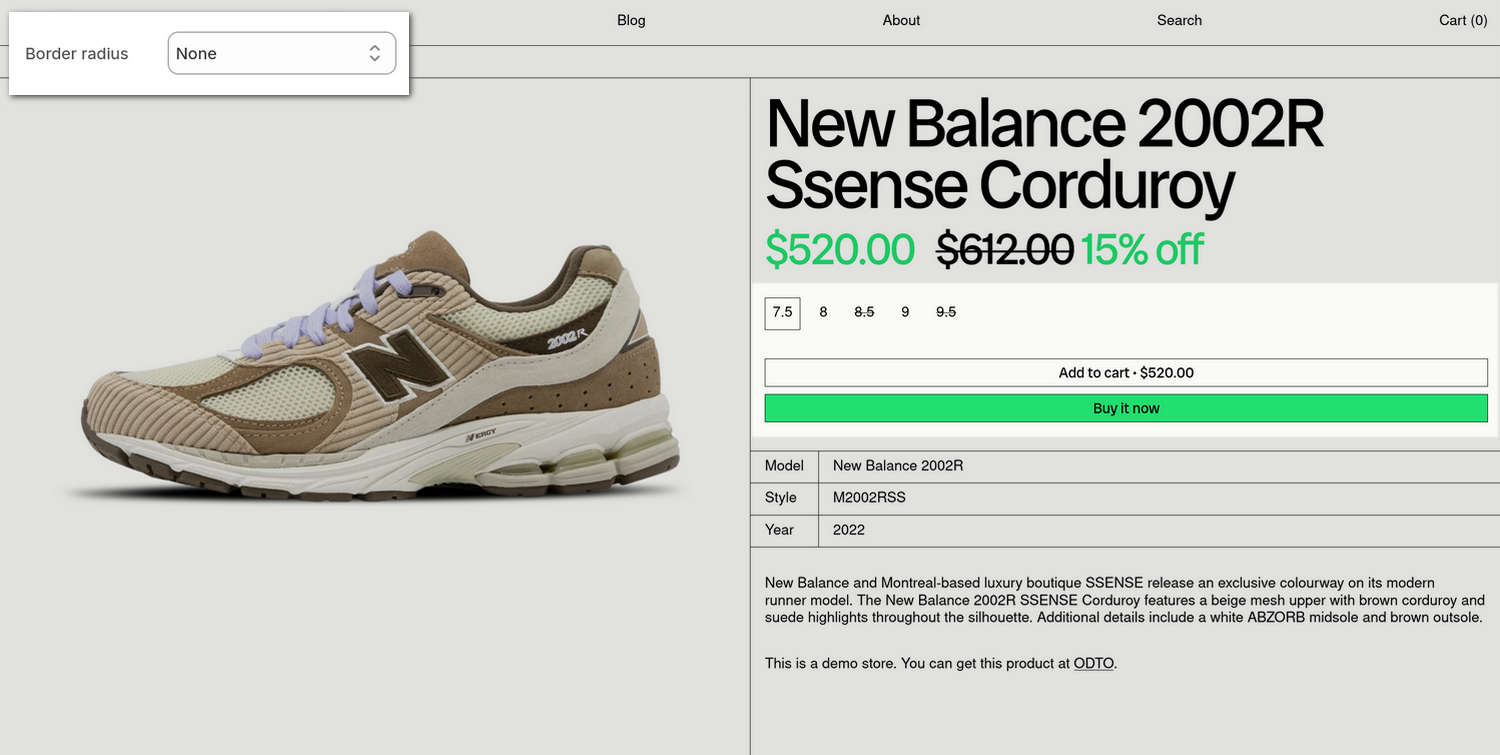
The previous image shows a store's product page. In the upper left, part of Theme editor's Theme settings > Buttons & links menu is displayed. The menu's Border radius option is set to None. On the store's Product page, on the right, this Border radius option turns off displaying curved corner edges and applies square edges to the borders around the page's Size, Add to Cart, and Buy it now buttons.
For general guidance with adjusting a theme setting, refer to Settings overview and Shopify help: Theme settings.
Set up buttons
To set up your store's buttons:
In Theme editor, go to Theme settings > Buttons.
Select a setting described in the following table.
| Setting name | Description |
|---|---|
| Use grid border width | Use the Use grid border width options to turn on/off "Grid border width" mode. With this option enabled, the value you specify for Border width is applied to the width of the grid border that's displayed around buttons and below links. |
| Double spacing above | Select the Double spacing above options to turn on/off displaying double spacing above buttons and links. Applies to call-to-actions that follow headings or body text. |
| Border width | Adjust the Border width slider between 1 px and 5 px (pixels) to specify the width of the grid border that's displayed around buttons and below links. To use this option, set the Use grid border width option to On. |
| Border radius | Use the Border radius option to set the size of the curve that's applied to the corner edges of the borders displayed around buttons. The options are: Small, Medium, Large and Full. To turn off curved corner edge and display square edges, select None. |
| Show arrow | Use the Show arrow options to turn on/off displaying an arrow symbol for button text. |
| Primary buttons > Color | Use the Color options to set a background and text color for primary buttons. The options are: Text background, Accent background, and Accent background with text border. Colors from your store's color scheme are applied to buttons. |
| Links > Show arrow | Use the Show arrow options to turn on/off displaying an arrow symbol for linked text, like social media share links or subscribe links. |