Appearance
Image with countdown timer
This guide describes how to set up the Image with countdown timer section.
Use this section to display an image with an overlaid countdown timer on a page.
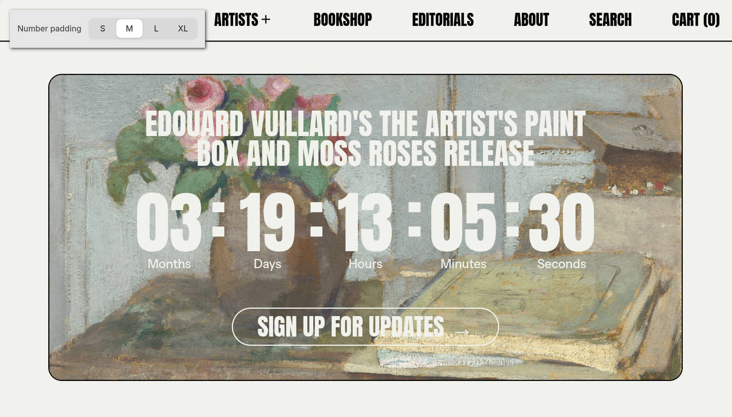
The previous image shows the home page of an example store. In the upper left, part of the Theme editor's Image with countdown timer section menu is displayed. The section's Number padding option is set to M (medium). This option applies medium spacing between each group of numbers in the countdown timer.
For general guidance with modifying sections, refer to Sections overview and Shopify help: Sections and blocks.
Configure the Image with countdown timer section
To configure your Image with countdown timer section:
In the Theme editor, at the top of the page, use the theme templates dropdown menu to select a page that contains an Image with countdown timer section.
Note
The section can be added to any page except Checkout, Gift card, and Customer pages. To add the section to the current page, select Add section > Image with countdown timer. Refer to Shopify help: Add a section.
From the side menu, select Image with countdown timer.
Select a setting described in the following table.
| Setting name | Description |
|---|---|
| Image | Use the Image picker to select an image to display in the section. A landscape-oriented .JPG image of at least 3600 × 1600 pixels is recommended. |
| Mobile image | Use the Mobile image picker to select an image to display in the section on mobile display devices. A portrait-oriented .JPG image of at least 1600 × 2400 pixels is recommended. |
| Deep inset | Set the Deep inset option to on or off. With this option enabled, an area of empty space is displayed around the section's image. |
| Desktop height | Use the Desktop height options to select Natural, Full screen, 3/4 screen, 2/3 screen, 1/2 screen, and more. This option specifies the height of the section's image area on desktop display devices. |
| Mobile height | Use the Mobile height options to select Natural, Full screen, 3/4 screen, 2/3 screen, 1/2 screen, and more. This option specifies the height of the section's image area on mobile display devices. |
| Content > Heading | In the Heading field, enter a single line of text to display as the section's heading. |
| Content > Heading size | Use the Heading size options to apply the Standard, Feature, or Secondary heading size to the section's heading. |
| Content > Text | In the Text field, enter text to display as body text in the section. Use the inline text editor to format the text and add links, as needed. |
| Content > Position | Use the Position options to select a position for the section's text. Options include Top left, Top center, Top right, Left, Center, and more. |
| Content > Width on desktop | Use the Width on desktop options to set the width of the content area to occupy One half, Two thirds, or Full width of the section. |
| Countdown timer > Use current year | Set the Use current year option to on or off. With this option enabled, the section's countdown timer uses the current year. Alternatively, to set the section's countdown timer to use a specific year, set this option to off and then enter a year in the Year option field. |
| Countdown timer > Year | In the Year field, enter a four-digit number that represents the year you want the section's countdown timer to display. For example, enter the year 2029. To use this option, disable the Use current year option. |
| Countdown timer > Month | Use the Month option to select the month you want the section's countdown timer to display. For example, select 1 – January, 2 – February, 3 – March, 4 – April, 5 – May, etc. |
| Countdown timer > Day | Use the Day option to select the date (day of the month) you want the section's countdown timer to display. |
| Countdown timer > Hour (24-hour time) | Use the Hour (24-hour time) option to select the hour (in 24-hour format) you want the section's countdown timer to display. For example, select 00 (12 a.m. / midnight), 01 (1 a.m.), 02 (2 a.m.), etc. |
| Countdown timer > Minute | Use the Minute option to select the minute you want the section's countdown timer to display. For example, select 00, 01, 02, etc. |
| Countdown timer > Style | Use the Style option to apply a Numbers or Timer style to the section's countdown timer. |
| Countdown timer > Number padding | Use the Number padding option to select S (small), M (medium), L (large) or XL (extra large). This option specifies the spacing between each group of numbers in the countdown timer. |
| Countdown timer > Flash separators | Set the Flash separators option to on or off. With this option enabled, a "flashing" or "blinking" animation is applied to the text characters that separate parts of the section's countdown timer. To use this option, set the Style option to Timer. |
| Countdown timer > Font | Use the Font options to set the section's text to use the same font as Heading or Body text. |
| Countdown timer > Always show | Use the Always show options to override the countdown timer's auto-hide behavior. By default, unless overridden, the section's countdown timer automatically hides numbers that reach zero. Use the Always show options to select which numbers will not be hidden. For example, set the timer to always display Minutes, seconds, Hours, minutes, seconds, or Days, hours, minutes, seconds, etc. |
| Date metafield > Metafield namespace and key | In the Metafield namespace and key field, enter a namespace and key value to use a dynamic source for the countdown timer date. Refer to Shopify help: Metafields. This option overrides the section's date settings, and it is supported on Products, Collections, Blogs, Articles, and Pages. |
| Color > Color scheme | Use the Color scheme picker to select a color scheme for the section. Refer to Colors. |
| Color > Apply text color only | Set the Apply text color only option to on or off. When enabled, the chosen color scheme applies only to the section's text, keeping the rest of the section's colors unchanged. |
| Call to action > Type | Use the Type option to select Link or Newsletter. This setting lets you choose whether the section's call to action displays a link or a newsletter signup form. |
| Call to action > Link | In the Link field, enter an external URL or select a store page for the section's call to action link. To use this option, set the Type option to Link. |
| Call to action > Text | In the Text field, enter a single line of text to display as a label for the section's call to action link. To use this option, set the Type option to Link. |
| Call to action > Style | Use the Style option to select Link or Button. This setting lets you choose whether the call to action appears as a text link or a button. To use this option, set the Type option to Link. |
| Call to action > Button style | Use the Button style option to apply a Primary or Secondary button style to the section's button. To use this option, set the Type option to Link and set the Style option to Button. |
| Theme settings | If available, select Theme settings to access additional settings for the section. Refer to Section theme settings menu. |
| Custom CSS | Select Custom CSS. In the CSS field, enter custom CSS styles to apply only to the current section. Refer to Shopify help: Add custom CSS. To apply custom styles to your entire online store, refer to Theme settings > Custom CSS. |
| Remove section | Select Remove section to delete the section from the current page. |
Note
To connect a metafield to a setting that supports metafields, select the Connect dynamic source icon displayed beside the setting in the Theme editor.
To learn how to connect a metafield to a supported setting, refer to Shopify help: Connecting metafields to your theme by using the Theme editor.