Appearance
Featured product
This guide describes setting up the Featured product section.
Use the section to promote a specific product by featuring it on a store page.
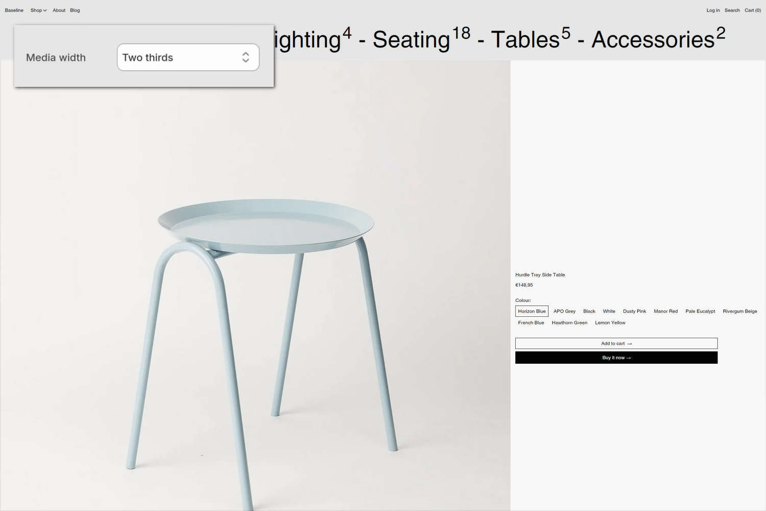
The previous image shows a Featured product section on a store's home page. In the upper left, part of Theme editor's section menu is displayed. The menu's Media width option is set to Two thirds. This setting specifies a width for the section's media area on desktop display devices.
For general guidance with modifying sections, refer to Sections overview and Shopify help: Sections and blocks.
Set up a Featured product section
To set up a Featured product section:
In Theme editor, at the top of the page, use the theme templates dropdown menu to select a page that contains a Featured product section.
Note
The section can be added to any page, except Checkout and Gift card pages. To add the section to the current page, select Add section > Featured product. Refer to Shopify help: Add a section.
From the side menu, select Featured product.
Select a setting described in the following table.
| Setting name | Description |
|---|---|
| Product | Use the Product picker to select a product to display inside the section. Refer to Shopify help: Products. |
| Select the first available variant | Set the Select the first available variant option to on or off. With this option enabled, the first available product variant is selected automatically when customers view the product. With this option off, adding to the cart is not possible until each product option has a selection. With this option off and the Theme settings > Products > Availability display mode option set to Adjacent, sold-out styling is not applied until selections for all options have been made. |
| Always show product featured media first | Set the Always show product featured media first option to on or off. With this option enabled, the section always displays a product's featured media first. To use this option, enable the Select the first available variant option. |
| Desktop > Media width | Use the Media width options to specify a width for the section's media area on desktop display devices. The options are One third, One half, Three fifths, and Two thirds. |
| Desktop > Media position | Use the Media position option to position the section's media area on the Left or Right. This option applies to desktop display devices. |
| Desktop > Content position | Use the Content position options to specify a position for the section's content area on desktop display devices. The options are: Top, Middle, Bottom, or Sticky. |
| Color > Color scheme | Use the Color scheme picker to select a color scheme for the section. Refer to Colors. |
| Media > Enable video looping | Use the Enable video looping option to turn continuous replay on or off for videos inside the section. With this option off, the video plays once. Refer to Shopify help: Product media. |
| Product form area > Max width of content | Use the Max width of content option to apply a Full, Wide or Narrow width to content inside the section's product form area. |
| Theme settings | If available, select Theme settings to access additional settings for the section. Refer to Section theme settings menu. |
| Custom CSS | Select Custom CSS. In the CSS field, enter custom CSS styles to apply only to the current section. Refer to Shopify help: Add custom CSS. To apply custom styles to your entire online store, refer to Theme settings > Custom CSS. |
| Remove section | Select Remove section to delete the section from the current page. |
Note
To connect a metafield to a setting that supports metafields, select the Connect dynamic source icon displayed beside the setting in Theme editor.
To learn how to connect a metafield to a supported setting, refer to Shopify help: Connecting metafields to your theme by using the Theme editor.
Configure a block within a Featured product section
A default Featured product section contains four product blocks. To configure a block inside the section:
In Theme editor, at the top of the page, use the theme templates dropdown menu to select a page that contains a Featured product section.
From the side menu, expand the Featured product section menu.
To configure an existing block, select the block from the side menu.
To add a new block, select Add block, choose a block to add, and then select the block you added.
Note
Inside the section, you can add, remove, show, hide, or move blocks. Refer to Configure blocks inside a section and Shopify help: Sections and blocks.
Apply a block setting described in the Table: Featured product blocks.
Table: Featured product blocks
The following table describes the blocks inside the Featured product section, and their corresponding settings.
The blocks indicated with an asterisk * are contained in a default Featured product section. To configure a block, refer to Configure a block within a Featured product section.
| Block name | Block description | Block setting(s) |
|---|---|---|
Title * | Displays a product's title inside the section. |
|
Price * | Displays a product's price inside the section. |
|
Variant picker * | Displays product options or a "variant" picker for choosing variations of a product, inside the section. |
|
Buy buttons * | Displays the Add to cart and Buy it now buttons inside the section. |
|
| Product group | Displays a customizable product picker inside the section for selecting sibling products from within a product group. |
|
| Quantity selector | Displays a quantity selector, inside the section, for choosing the number of products to purchase. |
|
| Vendor | Displays the name of a product's vendor inside the section. |
|
| Description | Displays a text area to contain a product's description text inside the section. |
|
| Complementary products | When a customer selects a product from your store, the block displays related products inside the section. To set up complementary products, install the Shopify search & discovery app, and refer to Shopify developer help: Product recommendations. |
|
| Inventory status | Displays a text indicator of a product's availability, inside the section. |
|
| Location inventory status | Displays the quantity of a product that's available in each of your store's inventory locations, inside the section. |
|
| Text | Displays a text area to contain additional product information, inside the section. |
|
| Rich text | Displays an area with formatted text and links inside the section. |
|
| Information list | Displays additional product information inside the section, using a table or list layout. |
|
| Collapsible tab | Displays a text area with expandable tabs, to contain additional product information, inside the section. |
|
| Icon list | Displays a list of items with icons, inside the section. |
|
| Popup | Displays a popup overlay to contain additional product information, inside the section. |
|
| Share | Displays an area, inside the section, with buttons for sharing links to your store's products via social media. Refer to Social media. |
|
| Separator | Displays a separator between the current block and the previous block inside the section. |
|
| Custom liquid | Displays advanced customizations from Liquid code, like app snippets, inside the section. |
|