

Appearance
Footer
This guide describes the Footer section.
Use this section to provide store visitors with information about your store, links to your store's social media, and a secondary menu for navigating your store's pages. The footer is typically displayed across the bottom of store pages.
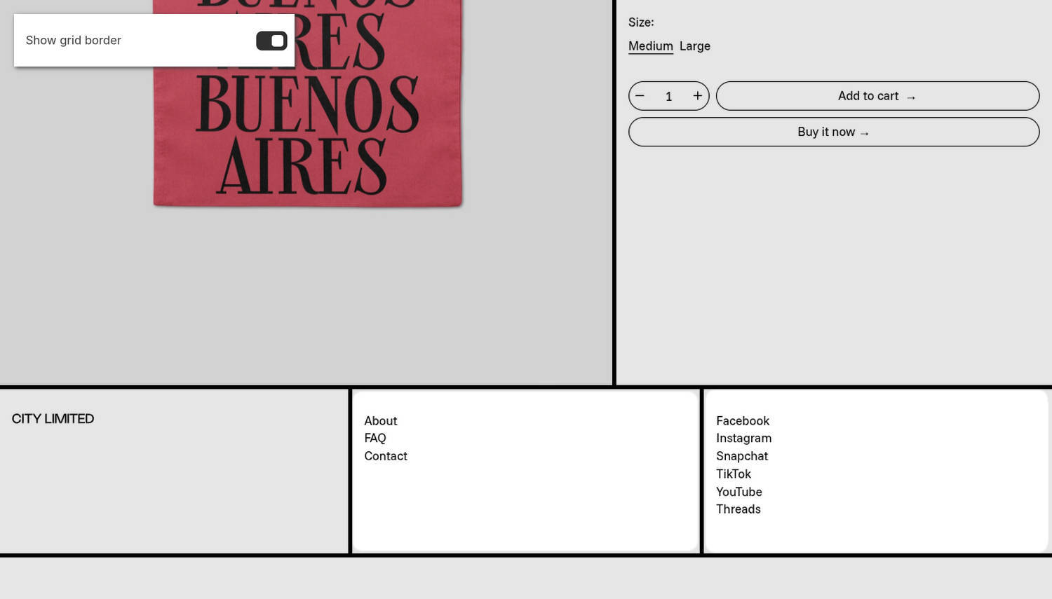
The previous image shows a Footer section on a store's home page. In the upper left, part of the Theme editor's section menu is displayed. The menu's Show grid border option is enabled. With this option enabled, border lines are displayed around the blocks in the footer, including the Menu and Social media blocks.
For general guidance with modifying sections, refer to Sections overview and Shopify help: Sections and blocks.
Configure the Footer section
To configure your Footer section:
In the Theme editor, at the top of the page, use the theme templates dropdown to select the home page.
Note
The section is accessible from all pages, excluding Checkout, Password, and Gift card pages.
From the side menu, select Footer.
Select a setting described in the following table.
| Setting name | Description |
|---|---|
| Show payment icons | Use the Show payment icons option to show or hide payment icons in the section. The payment icons represent your store's acceptable payment methods. |
| Language selector > Language settings (link) | Use the Language settings link to configure your store's supported languages. Refer to Shopify help: Selling in multiple languages. |
| Language selector > Show language selector | For stores that support multiple languages, use the Show language selector option to show or hide a language selector in the section. The language selector allows visitors to switch between different language versions of your store. |
| Country/region selector > Payment settings (link) | Use the Payment settings link to configure your store's supported payment methods, regions, and currencies. Refer to Shopify help: Payments. |
| Country/region selector > Show country/region selector | For stores that support multiple regions and currencies, use the Show country/region selector option to show or hide a country/region selector in the section. The region selector allows visitors to switch between your store's supported regions and currencies. |
| Policy links > Policy settings (link) | Use the Policy settings link to create and configure store policies, such as refund and data privacy policies. Refer to Shopify help: Adding store policies. |
| Policy links > Show policy links | Use the Show policy links option to show or hide links in the section to your saved store policies. |
| Layout > Show grid border | Use the Show grid border option to show or hide grid border lines around the content blocks in the section, such as the Menu and Social media blocks. |
| Layout > Font for block headings | Use the Font for block headings setting to apply the same font as Heading or Body text to block headings. |
| Color > Color scheme | Use the Color scheme picker to select a color scheme for the section. Refer to Colors. |
| Theme settings | If available, select Theme settings to access additional settings for the section. Refer to Section theme settings menu. |
| Custom CSS | Select Custom CSS. In the CSS field, enter custom CSS styles to apply only to the current section. Refer to Shopify help: Add custom CSS. To apply custom styles to your entire online store, refer to Theme settings > Custom CSS. |
Note
To connect a metafield to a setting that supports metafields, select the Connect dynamic source icon displayed beside the setting in the Theme editor.
To learn how to connect a metafield to a supported setting, refer to Shopify help: Connecting metafields to your theme by using the Theme editor.
Configure a block within a Footer section
A default Footer section contains four blocks.
To configure a block for your Footer section:
In the Theme editor, at the top of the page, use the theme templates dropdown menu to select the home page.
From the side menu, expand the Footer section menu.
To configure an existing block, select the block from the side menu.
To add a new block, select Add block, choose a block to add, and then select the block you added.
Note
Inside the section, you can add, remove, show, hide, and move blocks. Refer to Configure blocks inside a section and Shopify help: Sections and blocks.
Apply a block setting described in the Table: Footer blocks.
Table: Footer blocks
The following table describes the blocks in the Footer section and their settings.
To configure a block, refer to Configure a block within a Footer section.
| Block name | Block description | Block setting(s) |
|---|---|---|
| Logo | Display a logo image in the section. |
|
| Text | Display formatted text in the section. |
|
| Menu | Display a navigation menu in the section. |
|
| Social media | Display links to your store's social media profiles in the section. |
|
| Newsletter | Displays optional newsletter heading text in the section. Modify the contents of the section's newsletter area, open the footer's Newsletter section in the Theme editor. |
|
Set up a Footer menu block
To set up a menu inside a Menu block, apply the following settings in Footer > Menu (block).
If the block has no menu, choose Select menu. Enter the name of a menu into the Search box, or pick a menu from the list.
To edit the current menu, select the Menu picker and then choose the Edit link. The link opens the Menus editor in your store's Shopify admin. Use it to modify the menu. Refer to Shopify help: Add, remove, or edit menu items in your online store.
To create a new menu, select the Menu picker:
- If you have an existing menu, follow the Edit link.
- If no menu is present, follow the Create menu link.
The link opens the Menus editor in your store's Shopify admin. Use it to create a new menu, and then select that menu. Refer to Shopify help: Add, remove, or edit menu items in your online store.
To replace the current menu, select the Menu picker and then choose Replace. Enter the name of the replacement menu into the Search box, or pick a replacement menu from the list.
To delete the current menu, select the Menu picker and then choose Remove menu.