Appearance
Collection
This guide describes setting up the Collection section.
Use the section to customize how a collection is displayed on a (default) Collection page.
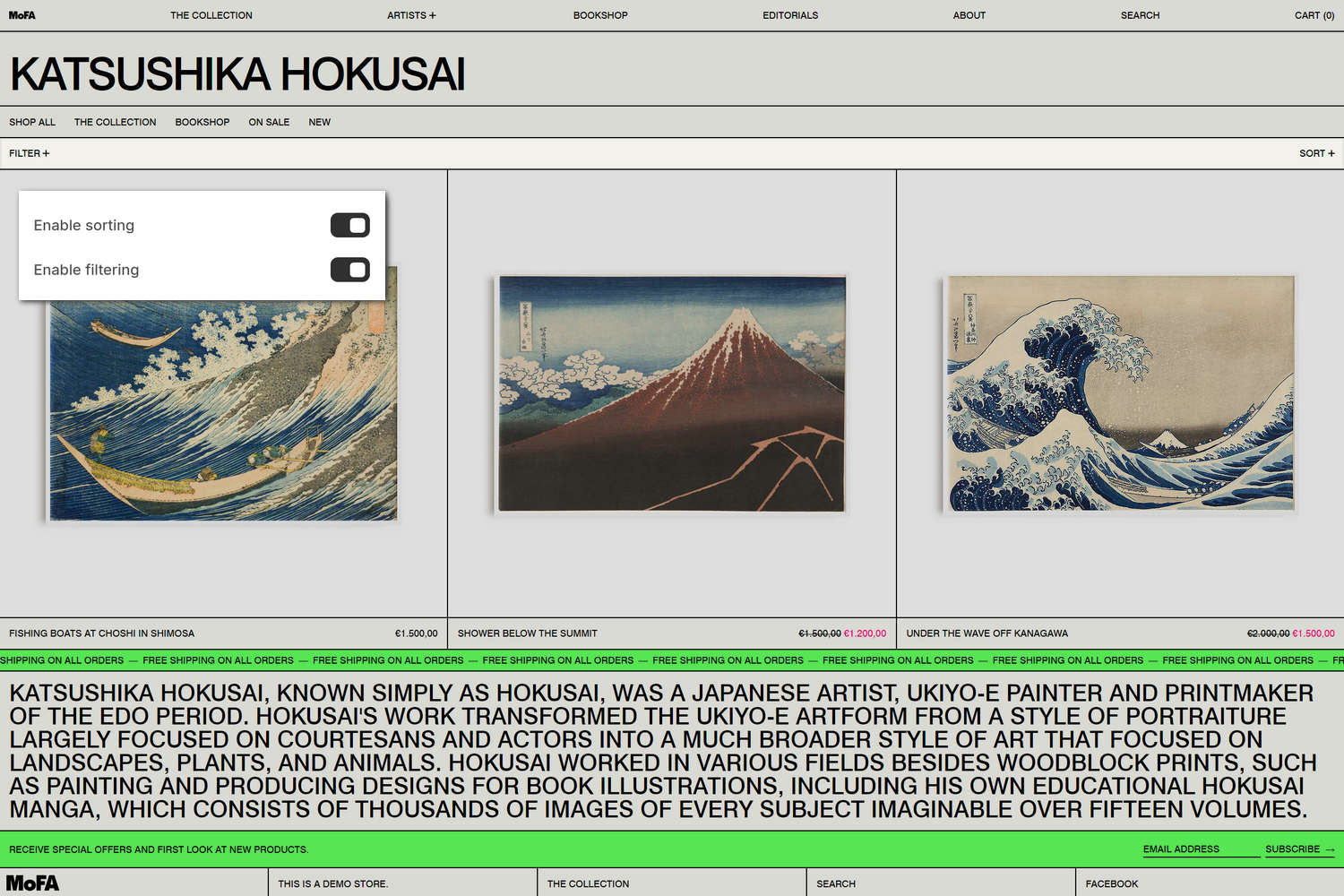
The previous image shows a Collection section on a store's Collection page. In the upper left, part of Theme editor's section menu is displayed. To show the product filtering and sorting options inside the section, the menu's Enable sorting and Enable filtering options are enabled. With these options enabled, store visitors can arrange the products in the section's collection by specifying product filtering and sorting criteria.
For general guidance with modifying sections, refer to Sections overview and Shopify help: Sections and blocks.
Set up a Collection section
To set up a Collection section:
In Theme editor, at the top of the page, use the theme templates dropdown menu to select the Collections > Default collection page.
Note
The section is available only on Collections > Default collection pages.
From the side menu, select Collection.
Select a setting described in the following table.
| Setting name | Description |
|---|---|
| Hide title | Use the Hide title options to show or hide the collection's title inside the section. |
| Show collection products count as superscript | Use the Show collection products count as superscript option to show or hide a number inside the section. The number is displayed as superscript and indicates how many products there are in a collection. To use this option, turn off the Hide title option. |
| Image > Show collection image | Use the Show collection image options to show or hide the collection's image inside the section. |
| Image > Deep inset | Set the Deep inset option to on or off. With this option enabled, a margin is applied around the collection image inside the section. To use this option, turn on the Show collection image option. |
| Image > Crop | Use the Crop options to set a cropping shape for the collection image inside the section. The options are No crop, Full portrait (9:16), Portrait (4:5), Square (1:1), Standard (4:3), Widescreen (16:9), Cinema (1.85:1), Ultrawide (2.35:1), and Letterbox (4:1). To use this option, turn on the Show collection image option. |
| Image > Desktop size | Use the Desktop size setting to specify a size for the collection image inside the section. The options are One third, One half, Three fifths, Two thirds, and Full width. This setting applies to desktop display devices. To use this option, turn on the Show collection image option. |
| Description > Description position | Use the Description position option to specify a position for the collection description text. The Under title option positions the description text below the collection title. The After first row option positions the description text below the first row of the collection's product tiles. The Bottom of page option positions the description text below the bottom of the section. |
| Description > Description color scheme | Use the Description color scheme picker to select a color scheme for the section's collection description text. Refer to Colors. This option applies when the Description position option is set to After first row or Bottom of page. |
| Products > Product tile type | Use the Product tile type options to specify the type of product tile to display inside the section. The options are Standard or Text overlay. With Standard product tiles, product details, like product title and price, are displayed below the section's product images. With Text overlay product tiles, product details overlay the section's product images. |
| Products > Products per row | Adjust the Products per row slider to specify the number of collection products to display within each row inside the section. The minimum number is 2 products and the maximum is 5. This setting applies to desktop display devices. |
| Products > Rows | Adjust the Rows slider to specify the number of product rows to display inside the section. The minimum number is 1 row and the maximum is 8. |
| Products > Products per row on mobile | Use the Products per row on mobile option to specify the number of products to display in each row inside the section. The options are 1 and 2. This setting applies to mobile display devices. |
| Quick buy > Enable quick buy | Use the Enable quick buy options to show or hide a "Choose options" button on product tiles inside the section. A store visitor uses the button to choose product options, like variants, to add to their cart. To use this option, set the Product tile type to Standard. |
| Navigation > Collection menu | Use the Collection menu picker to set up a menu to display inside the section. Refer to Set a menu for a Collection section. Note that the menu will not show dropdown items. |
| Sorting and filtering > Desktop layout | Use the Desktop layout options to apply a Dropdown, Sidebar, or Drawer style layout to the section's sorting and filtering area. This setting applies to desktop display devices. Note that the Drawer layout only applies to filters. |
| Sorting and filtering > Enable sorting | Use the Enable sorting options to show or hide the product sorting options inside the section. If enabled, visitors can arrange the products in the collection by using sorting criteria. |
| Sorting and filtering > Enable filtering | Use the Enable filtering options to show or hide the product filtering options inside the section. If enabled, visitors can select a range of products by using the section's filtering criteria. To learn how to customize filters, refer to Shopify help: Adding filters with Shopify Search & Discovery. |
| Sorting and filtering > Collapse filters | Use the Collapse filters options to turn on or off "collapse mode" for product filtering options inside the section. With this option enabled, to access the product filtering options, visitors must select the expand menu icon inside the section. To use this setting, turn on the Enable filtering option. Note that this option does not apply to the dropdown layout. |
| Sorting and filtering > Capitalize labels | Use the Capitalize labels options to turn on or off "uppercase mode". With this setting enabled, uppercase is applied to the text labels for the section's filtering and sorting options. To use this setting, turn on the Enable filtering option. |
| Color > Color scheme | Use the Color scheme picker to select a color scheme for the section. Refer to Colors. |
| Color > Use this color scheme for header and footer | Use the Use this color scheme for header and footer options to turn "header and footer color" mode on or off. With this setting enabled, the color scheme you choose for the section is also applied to the current page's header and footer. Note that this option only applies to the collection template. |
| Theme settings | If available, select Theme settings to access additional settings for the section. Refer to Section theme settings menu. |
| Custom CSS | Select Custom CSS. In the CSS field, enter custom CSS styles to apply only to the current section. Refer to Shopify help: Add custom CSS. To apply custom styles to your entire online store, refer to Theme settings > Custom CSS. |
Note
To connect a metafield to a setting that supports metafields, select the Connect dynamic source icon displayed beside the setting in Theme editor.
To learn how to connect a metafield to a supported setting, refer to Shopify help: Connecting metafields to your theme by using the Theme editor.
Set a menu for a Collection section
To set up a menu to display inside a Collection section, apply the following section settings in Collection > Navigation > Collection menu.
If the section has no menu, to select a menu, choose Select. Enter the name of a menu into the Search box, or pick a menu from the list.
To edit the current menu, select the Menu picker and then choose the Edit link. The link opens the Menus editor in your store's Shopify admin. Use the editor to modify the menu. Refer to Shopify help: Add, remove, or edit menu items in your online store.
To create a new menu, select the Menu picker:
- If you have an existing menu, follow the Edit link.
- If no menu is present, follow the Create menu link.
The link opens the Menus editor in your store's Shopify admin. Use the menu editor to create a new menu, and then select the new menu. Refer to Shopify help: Add, remove, or edit menu items in your online store.
To replace the current menu, select the Menu picker and then choose Replace. Enter the name of the replacement menu into the Search box, or pick a replacement menu from the list.
To delete the current menu, select the Menu picker and then choose Remove menu.
Configure a block within a Collection section
A default Collection section contains no Scrolling text blocks. To configure a Scrolling text block within a Collection section:
In Theme editor, at the top of the page, use the theme templates dropdown menu to select the Collections > Default collection page.
From the side menu, expand the Collection section menu.
To configure an existing block, select the block from the side menu.
To add a new block, select Add Scrolling text, and then select the block you added.
Note
Inside the section, you can add, remove, show, hide, and move blocks. Refer to Configure blocks inside a section and Shopify help: Sections and blocks.
Select a block setting described in the following table.
| Setting name | Description |
|---|---|
| Position | Use the Position setting to specify a position for displaying the block inside the section. The Top option positions the block at the top of the section. The Under title option positions the block below the section's collection title. The After first row option positions the block below the first row of the section's product tiles. |
| Text | In the Text field, enter text to display as scrolling text inside the block. |
| Link | In the Link field, enter a URL or select a store page for the block to use as a link. |
| Mobile font size scale | Adjust the Mobile font size scale slider to set a font size for the block's text on mobile display devices. The minimum value is -2 and the maximum is 4. |
| Desktop font size scale | Adjust the Desktop font size scale slider to set a font size for the block's text on desktop display devices. The minimum value is -2 and the maximum is 9. |
| Font | Use the Font options to set the block's text to use the same font as Heading or Body text. |
| Scroll > Speed | Adjust the Speed slider to specify a scroll speed between 20 and 400 for the block's scrolling text. If a user has reduced motion options enabled, scrolling text is displayed as a static banner. |
| Scroll > Direction | Use the Direction setting to set the block's scrolling text to move from Right to left or Left to right. |
| Scroll > Repeat text | Use the Repeat text options to turn on or off "repeating text" mode. With this option enabled, text is scrolled across the block repeatedly to create an infinity effect. |
| Repeat text separator > Spacing | Use the Spacing option to select S, M, L, or XL. This setting specifies the size of the spacing between each occurrence of repeated text. |
| Repeat text separator > Type | Use the Type option to select Gap, Character, or Button. This option specifies how the spacing between each occurrence of repeated text is displayed. The Gap option displays empty space between each occurrence. The Character option displays a specific text character between each occurrence. The Button option displays a button between each occurrence. |
| Repeat text separator > Character | Use the Character option to select ·, •, ↑, →, ↓, and more. This setting specifies the text character that is displayed between each occurrence of repeated text inside the block. To use this option, set the Type option to Character. |
| Repeat text separator > Repeat character | Adjust the Repeat character slider between 1x and 6x. This setting specifies the number of text characters that are displayed between each occurrence of repeated text inside the block. To use this option, set the Type option to Character. |
| Repeat text separator > Spacing between repeated characters | Use the Spacing between repeated characters option to select None, Hair, Thin, Punctuation, 4-per-em, and more. This setting changes the spacing used between the text characters that separate each occurrence of repeated text inside the block. To use this option, set the Type option to Character. |
| Repeat text separator > Button label | In the Button label field, enter a single line of text to use as a label for the button that separates each occurrence of repeated text inside the block. To use this option, set the Type option to Button. |
| Repeat text separator > Button style | Use the Button style option to apply a Primary or Secondary button style to the button that separates each occurrence of repeated text inside the block. To use this option, set the Type option to Button. |
| Color > Color scheme | Use the Color scheme picker to select a color scheme for the block. Refer to Colors. |
| Remove block | Select Remove block to delete the block from the current section. |