Appearance
Announcement bar
This guide describes the Announcement bar section.
Use this section to display messages about sales, special discounts, and new products at the top of your store's pages.
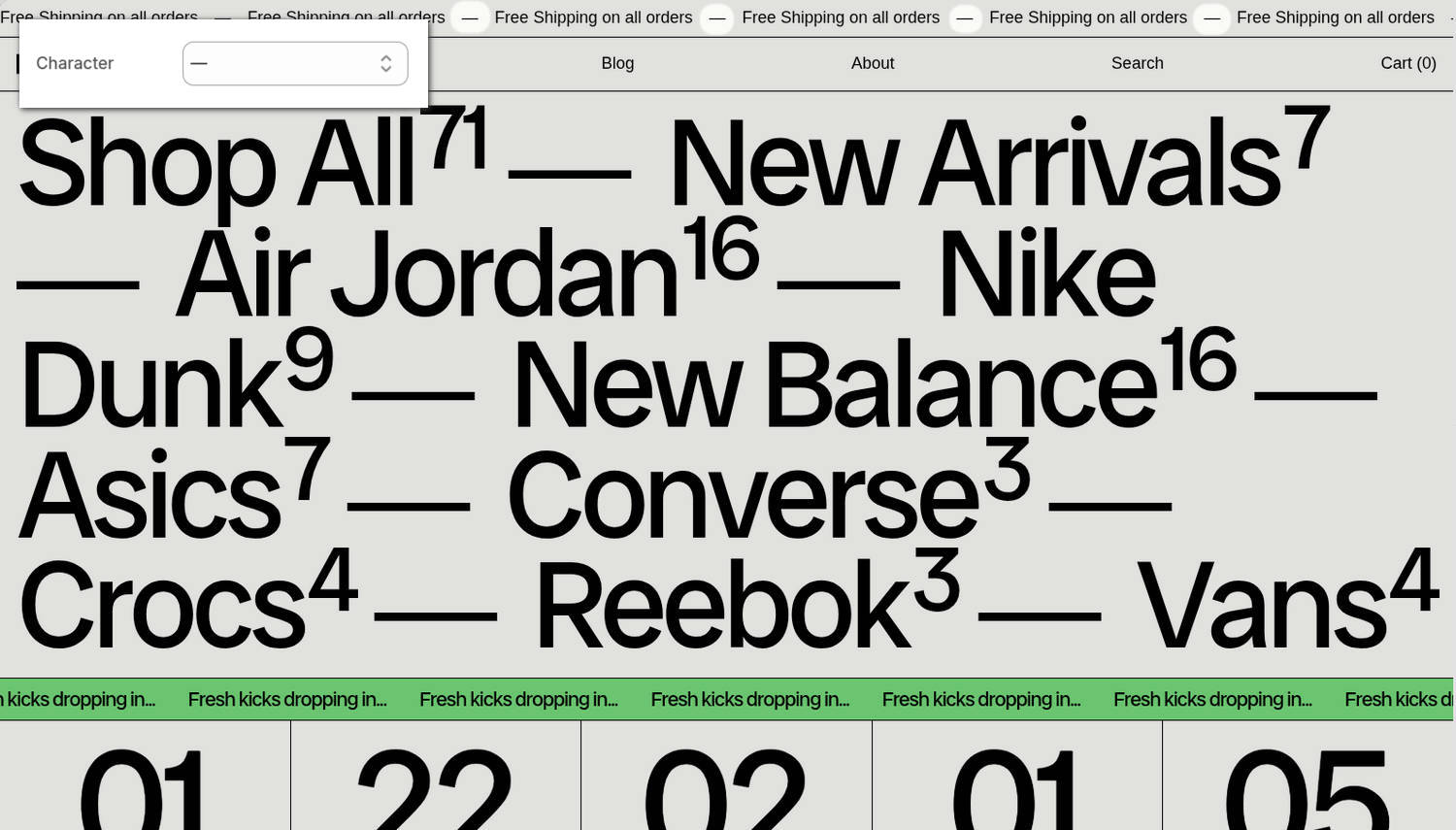
The previous image shows an Announcement bar section at the top of a store's home page. In the upper-left corner of the image, part of the Theme editor's section menu is displayed below the section. The menu's Character option is set to "—" (the em dash symbol). This setting specifies the symbol displayed between the section's lines of scrolling text. In the image, the symbol is shown between each occurrence of the Free shipping on all orders text.
For general guidance with modifying sections, refer to Sections overview and Shopify help: Sections and blocks.
Configure the Announcement bar section
To configure your Announcement bar section:
In the Theme editor, at the top of the page, use the theme templates dropdown menu to select the home page.
Note
The section is accessible from all pages, excluding the Checkout, Password, and Gift card pages.
From the side menu, select Announcement bar.
Select a setting described in the following table.
| Setting name | Description |
|---|---|
| Home page only | Set the Home page only option to on or off. With this setting enabled, the section displays on the home page only. |
| Hide on mobile | Use the Hide on mobile option to show or hide the section on mobile display devices. |
| Uppercase | Set the Uppercase option to on or off. With this option enabled, uppercase is applied to the section's text. |
| Text | In the Text field, enter body text to display in the section. |
| Link | Use the Link field to enter an external URL or to select a link to display inside the section. |
| Display | Use the Display option to select Scrolling text or Static. This setting determines whether scrolling or static text is displayed in the section. If a visitor has reduced motion enabled, the scrolling text does not animate and is displayed as a static banner. |
| Scroll > Speed | Adjust the Speed slider between 20 and 400 (seconds) to specify a scroll speed for the section's scrolling text. To use this setting, set the Display option to Scrolling text. |
| Scroll > Direction | Use the Direction option to set the section's scrolling text to move from Right to left or Left to right. To use this setting, set the Display option to Scrolling text. |
| Scroll > Repeat text | Set the Repeat text option to on or off. With this option enabled, the section's text is scrolled in a continuous stream of repeated text across the section. To use this option, set the Display option to Scrolling text. |
| Repeat text separator > Spacing | Use the Spacing option to select S (small), M (medium), L (large) or XL (extra large). This option specifies a size for the spacing that separates each occurrence of repeated text. To use this option, set the Display option to Scrolling text. |
| Repeat text separator > Type | Use the Type option to select Gap, Character or Button. This option specifies the type of separator to display between each occurrence of repeated text. To use this option, set the Display option to Scrolling text. |
| Repeat text separator > Character | Use the Character option to select ·, •, ↑, →, ↓, and more. This option specifies the text character (symbol) to display between each occurrence of repeated text. To use this option, set the Display option to Scrolling text and set the Type option to Character. |
| Repeat text separator > Repeat character | Adjust the Repeat character slider between 1 and 6 x. This option specifies the number of text characters (symbols) to display between each occurrence of repeated text. To use this option, set the Display option to Scrolling text and set the Type option to Character. |
| Repeat text separator > Spacing between repeated characters | Use the Spacing between repeated characters option to select None, Hair, Thin, Punctuation, 4-per-em, and more. This option specifies the type of spacing to display between each text character (symbol) that separates each occurrence of repeated text. To use this option, set the Display option to Scrolling text, and set the Type option to Character. |
| Repeat text separator > Button label | Enter a single line of text in the Button label field. The text you enter is displayed as the label for the button that separates each occurrence of repeated text. To use this option, set the Display option to Scrolling text and set the Type option to Button. |
| Repeat text separator > Button style | Use the Button style option to select Primary or Secondary. This option specifies a style for the button that separates each occurrence of repeated text. To use this option, set the Display option to Scrolling text and set the Type option to Button. |
| Color > Color scheme | Use the Color scheme picker to select a color scheme for the section. Refer to Colors. |
| Color > Theme settings (link) | Follow the Theme settings link to open the Theme editor's Color theme settings. Use the settings to edit the theme colors for your entire store. |
| Custom CSS | Select Custom CSS. In the CSS field, enter custom CSS styles to apply only to the current section. Refer to Shopify help: Add custom CSS. To apply custom styles to your entire online store, refer to Theme settings > Custom CSS. |
| Remove section | Select Remove section to delete the section from the current page. |
Note
To connect a metafield to a setting that supports metafields, select the Connect dynamic source icon displayed beside the setting in the Theme editor.
To learn how to connect a metafield to a supported setting, refer to Shopify help: Connecting metafields to your theme by using the Theme editor.
Configure a block within an Announcement bar section
A default Announcement bar section contains one Text block.
To configure a block for your Announcement bar section:
In the Theme editor, at the top of the page, use the theme templates dropdown menu to select the home page.
From the side menu, expand the Announcement bar section menu.
To configure an existing block, select the block from the side menu.
To add a new block, select Add block, choose a block to add, and then select the block you added.
Note
Inside the section, you can add, remove, show, hide, and move blocks. Refer to Configure blocks inside a section and Shopify help: Sections and blocks.
Apply a block setting described in the following table.
| Block name | Description | Setting |
|---|---|---|
| Text | Displays text inside the section. |
|
| Free shipping | Displays a free shipping bar inside the section. |
|
| Countdown timer | Displays a countdown timer inside the section. Note that the block's time is set in the store's time zone. |
|