Appearance
Custom links with image
This guide describes setting up the Custom links with image section.
Use the section to display a selection of links to your store's pages, with an image representing each link, and an image to represent the set of links.
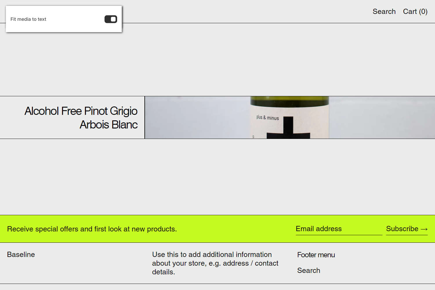
The previous image shows a Custom links with image section on a store's home page. In the upper left, part of Theme editor's section menu is displayed. The menu's Fit media to text option is enabled. With this option enabled, the section's image is cropped to match the size of the section's text area. On desktop display devices, the store shows the section's image cropped to the height of the section's text area.
For general guidance with modifying sections, refer to Sections overview and Shopify help: Sections and blocks.
Set up a Custom links with image section
To set up a Custom links with image section:
In Theme editor, at the top of the page, use the theme templates dropdown menu to select a page that contains a Custom links with image section.
Note
The section can be added to any page, except Checkout and Gift card pages. To add the section to the current page, select Add section > Custom links with image. Refer to Shopify help: Add a section.
From the side menu, select Custom links with image.
Select a setting described in the following table.
| Setting name | Description |
|---|---|
| Mobile font size scale | Adjust the Mobile font size scale slider to set a font size for the section's text on mobile display devices. The minimum value is -2 and the maximum is 4. |
| Desktop font size scale | Adjust the Desktop font size scale slider to set a font size for the section's text on desktop display devices. The minimum value is -2 and the maximum is 9. |
| Text alignment | Use the Text alignment options to align the section's text to the Left, Center, or Right. |
| Text position | Use the Text position options to specify a position for the section's text. The options are Top, Middle, and Bottom. |
| Show index as superscript | Use the Show index as superscript option to show or hide a prefix for each link item inside the section. With this setting enabled, each item is prefixed with an ascending index number, like a numbered list, to help customers see the order at a glance. The first item is prefixed with 1, the second item is prefixed with 2, etc. |
| Media > Type | Use the Type option to set the section to display an Image or Video. |
| Media > Image | Use the Image picker to select an image to display inside the section's media area. Refer to Add, replace or remove an image or video inside a section or block. The image represents the set of links inside the section. The image displays by default. When a store visitor places a cursor over a link inside the section, the section's image in the media area is replaced by the link block's image. To use this option, set the Type option to Image. |
| Media > Video | Use the Video picker to select a video to display inside the section's media area. Refer to Add, replace or remove an image or video inside a section or block. The video represents the set of links inside the section. The video displays by default. When a store visitor places a cursor over a link inside the section, the section's video in the media area is replaced by the link block's video. To use this option, set the Type option to Video. |
| Media > Media position on desktop | Use the Media position on desktop options to position the section's media to the Left or Right. |
| Media > Media size on desktop | Use the Media size on desktop setting to specify a width for the section's media. The options are One third, One half, and Two thirds. This setting applies to desktop display devices. |
| Media > Fit media to text | Use the Fit media to text option to turn media-fitting on or off. With this option enabled, the section's media item is cropped to match the size of the section's text area. On desktop display devices, enabling this option crops media to the height of the section's text area. |
| Media > Deep inset | Use the Deep inset option to show or hide an area of empty space around the section's media. |
| Color > Color scheme | Use the Color scheme picker to select a color scheme for the section. Refer to Colors. |
| Theme settings | If available, select Theme settings to access additional settings for the section. Refer to Section theme settings menu. |
| Custom CSS | Select Custom CSS. In the CSS field, enter custom CSS styles to apply only to the current section. Refer to Shopify help: Add custom CSS. To apply custom styles to your entire online store, refer to Theme settings > Custom CSS. |
| Remove section | Select Remove section to delete the section from the current page. |
Note
To connect a metafield to a setting that supports metafields, select the Connect dynamic source icon displayed beside the setting in Theme editor.
To learn how to connect a metafield to a supported setting, refer to Shopify help: Connecting metafields to your theme by using the Theme editor.
Configure a link inside a Custom links with image section
A default Custom links with image section contains three link blocks. To configure a link block inside the section:
In Theme editor, at the top of the page, use the theme templates dropdown menu to select a page that contains a Custom links with image section.
From the side menu, expand the Custom links with image section menu.
To configure an existing block, select the block from the side menu.
To add a new block, select Add link, and then select the block you added.
Note
Inside the section, you can add, remove, show, hide, or move blocks. Refer to Configure blocks inside a section and Shopify help: Sections and blocks.
Apply a block setting described in the following table.
| Block name | Description | Setting |
|---|---|---|
| Link | Displays a link to a store page inside the section. |
|